demography

When I teach social statistics, I often show students how small changes in measurement or analysis can make a big difference in the way we understand the world. Recently, I have been surprised by some anger and cynicism that comes up when we talk about this. Often at least one student will ask, “does it even matter if you can just rig the results to say whatever you want them to say?”

I can’t blame them. Controversy about manufactured disagreement on climate change, hoax studies, or the rise of fake news and “both side-ism” in our politics can make it seem like everyone is cooking the books to get results that make them happy. The social world is complicated, but it is our job to work through that complexity and map it out clearly, not to throw up our hands and say we can’t do anything about it. It’s like this optical illusion:

The shape isn’t just a circle or a square. We can’t even really say that it is both, because the real shape itself is complicated. But we can describe the way it is built to explain why it looks like a circle and a square from different angles. The same thing can happen when we talk about debates in social science.

A fun example of this popped up recently in the sociology of religion. In 2016, David Voas and Mark Chaves published an article in the American Journal of Sociology about how rates of religious commitment in the United States are slowly declining. In 2017, Landon Schnabel and Sean Bock published an article in Sociological Science responding to this conclusion, arguing that most of the religious decline was among moderate religious respondents—people with very strong religious commitments seemed to be holding steady. Just recently, both teams of authors have published additional comments about this debate (here and here), analyzing the same data from the General Social Survey.

So, who is right?

Unlike some recent headlines about this debate, the answer about religious decline isn’t just “maybe, maybe not.” Just like the circle/square illusion, we can show why these teams get different results with the same data.

Parallel Figures from Voas & Chaves (2018) and Schnabel & Bock (2018) (Click to Enlarge)

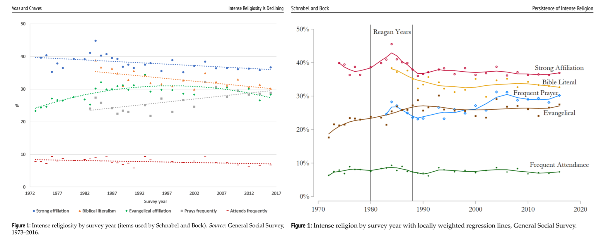
When we put the charts together, you can see how Voas and Chaves fit straight and smoothly curved lines to trends across waves in the GSS. This creates the downward-sloping pattern that fits their conclusions about slow religious decline over time. Schnabel and Bock don’t think a single straight line can accurately capture these trends, because the U.S. saw a unique peak in religious commitment that happened during the Regan years and may have receded more quickly. Their smoothing technique (LOESS smoothing) captures this peak and a quick decline afterwards, and doing so flattens out the rest of the trends after that period.

The most important lesson from these charts is that they don’t totally get rid of the ambiguity about religious change. Rather than just ending the debate or rehashing it endlessly, this work helps us see how it might be more helpful to ask different questions about the historical background of the case. I like this example because it shows us how disagreement among experts can be an invitation to dig into the details, rather than a sign we should just agree to disagree. Research methods matter, and sometimes they can help us more clearly explain why we see the world so differently.

Evan Stewart is an assistant professor of sociology at University of Massachusetts Boston. You can follow his work at his website, on Twitter, or on BlueSky.

The Star Tribune recently ran an article about a new study from George Washington University tracking cases of Americans who traveled to join jihadist groups in Syria and Iraq since 2011. The print version of the article was accompanied by a graph showing that Minnesota has the highest rate of cases in the study. TSP editor Chris Uggen tweeted the graph, noting that this rate represented a whopping seven cases in the last six years.

Here is the original data from the study next to the graph that the paper published:

(Click to Enlarge)

Social scientists often focus on rates when reporting events, because it make cases easier to compare. If one county has 300 cases of the flu, and another has 30,000, you wouldn’t panic about an epidemic in the second county if it had a city with many more people. But relying on rates to describe extremely rare cases can be misleading. 

For example, the data show this graph misses some key information. California and Texas had more individual cases than Minnesota, but their large populations hide this difference in the rates. Sorting by rates here makes Minnesota look a lot worse than other states, while the number of cases is not dramatically different. 

As far as I can tell, this chart only appeared in the print newspaper photographed above and not on the online story. If so, this chart only went to print audiences. Today we hear a lot of concern about the impact of “filter bubbles,” especially online, and the spread of misleading information. What concerns me most about this graph is how it shows the potential impact of offline filter bubbles in local communities, too.

Evan Stewart is an assistant professor of sociology at University of Massachusetts Boston. You can follow his work at his website, on Twitter, or on BlueSky.

Flashback Friday.

A set of maps from Eric Fischer illustrate racial/ethnic populations in a number of U.S. cities, based on Census 2000 data. They’re great for showing levels of segregation, as well as comparing racial/ethnic diversity and population density in different regions.

On the maps, red = White/Caucasian, blue = African American, green = Asian, orange = Hispanic, and gray = Other. Each dot represents 25 people. At Fischer’s website, if you hover over the images you can identify individual neighborhoods/regions.

Here’s NYC, which not surprisingly has the highest apparent population density of any of the cities mapped and a high level of diversity, though also clearly the racial/ethnic groups are residentially segregated to a large degree:

Vegas still shows the distinctive residential segregation of African Americans that first emerged when they were forced to live in a segregated neighborhood called Westside, physically separated from other parts of town by Boulder Highway (see Las Vegas: The Social Production of an All-American City for a history of its development), and the predominantly-White neighborhoods ringing the Vegas Valley:

Fischer has up 102 different city maps, so there’s lots to play with and compare.

Originally posted in September, 2010.

Gwen Sharp is an associate professor of sociology at Nevada State College. You can follow her on Twitter at @gwensharpnv.

I love gender and sexual demography.  It’s incredibly important work.  Understanding the size and movements of gender and sexual minority populations can help assess what kinds of resources different groups might require and where those resources would be best spent, among others things.  Gary J. Gates and Frank Newport initially published results from a then-new Gallup question on gender/sexual identity in 2012-2013 (here).  At the time, 3.4% of Americans identified as either lesbian, gay, bisexual, or transgender.  It’s a big deal – particularly as “identity” is likely a conservative measure when it comes to assessing the size of the population of LGBT persons.  After I read the report, I was critical of one element of the reporting: Gates and Newport reported proportions of LGBT persons by state.  As data visualizations go, I felt the decision concealed more than it revealed.

From 2015-2016, Gallup collected a second round of data. These new data allowed Gates to make some really amazing observations about shifts in the proportion of the U.S. population identifying themselves as LGBT.  It’s a population that is, quite literally on the move.  I posted on this latter report here.  The shifts are astonishing – particularly given the short period of time between waves of data collection.  But, again, data on where LGBT people are living was reported by state.  I suspect that much of this has to do with sample size or perhaps an inability to tie respondents to counties or anything beyond state and time zone.  But, I still think displaying the information in this way is misleading.  Here’s the map Gallup produced associated with the most recent report:

During the 2012-2013 data collection, Hawaii led U.S. states with the highest proportions of LGBT identifying persons (with 5.1% identifying as LGBT)–if we exclude Washington D.C. (with 10% identifying as LGBT).  By 2016, Vermont led U.S. states with 5.3%; Hawaii dropped to 3.8%.  Regardless of state rank, however, in both reports, the states are all neatly arranged with small incremental increases in the proportions of LGBT identifying persons, with one anomaly–Washington D.C.  Of course, D.C. is not an anomaly; it’s just not a state. And comparing Washington D.C. with other states is about as meaningful as examining crime rate by European nation and including Vatican City.  In both examples, one of these things is not like the others in a meaningful sense.

In my initial post, I suggested that the data would be much more meaningfully displayed in a different way.  The reason D.C. is an outlier is that a good deal of research suggests that gender and sexual minorities are more populous in cities; they’re more likely to live in urban areas.  Look at the 2015-2016 state-level data on proportion of LGBT people by the percentage of the state population living in urban areas (using 2010 Census data).  The color coding reflects Census regions (click to enlarge).

Vermont is still a state worth mentioning in the report as it bucks the trend in an impressive way (as do Maine and New Hampshire).  But I’d bet you a pint of Cherry Garcia and a Magic Hat #9 that this has more to do with Burlington than with thriving communities of LGBT folks in the towns like Middlesex, Maidstone, or Sutton.

I recognize that the survey might not have a sufficient sample to enable them to say anything more specific (the 2015-2016 sample is just shy of 500,000).  But, sometimes data visualizations obscure more than they reveal.  And this feels like a case of that to me.  In my initial post, I compared using state-level data here with maps of the U.S. after a presidential election.  While the maps clearly delineate which candidate walked away with the electoral votes, they tell us nothing of the how close it was in each state, nor do they provide information about whether all parts of the state voted for the same candidates or were regionally divided.  In most recent elections traditional electoral maps might leave you wondering how a Democrat ever gets elected with the sea of red blanketing much of the nation’s interior.  But, if you’ve ever seen a map showing you data by county, you realize there’s a lot of blue in that red as well–those are the cities, the urban areas of the nation.  Look at the results of the 2016 election by county (produced by physicist Mark Newman – here).  On the left, you see county level voting data, rather that simply seeing whether a state “went red” or “went blue.”  On the right, Newman uses a cartogram to alter the size of each county relative to its population density.  It paints a bit of a different picture, and to some, it probably makes that state-level data seem a whole lot less meaningful.

Maps from Mark Newman’s website: http://www-personal.umich.edu/~mejn/election/2016/

The more recent report also uses that state-level data to examine shifts in LGBT identification within Census regions as well.  Perhaps not surprisingly, there are more people identifying as LGBT everywhere in the U.S. today than there were 5 years ago (at least when we ask them on surveys).  But rates of identification are growing faster in some regions (like the Pacific, Middle Atlantic, and West Central) than others (like New England).  Gates suggests that while this might cause some to suggest that LGBT people are migrating to different regions, data don’t suggest that LGBT people are necessarily doing that at higher rates than other groups.

The recent shifts are largely produced by young people, Millennials in the Gallup sample.  And those shifts are more pronounced in those same states most likely to go blue in elections.  As Gates put it, “State-level rankings by the portion of adults identifying as LGBT clearly relate to the regional differences in LGBT social acceptance, which tend to be higher in the East and West and lower in the South and Midwest. Nevada is the only state in the top 10 that doesn’t have a coastal border. States ranked in the bottom 10 are dominated by those in the Midwest and South” (here).

When we compare waves of data collection, we can see lots of shifts in the LGBT-identifying population by state (see below; click to enlarge).  While the general trend was for states to have increasing proportions of people claiming LGBT identities in 2015-2016, a collection of states do not follow that trend.  And this struck me as an issue that ought to provoke some level of concern.  Look at Hawaii, Rhode Island, and South Dakota, for example.  These are among the biggest shifts among any of the states and they are all against the liberalizing trend Gates describes.

Presentation of data is important.  And while the report might help you realize, if you’re LGBT, that you might enjoy living in Vermont or Hawaii more than Idaho or Alabama if living around others who share your gender or sexual identity is important to you, that’s a fact that probably wouldn’t surprise many.  I’d rather see maps illustrating proportions of LGBT persons by population density rather than by state.  I don’t think we’d be shocked by those results either.  But it seems like it would be provide a much better picture of the shifts documented by the report than state-level data allow.

Tristan Bridges, PhD is a professor at the University of California, Santa Barbara. He is the co-editor of Exploring Masculinities: Identity, Inequality, Inequality, and Change with C.J. Pascoe and studies gender and sexual identity and inequality. You can follow him on Twitter here. Tristan also blogs regularly at Inequality by (Interior) Design.

1
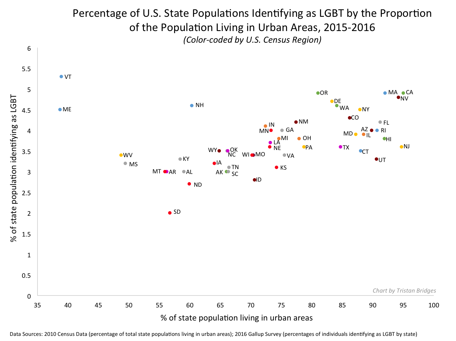
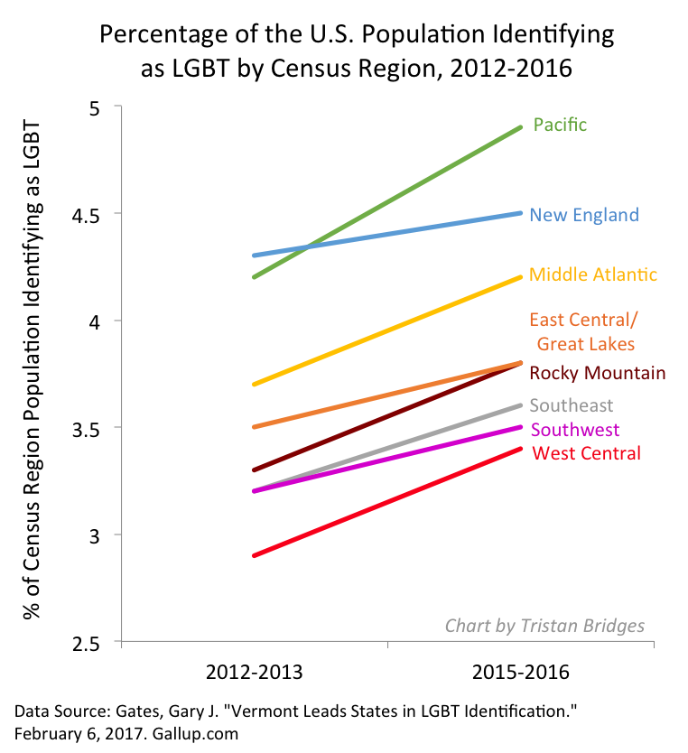
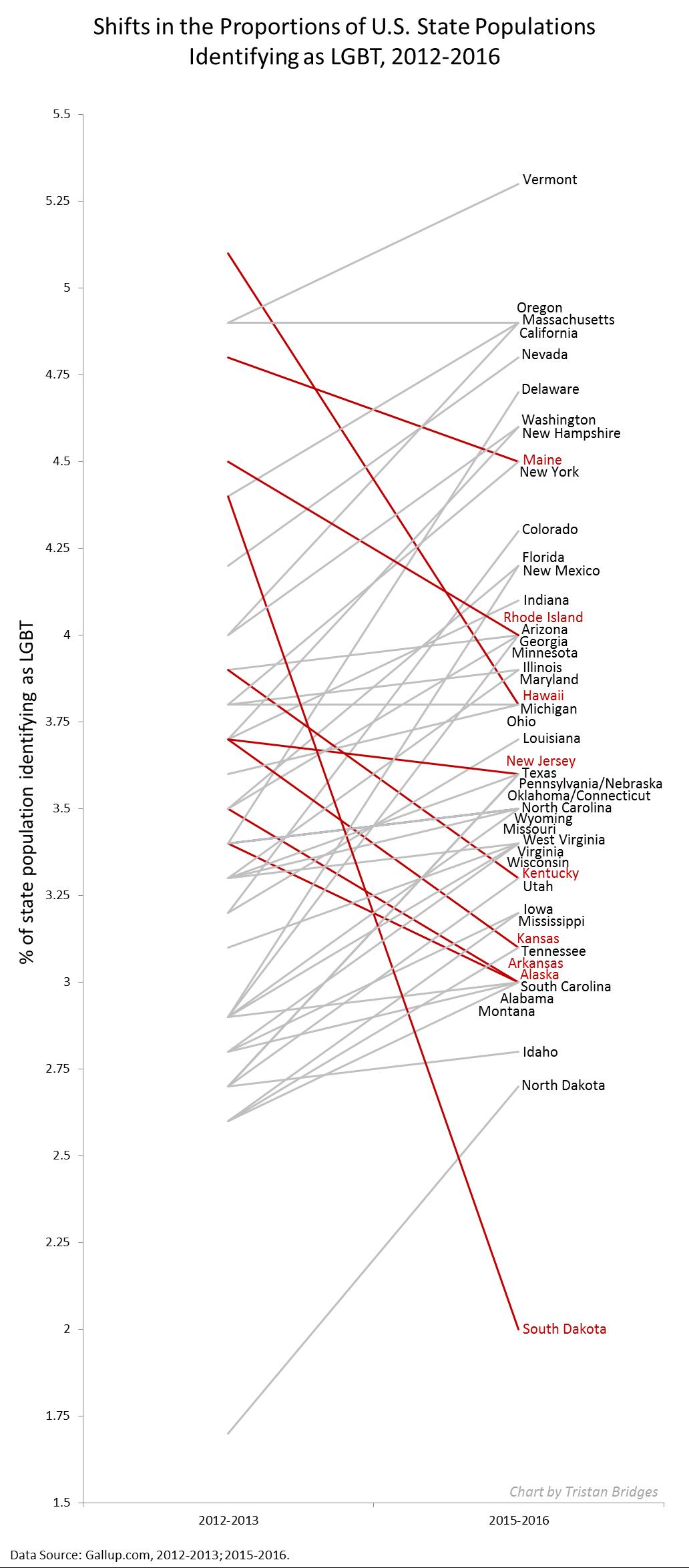
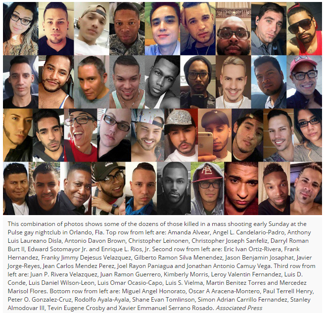
It was “Latino night” at a gay club. When the story finally broke, that’s all I heard. Orlando’s tragedy at the Pulse puts Latina/o, Latin American, Afro-Latinos, and Puerto Ricans and other Caribbean LGBT people front and center. Otherness mounts Otherness, even in the Whitewashing of the ethno-racial background of those killed by the media, and the seemingly compassionate expressions of love by religious folk. The excess of difference—to be Black or Brown (or to be both) and to be gay, lesbian, bisexual, or transgender (or queer, as some of us see ourselves) serves to shock, through difference, how news are reported. Difference – the very basis of feminist and ethnic politics in the 20th century – has been co-opted and ignored, sanitized even, to attempt to reach a level of a so-called “humanity” that is not accomplishable. We know this, but we don’t talk about it.

4

.

Don’t get me wrong: empathy is essential for most social codes of order to functionally sustain any given society. To pay one’s respects for others’ losses, however, does not mean that we think of those lost as equals. Liberal people demanding that sexuality be less important in the news (and thus removed from the coverage) is an inherent violence toward those who partied together because there was real love among them, in that club, for who they were – and are. Religious righters may spread hate while trying to give the illusion of compassion, but they do so in a clear hierarchical, paternalistic way – that is hypocrisy, and we must call it out every chance we get. But this goes beyond liberal notions and conservative hypocrisy – even while Anderson Cooper wept when reading the list of those killed, he knows the distance between himself and many of those at the club is enough to build a classed, raced, and social wall between them. Clearly, empathy is not enough.

To be Latina/o in the US – increasingly another Latin American country, again – is to breathe in hate, to face retaliation, to be questioned at every turn about our allegiances, tested on our sense of citizenship, pushed in our capacity to love the nation and thus hate “like the rest” (a testament to the masculinity of the nation). At a minimum, to be Latina/o guarantees one to be looked at oddly, as if one was out of place, misplaced, inappropriately placed. Simply by being, Latinas/os rupture the logics of normalcy in USAmerica. To be Latina/o and LGBT is to disrupt the logics of racial formation, of racial purity, of the Black and White binary still ruling this country – all while de-gendering and performing an excess (of not only gender, but sexuality) that overflows and overwhelms “America.” In being Latino and queer, some of us aim to be misfits that disrupt a normalcy of regulatory ways of being.

A break between queer and América erupted this past weekend – in Orlando, a city filled with many Latin Americans; a city that, like many others, depends on the backs of Brown folk to get the work done. Put another way, Orlando’s tragedy created a bridge between different countries and newer readings of queerness – Orlando as in an extension of Latin América here. Queer-Orlando-América is an extension of so many Latin American cities as sites of contention, where to be LGBT is both celebrated and chastised – no more, or less, than homophobia in the US.

Enough has been said about how the Pulse is a place where people of color who desired others like themselves, or are trans, go to dance their fears away, and dream on hope for a better day. Too little has been said about the structural conditions faced by these Puerto Ricans, these immigrants, these mixed raced queer folks – some of whom were vacationing, many of whom lived in Florida. Many were struggling for a better (financial, social, political – all of the above) life. Assumptions have also been made about their good fortune as well. Do not assume that they left their countries seeking freedom – for many who might have experienced homophobia back home, still do here; though they have added racism to their everyday lived experience. Of course, there are contradictions on that side of queer-Orlando-América, too; yet same sex marriage was achieved in half a dozen countries before the US granted it a year ago. This is the world upside down, you say, since these advances – this progress – should have happened in the US first.Wake up. América is in you and you are no longer “America” but América.

You see, this is how we become queer-Orlando-América: we make it a verb, an action. It emerges where the tongues twist, where code switching (in Spanish/English/Spanglish) is like a saché-ing on the dance floor, where gender and race are blurry and yet so clear, where Whiteness isn’t front and center – in fact it becomes awkward in this sea of racial, gendered, and sexual differences. This queer-Orlando-América (a place neither “here,” nor “there,” where belonging is something you carry with you, in you, and may activate on some dance floor given the right people, even strangers, and real love – especially from strangers) was triggered – was released – by violence. But not a new violence, certainly not a Muslim-led violence. Violence accumulated over violence – historically, ethnically, specific to transgender people, to Brown people, to effeminate male-bodied people, to the power of femininity in male and female bodies, to immigrants, to the colonized who speak up, to the Spanglish that ruptures “appropriateness,” to the language of the border. And in spite of this, queer-Orlando-América has erupted. It is not going down to the bottom of the earth. You see us. It was, after all, “Latino night” at a gay club. You can no longer ignore us.

As the week advanced, and fathers’ day passed us by, I have already noticed the reordering of the news, a staged dismissal so common in media outlets. Those queer and Brown must continue to raise this as an issue, to not let the comfort of your organized, White hetero-lives go back to normal. You never left that comfort, you just thought about “those” killed.  But it was “Latino night” at a gay club. I do not have that luxury. I carry its weight with me. Now the lives of those who are queer and Latina/o have changed – fueled with surveillance and concerns, never taking a temporary safe space for granted. Queer-Orlando-América is thus a “here and now” that has changed the contours of what “queer” and “America” were and are. Queer has now become less White – in your imaginary (we were always here). América now has an accent (it always had it – you just failed to notice).  Violence in Orlando did this. It broke your understanding of a norm and showed you there is much more than the straight and narrow, or the Black and White “America” that is segmented into neatly organized compartments. In that, Orlando queers much more than those LGBT Latinas/os at the club. Orlando is the rupture that bridges a queer Brown United States with a Latin America that was always already “inside” the US – one that never left, one which was invaded and conquered. Think Aztlán. Think Borinquen. Think The Mission in San Francisco. Or Jackson Heights, in NYC. Or the DC metro area’s Latino neighborhoods. That is not going away. It is multiplying.

I may be a queer Latino man at home, at the University, at the store, and at the club. That does not mean that the layered account of my life gets acknowledged (nor celebrated) in many of those sites – in fact, it gets fractured in the service of others’ understandings of difference (be it “diversity,” “multiculturalism” or “inclusion”). But it sure comes together on the dance floor at a club with a boom-boom that caters to every fiber of my being. It is encompassing. It covers us. It is relational. It moves us – together. So, even if I only go out once a year, I refuse to be afraid to go out and celebrate life. Too many before me have danced and danced and danced (including those who danced to the afterlife because of AIDS, hatred, and homophobia), and I will celebrate them dancing – one night at a time.

We are not going away – in fact, a type of queer-Orlando-América is coming near you, if it hasn’t arrived already, if it wasn’t there already—before you claimed that space. No words of empathy will be enough to negotiate your hypocrisy, to whitewash our heritage, or make me, and us, go away. If anything, this sort of tragedy ignites community, it forces us to have conversations long overdue, it serves as a mirror showing how little we really have in common with each other in “America” – and the only way to make that OK is to be OK with the discomfort difference makes you experience, instead of erasing it.

We must never forget that it was “Latino night” at a gay club. That is how I will remember it.

Salvador Vidal-Ortiz, PhD, is associate professor of sociology at American University; he also teaches for their Women’s, Gender, and Sexuality Studies program. He coedited The Sexuality of Migration: Border Crossings and Mexican Immigrant Men and Queer Brown Voices: Personal Narratives of Latina/o LGBT Activism. He wrote this post, originally, for Feminist Reflections.

Media have tended to depict childfree people negatively, likening the decision not to have children to “whether to have pizza or Indian for dinner.” Misperceptions about those who do not have children have serious weight, given that between 2006 and 2010 15% of women and 24% of men had not had children by age 40, and that nearly half of women aged 40-44 in 2002 were what Amy Blackstone and Mahala Dyer Stewart refer to as “childfree,” or purposefully not intending to have children.

Trends in childlessness/childfreeness from the Pew Research Center:

4

Blackstone and Stewart’s forthcoming 2016 article in The Family Journal, “There’s More Thinking to Decide”: How the Childfree Decide Not to Parent, engages the topic and extends the scholarly and public work Blackstone has done, including her shared blog, We’re Not Having a Baby.

When researchers explore why people do not have children, they find that the reasons are strikingly similar to reasons why people do have children. For example, “motivation to develop or maintain meaningful relationships” is a reason that some people have children – and a reason that others do not. Scholars are less certain on how people come to the decision to to be childfree. In their new article, Blackstone and Stewart find that, as is often the case with media portrayals of contemporary families, descriptions of how people come to the decision to be childfree have been oversimplified. People who are childfree put a significant amount of thought into the formation of their families, as they report.

Blackstone and Stewart conducted semi-structured interviews with 21 women and 10 men, with an average age of 34, who are intentionally childfree. After several coding sessions, Blackstone and Stewart identified 18 distinct themes that described some aspect of decision-making with regard to living childfree. Ultimately, the authors concluded that being childfree was a conscious decision that arose through a process. These patterns were reported by both men and women respondents, but in slightly different ways.

Childfree as a conscious decision

All but two of the participants emphasized that their decision to be childfree was made consciously. One respondent captured the overarching message:

People who have decided not to have kids arguably have been more thoughtful than those who decided to have kids. It’s deliberate, it’s respectful, ethical, and it’s a real honest, good, fair, and, for many people, right decision.

There were gender differences in the motives for these decisions. Women were more likely to make the decision based on concern for others: some thought that the world was a tough place for children today, and some did not want to contribute to overpopulation and environmental degradation. In contrast, men more often made the decision to live childfree “after giving careful and deliberate thought to the potential consequences of parenting for their own, everyday lives, habits, and activities and what they would be giving up were they to become parents.”

Childfree as a process

Contrary to misconceptions that the decision to be childfree is a “snap” decision, Blackstone and Stewart note that respondents conceptualized their childfree lifestyle as “a working decision” that developed over time. Many respondents had desired to live childfree since they were young; others began the process of deciding to be childfree when they witnessed their siblings and peers raising children. Despite some concrete milestones in the process of deciding to be childfree, respondents emphasized that it was not one experience alone that sustained the decision. One respondent said, “I did sort of take my temperature every five, six, years to make sure I didn’t want them.” Though both women and men described their childfree lifestyle as a “working decision,” women were more likely to include their partners in that decision-making process by talking about the decision, while men were more likely to make the decision independently.

Blackstone and Stewart conclude by asking, “What might childfree families teach us about alternative approaches to ‘doing’ marriage and family?” The present research suggests that childfree people challenge what is often an unquestioned life sequence by consistently considering the impact that children would have on their own lives as well as the lives of their family, friends, and communities. One respondent reflected positively on childfree people’s thought process: ‘‘I wish more people thought about thinking about it… I mean I wish it were normal to decide whether or not you were going to have children.’’

Braxton Jones is a graduate student in sociology at the University of New Hampshire, and serves as a Graduate Research and Public Affairs Scholar for the Council on Contemporary Families, where this post originally appeared.

This November, a wave of student activism drew attention to the problem of racism at colleges and universities in the US.  Sparked by protests at the University of Missouri, nicknamed Mizzou, we saw actions at dozens of colleges. It was a spectacular show of strength and solidarity and activists have won many concessions, including new funding, resignations, and promises to rename buildings.

Activists’ grievances are structural — aimed at how colleges are organized and who is in charge, what colleges teach and who does the teaching, and what values are centered and where they come from — but they are also interpersonal. Student activists of color talked about being subject to overtly racist behavior from others and being on the receiving end of microaggressions, seemingly innocuous commentary from others that remind them that they do not, as a Claremont McKenna dean so poorly put it, “fit the mold.” That dean lost her job after that comment. Many student activists seem to embrace the policing of offensive speech, both the hateful and the ignorant kind.

Negative reactions to this activism was immediate and widespread. Much of it served only to affirm the students’ claims: that we are still a racist society and that we, at best, tolerate our young people of color only if they stay “in their place.” Other times, it was confusion about the kind of world these young people seemed to want to live in. Why, some people asked, would anyone — especially a member of a marginalized population — want to shut down free speech?

Well, it may be that the American love of free speech is waning. The Pew Research Center released data measuring attitudes about censorship. They asked Americans whether they thought the government should be able to prevent people from saying things that are “offensive to minorities.” Millennials — that is, today’s college students — are significantly more likely than any other generation to say that they should.

In fact, the data show a steady decrease in the proportion of Americans who are eager to defend speech that is offensive to minorities. Only 12% of the Silent generation is in favor of censorship, compared to 24% of the Baby Boomers, 27% of Gen X, and 40% of Millennials. Notably, women, Democrats, and non-whites are all more likely than their counterparts to be willing to tolerate government control of speech.

4

Americans still stand out among their national peers. Among European Union countries, 49% of citizens are in favor of censorship, compared to 28% of Americans. If the Millennials have anything to say about it, though, that might be changing. Assuming this is a cohort effect and not an age effect (that is, assuming they won’t change their minds as they age), and with the demographic changes this country will see in the next few decades, we may  very soon look more like Europe on this issue than we do now.

Re-posted at Pacific Standard.

Lisa Wade, PhD is an Associate Professor at Tulane University. She is the author of American Hookup, a book about college sexual culture; a textbook about gender; and a forthcoming introductory text: Terrible Magnificent Sociology. You can follow her on Twitter and Instagram.

1 (3)

Today marks ten years to the day that Hurricane Katrina flooded the city of New Orleans and devastated the Gulf Coast.   These posts are from our archives:

Was Hurricane Katrina a “Natural” Disaster?

Racism and Neglect

Disaster and Discourse

Devastation and Rebuilding

10 Years Later and Beyond

Lisa Wade, PhD is an Associate Professor at Tulane University. She is the author of American Hookup, a book about college sexual culture; a textbook about gender; and a forthcoming introductory text: Terrible Magnificent Sociology. You can follow her on Twitter and Instagram.