death

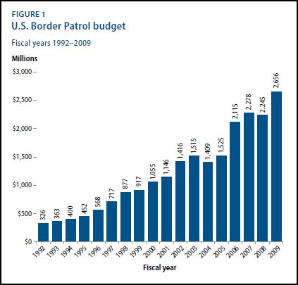
The Center for American Progress released a report detailing the state of border policing and the projected impact of immigration policies.  First, notice that spending on border patrol and the number of border patrol agents in the southwest have increased significantly between 1992 and 2009:

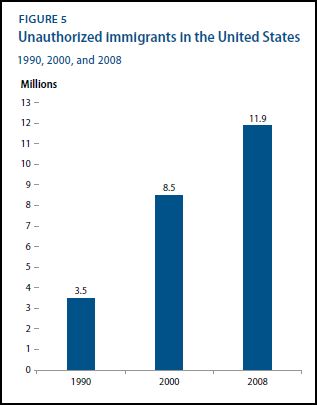
Still, despite this, the number of people illegally crossing the border has increased:


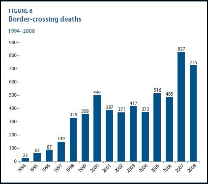
So the policing hasn’t deterred a rise in disallowed border crossings, but it has made it more dangerous:

So, the U.S. is spending a lot of money trying to keep undocumented non-citizens out.  Is it worth it?

The report also discusses projected changes in the GDP under three different scenarios: immigration reform, allowing temporary workers only, and mass deportation.

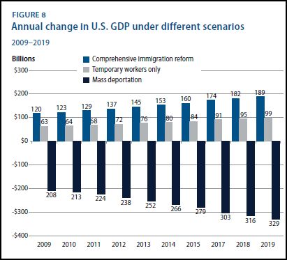
The figure suggests that undocumented workers are making a substantial contribution to the well-being of the U.S. economy, one that would decrease under conditions of mass deportation.  Temporary workers are helpful, but real immigration reform that would bring in greater numbers of permanent and temporary workers is the best thing for America.

Hat tip to Graphic Sociology.

Lisa Wade, PhD is an Associate Professor at Tulane University. She is the author of American Hookup, a book about college sexual culture; a textbook about gender; and a forthcoming introductory text: Terrible Magnificent Sociology. You can follow her on Twitter and Instagram.

Everyone knows phones and other devices are a major source of distraction to drivers, with deadly consequences. Six states — including New York and California — ban handheld phones while driving. The New York Times is running a major series on the danger, reporting that 11% of drivers are on the phone at any one time, causing 2,600 deaths per year.

I don’t doubt the danger. But this is my question: Where is the upward trend in traffic deaths and accidents? The number of wireless phone subscribers increased by 10-times from 1994 to 2006, but the rate of traffic fatalities per mile traveled dropped 18% during that time. Here’s my chart based on those numbers.

2010-03-13-cellphonedeaths.jpg

I don’t doubt it’s dangerous to talk on the phone while driving, and texting is reportedly even worse. So I’m left with a few possible explanations. First, maybe cars are just safer. So there is an increase in accidents but fewer deaths per mile driven. Second, maybe distracted driving is more likely to cause minor collisions, because people jabber and text less in high-risk situations. (OK, I checked it out and those explanations won’t do: Accidents causing property damage only, per mile driven, have also declined, by 24%, from 1994 to 2007.)

Or third — and I like this idea, though I have no evidence for it — maybe phone-based distractions are replacing other distractions, like eating, grooming, listening to music, supervising children, or interacting with other passengers.

Can you explain this?

(And no, I don’t work for the telecommunications industry.)

If you’re interested, I wrote a piece for The Daily Mirror about my recent trip to the LAPD’s “Behind the Scenes” exhibit here in Vegas (which got a lot of media attention when the Kennedy family protested the inclusion of bloody clothing from Robert Kennedy’s shooting). My friend Larry was interested in the politics involved–whose personal tragedy gets put on public display? Were the displays as sensationalistic as he suspected they would be? He was particularly interested in how the case of the Black Dahlia (aka Elizabeth Short) would be presented, and what the LAPD would think was appropriate to display for public consumption.

So I agreed to go take a look. And I was horrified in so many ways. Absolutely stunned. You can find the piece here.

Nate Silver at FiveThirtyEight posted some graphs that show a clear decrease in passenger deaths as a result of Violent Passenger Incidents (hijackings, sabotage/bombings, pilot shootings) since the 1980s:

airsafe1

Of course, the vast majority of people killed on 9/11 weren’t in the planes, but on the ground; if you include those, then 2001 has a much higher fatality level than any other year:

airsafe3

Silver’s point is that because of 9/11 and attempted bombings since then, many people are under the impression that the danger of violent incidents on planes is increasing. But it clearly isn’t–the number of passengers killed per decade as a result of such incidents has gone down even as plane travel has become more widespread and the number of people in the air each year has increased.

He also suggests,

…the loss of life that occurred on the ground on 9/11 would be very hard for Al Qaeda or any other terrorist group to replicate. The reason is that the last line of defense against the terrorists has also proven to be the best, and that is the passengers. Brave passengers thwarted the hijacking attempts aboard United 93 and Qantas 173, and sabotage attempts aboard NWA 253 and AA 63 (the Shoe Bomber incident).

This isn’t, obviously, meant to say that we shouldn’t worry about airline security or that the loss of life on 9/11 is unimportant. It’s just a good example of how it can be difficult to judge whether the risk of things is increasing or decreasing, particularly when they’re scary, and incidents that are actually quite rare can seem to be happening “all the time” once we’re thinking about, and noticing reports of, them.

Chris Uggen, fellow sociologist and editor of Contexts magazine, put together a graphic for Public Criminology comparing the current age of death row inmates in the US with their age at arrest (in the title, I assumed they were mostly men, but I don’t know):

deathrow3

So the median age at arrest is 27 and the median current age is 43.  This illustrates the lag time between arrest, conviction, sentencing, and  execution.  It also creates the conditions for what Uggen calls the “graying of prison populations.”   We are executing mostly middle-aged men and older, even as the young are disproportionately convicted for committing violent crimes.

I suppose whether or not we support executing a 50-year-old man for a crime he committed half a lifetime ago depends on what you think the death penalty is for.   Is it to satisfy the family of the victims?  Is it for revenge?  Is it for deterrence?  Is it to make the world outside the prison a safer place?

Executing people in their 40s, 50s, and beyond makes more sense if your goal is something like revenge, less sense if your goal is a safer world with less violent crime.  So, how we frame the death penalty (that is, how we answer the questions “what is it?” and “what is it for?”) shapes whether the graph above looks like social justice or social tragedy.

Lisa Wade, PhD is an Associate Professor at Tulane University. She is the author of American Hookup, a book about college sexual culture; a textbook about gender; and a forthcoming introductory text: Terrible Magnificent Sociology. You can follow her on Twitter and Instagram.

Flowing Data presented a number of figures revealing data about life expectancy (via).  It is well known that women live longer than men in Western countries (to age 81 versus age 76), but this graph, displaying the probability of dying in any given year, caught my eye:

Capture

Men have a higher probability of dying than women in any given year starting (it looks like) at about age 55.  It’s a small difference (maybe 5 percentage points at its largest), but over time it adds up.  Until about age 112, when men and women die at the same rates.

Awesomely, even at 119, your chance of dying in the next year isn’t quite 100%.  And that goes for men and women alike.

Also interesting, life expectancy by state:

Capture1

—————————

Lisa Wade is a professor of sociology at Occidental College. You can follow her on Twitter and Facebook.

U.S. civilians, by virtue of geography and geopolitics, have rarely experienced war firsthand. The possibility of the destruction of our infrastructure or civilian casualties on our land has remained remote. Today, for example, though we are waging war in Iraq and Afghanistan, non-military Americans do not expect to personally suffer (with the significant exception of harm to and the loss of loved ones).

That civilian populations can experience war in vastly different ways is illustrated by this photograph:

MaskedPioneers

It is the early 1920s and the Soviet Union has been at war with much of Europe for several years. In the photograph, children practice their response to being gassed in an attack.

The Vietnam War was the first televised war and some sociologists credit the visual images returning from the war for increasing opposition.  But the idea that an understanding of the horrible, destructive, and deadly effects of war would require the mass media is predicated on U.S. geographical detachment.  That is, the mass media would be less necessary if the war was happening on our soil.

Earlier this month, the U.S. military hardened its rule against publishing photographs of dead or dying U.S. soldiers.  The rule for embedded journalists states that:

Media will not be allowed to photograph or record video of U.S. personnel killed in action.

This separates U.S. civilians from war in a second way, by politics.  So a civilian population can be isolated from its own wars by geography or by politics and, largely, the U.S. is separated by both.

Thanks to Dmitriy T.M. for this great photograph.

For more posts discussing the impact of war on civilians, see license plate patriotismsex protestwar is boring, WWII civilian sacrifices (carpooling and staying off the phone), war and euphemism, framing “their” deathsthe silent ranksU.S. non-news about war, and reframing the “atomic bomb” (the evolution of the term and mushroom clouds have a silver lining).

—————————

Lisa Wade is a professor of sociology at Occidental College. You can follow her on Twitter and Facebook.

From statehealthfacts.org using data from 2006:

Picture 1

At the website you can scroll over each state to see the exact number. The overall rate for the U.S. is 10.2 per 100,000. The high is in the District of Columbia, at 20.6; the high among states was 19.3 in Louisiana. The lowest rate is in Hawaii–2.5 per 100,000.

I don’t know what’s going on in the U.S. Virgin Islands–the table has a rate of 43.2 per 100,000. Perhaps that’s statistical noise in the estimate due to the fact that the territory has a total population of only about 110,000, which might distort rates given per 100,000 population.

I am also embarrassed to admit that until this very moment I thought the Virgin Islands were somewhere in the Pacific, probably near Tahiti. Turns out it’s in the Caribbean. Huh.