culture: color

One of the more difficult sociological concepts to explain is the social institution.  When sociologists talk about institutions they don’t mean hospitals or churches or any of the concrete organizations that easily come to mind, they mean something much bigger and more difficult to pin down.  They  mean institutionalized ways of doing things or, as I’ve defined them elsewhere:

Persistent patterns of social interaction aimed at meeting the needs of a society that can’t easily be met by individuals alone.

Education, then, is an institution, as is medicine and transportation.  In my textbook, I discuss the examples of sanitation and sport.  One can’t play on a team all by oneself and it’d be pretty gross to take a personal potty with you everywhere you went.  Instead, we have organized sport and the provision of toilet facilities. Eventually, institutionalized ways of solving social needs get taken-for-granted as the way we do things, often to the point that we forget that they were invented in the first place.

I was inspired to write about this by a post at Sociological Cinema by sociologist Tristan Bridges.  He uses a clip from The Devil Wears Prada to illustrate just this phenomenon.  Meryl Streep plays the editor of a fashion magazine.  Fashion is an institution because we can no longer feasibly make our own clothes.  Even the most industrious and clever among us, those who make their own clothes, will buy the fabric with which to do so.  Almost no one in a Western country has the faintest idea of how to make fabric, let alone the resources.

In the clip, Streep’s character responds icily when a holier-than-thou fashion outsider scoffs at her as she goes about her work.

She says:

You think this has nothing to do with you.

You go to your closet and you select, I don’t know, that lumpy blue sweater, for instance, because you’re trying to tell the world that you take yourself too seriously to care about what you put on your back.

But what you don’t know is that that sweater is not just blue, it’s not turquoise, it’s not lapis, it’s actually cerulean.

And you’re also blithely unaware of the fact that, in 2002 Oscar de la Renta did a collection of cerulean gowns and then I think it was Yves St. Laurent — wasn’t it? — who showed cerulean military jackets…

And then cerulean quickly showed up in the collections of eight different designers.  And then it filtered down through the department stores and then trickled down into some Casual Corner where you, no doubt, fished it out of some clearance bin.

However, that blue represents millions of dollars and countless jobs and it’s sort of comical that you think you’ve made a choice that exempts you from the fashion industry when, in fact, you’re wearing a sweater that was selected for you by the people in this room.

An institution has emerged to put clothes on our back.  The scoffer who inspires Streep character’s rant would like to think that she is outside of the fashion industry, that it has nothing to do with her. Likewise, many of us would like to think that we’re outside of the institutions that we don’t like. But we’re not.  That’s the rub.  No matter how enlightened or inspired we are to fight social convention, we can’t get outside the institutions that organize our societies.  We’re in them whether we know it or not.

Here’s the clip; it’s worth it, even given the advertisement:

[youtube]https://www.youtube.com/watch?v=vL-KQij0I8I[/youtube]

Lisa Wade, PhD is an Associate Professor at Tulane University. She is the author of American Hookup, a book about college sexual culture; a textbook about gender; and a forthcoming introductory text: Terrible Magnificent Sociology. You can follow her on Twitter and Instagram.

Flashback Friday.

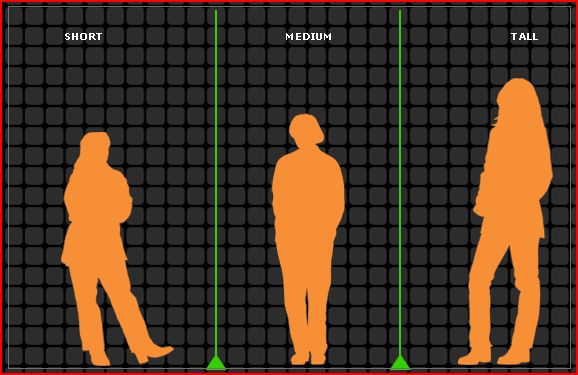
The images below are all screen shots from the fantastic American Anthropological Association website on race.  They are designed to show how we take what is in reality a nuanced spectrum of skin color and turn it into racial categories.  In this first image, they show how we could, conceivably, separate human beings into short, medium, and tall based on height:

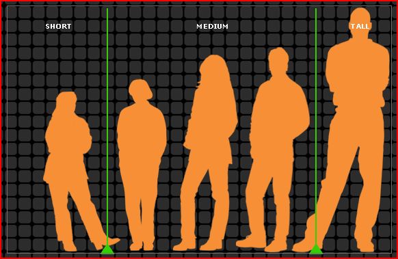
In this second image, they show how, by adding two additional figures, both taller than the tallest in the previous image, the way in which we designate people can easily change.

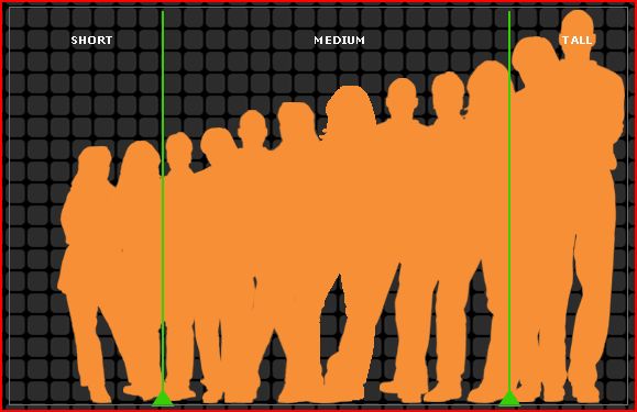
And this third image demonstrates how, when we actually consider all potential heights, where we draw the line between short and medium and medium and tall is arbitrary and, ultimately, not very useful.

Skin color is like height.  If we just look at three groups with very different skin colors, there appears to be a significant and categorical difference between those three groups of people.

But, if we consider a wide range of people, it becomes clear that skin color comes in a spectrum, not in categories (such as the five from which U.S. citizens are forced to choose on the census).

Much more on the social construction of race at our Pinterest board.

This post originally appeared in 2008.

Lisa Wade, PhD is an Associate Professor at Tulane University. She is the author of American Hookup, a book about college sexual culture; a textbook about gender; and a forthcoming introductory text: Terrible Magnificent Sociology. You can follow her on Twitter and Instagram.
Flashback Friday.

Non-white people are increasingly being featured in advertisements and a principled interest in “diversity” is not the only, or likely even the main motivation.

In this series, I share some ideas about why and how people of color are included in advertising aimed primarily at whites.  This post is about the inclusion of people of color in ads to invoke the idea of “color,” “flavor,” or “personality.”

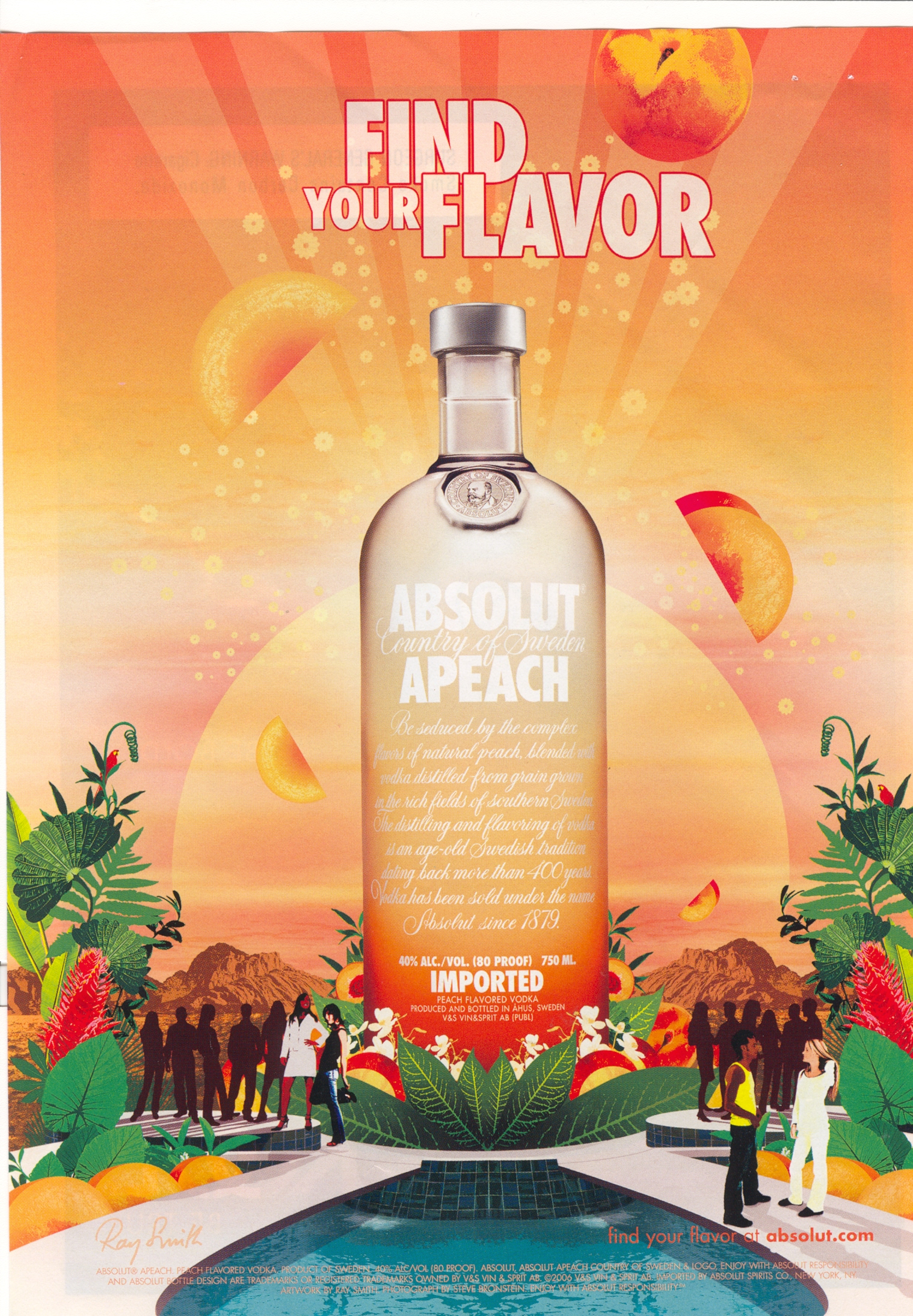
Consider, this ad for Absolute Vodka Peach (“Find Your Flavor”) includes two white and two brown people, plus a set of silhouettes.

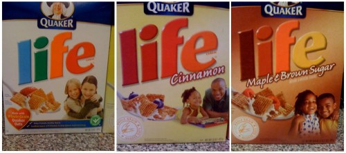
Holly F. and Lafin T.J. sent in three Life cereal box covers.  Notice that “regular” Life has white people on the cover, while cinnamon and maple and brown sugar flavors have people of color on their covers:

1

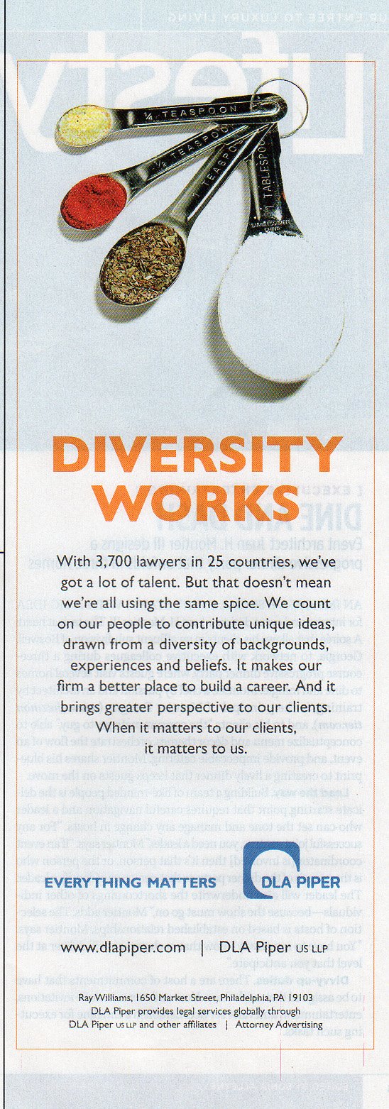
In this pro-diversity ad, spice is literally used to represent diversity (via MultiCultClassics).  (Just a bit misguided too: Just a teaspoon or less of color, please.)

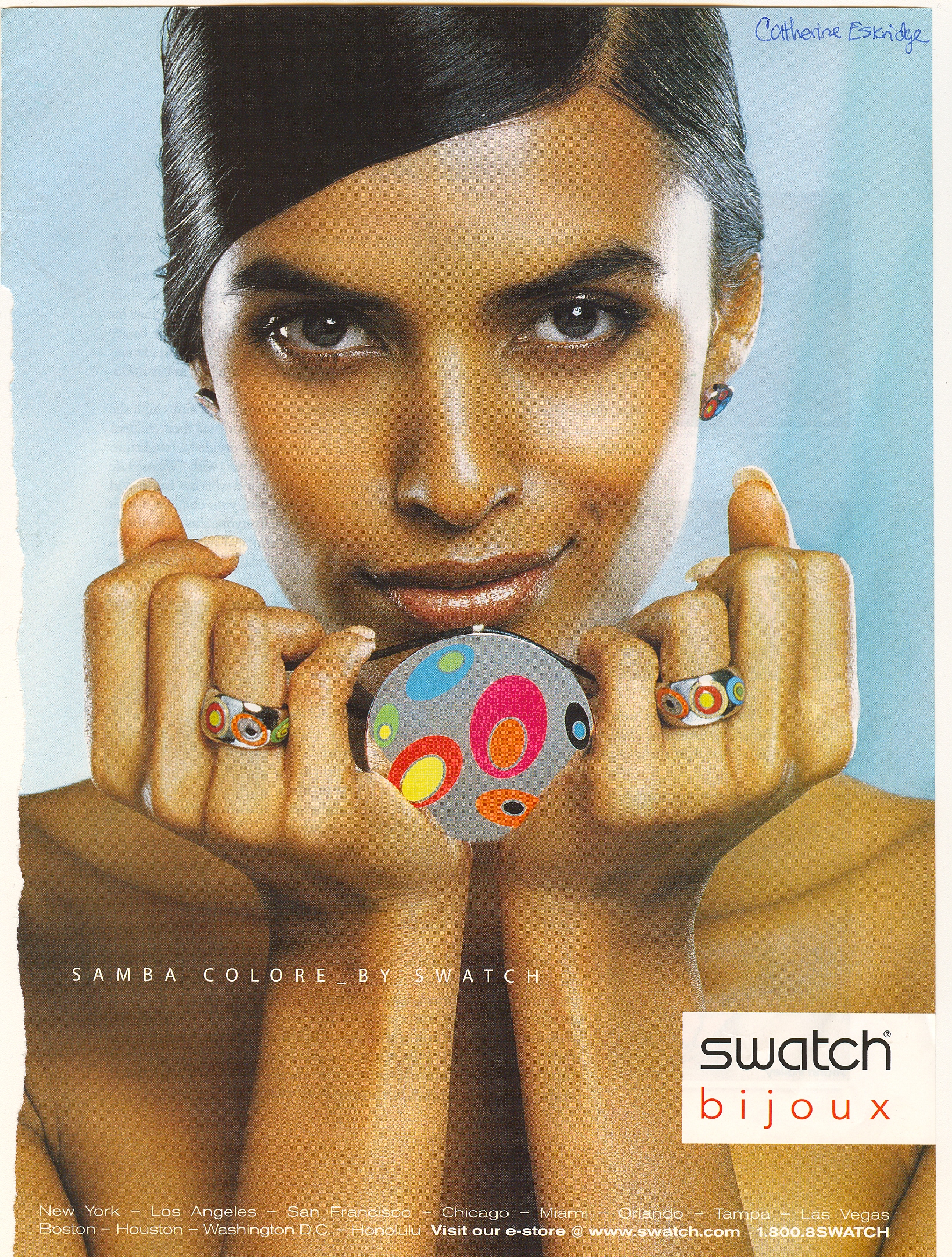
This ad for Samba Colore by Swatch also uses a model of color:

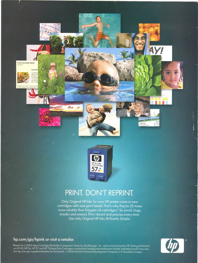
“Welcome to the Color Factory.”  These two ads for a color photo printer and a color printer cartridge both use models of color alongside white models in order to express how “colorful” their product is.

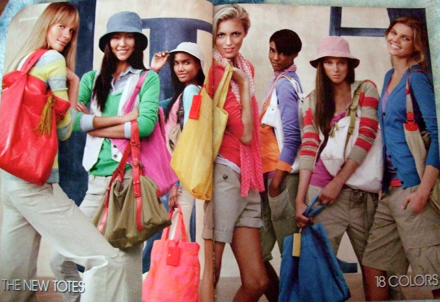
Bri sent in these four images (three from Gap and one from United Colors of Benneton).  Each Gap ad is advertising a different product, with an emphasis on how many colors they come in (bottom right corner).  They all, also, feature models of color.  Here’s just one of them:

gap03

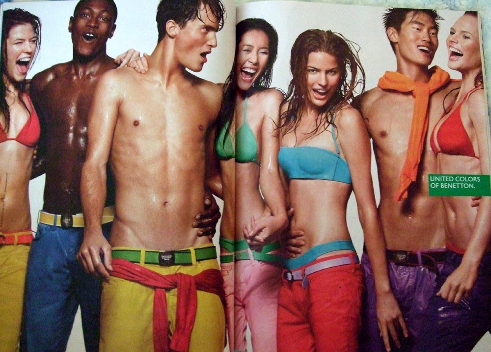
And, of course, the United Colors of Benneton is famous for its use of models of color in its ads, blending quite purposefully the idea of clothing colors and skin colors:

unitedcolors

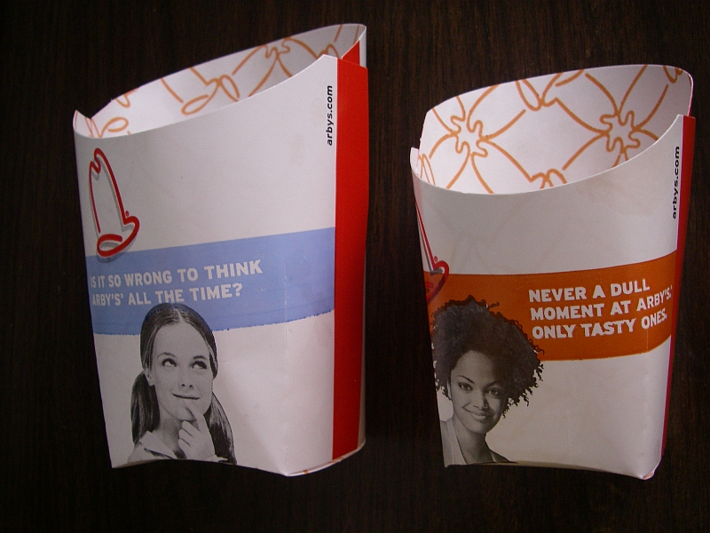
Finally Joshua B. sent in this photo of two french fry holders, one with a black and one with a white woman, reading “never a dull moment, only tasty,” and “Is it wrong to think Arby’s all the time.”  The black woman, then, is presented alongside the ideas of excitement and flavor:

Arbys

There is also this Crystal Light ad campaign that compares water to a “pale” white woman and crystal light to a “pumped” black woman and these ads for an Australian bread company that use Blackness to argue that their bread is not bland.

This kind of advertising can easily be explained away as coincidence, but I think it’s a pattern.  Feel free to send in examples and counter examples if you see them.

Next up: Including people of color so as to make the product seem “hip,” “cool,” or “modern.”  Don’t miss the first in the series: Including people of color so as to associate the product with the racial stereotype.

Lisa Wade, PhD is an Associate Professor at Tulane University. She is the author of American Hookup, a book about college sexual culture; a textbook about gender; and a forthcoming introductory text: Terrible Magnificent Sociology. You can follow her on Twitter and Instagram.
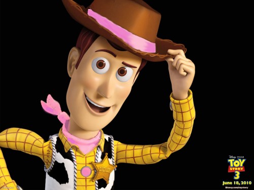
What would you think of Woody from Toy Story if he wore pink?

woody-pink-2

Would you think the color choice was incongruous — that it didn’t seem masculine enough for a 1950s-era cowboy toy?

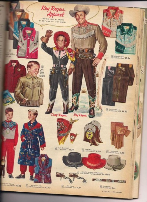
Well, you’d be wrong. Check out these images from the 1955 Sears Christmas Book catalog that Elizabeth Sweet, a newly minted Ph.D. from the University of California at Davis, sent me. Here’s Roy Rogers Apparel, featuring Roy Rogers and his son, Dusty – who is wearing a cowboy outfit with red, yellow, and pink accents:

2

To modern eyes, this is surprising. “Pink is a girls’ color,” we think. This association has become so firmly entrenched in our cultural imagination that people are flabbergasted to learn that until the 1950s, pink was often considered a strong color and, therefore, was associated with boys.

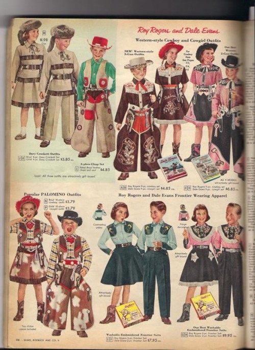
But it wasn’t only for boys. Although gender segregation is de rigeur today, it wasn’t back then. Look at these outfits for boys and girls, also from the 1955 Sears catalog: There are brown and red outfits for boys and girls. Pink and blue outfits for boys and girls. Blue and green outfits for boys and girls.

3

These spreads make it clear that in the 1950s, when Woody’s Roundup is supposed to have originated, Woody would have been pretty darned stylish in pink.

A decade later, things had started changing; pink was more closely associated with girls. (As Elizabeth notes of the Sears catalogs in her collection, “I didn’t find anything similar in 1965.”)

In today’s marketplace, I believe parents would love to see options like these. In fact, just yesterday, one of my friends posted this to facebook about his failed shopping trip:

Alright, parents, I went to buy my daughter cool costume stuff like pirate stuff and cowgirl stuff and all I found was princess outfits. She doesn’t know the word “princess.” She knows the words ‘cowgirl” and “pirate.” What’s the deal? Why does every company want her to be a princess? Why can’t she be an awesome cowgirl pirate?

Sadly, the reason is that in the retail world, this kind of diversity just doesn’t fly anymore. The status quo is segregation; as Elizabeth Sweet has argued, “finding a toy that is not marketed either explicitly or subtly (through use of color, for example) by gender has become incredibly difficult.” And the more entrenched this practice becomes, the harder it becomes to change, as change is perceived by marketers and retailers as a risk.

Therefore, for the foreseeable future, pink will serve as a clear delineation in the marketplace: If something is pink, it is most definitely not for boys, who regard it as a contagion — something to be avoided at all costs.

So it is that if Woody wore pink today, he would be unintelligible in the marketplace. And so it is that my friend can’t find a good cowgirl outfit for his little girl: he’d have to travel back to 1955 to do so.

The push for “girly” to be synonymous with “pink” saddens me. It has caused girls’ worlds to shrink, and it only reinforces for boys the idea that they should actively avoid anything girlish. Monochromatic girlhood drives a wedge between boys and girls — separating their spheres during a time when cross-sex play is healthy and desirable, and when their imaginations should run free.

Instead, we’re limiting our kids.

Rebecca Hains, PhD is a media studies professor at Salem State University.  Follow her on Facebook and Twitter.  Read the original post here. Cross-posted at Business Insider and The Christian Science Monitor.

This summer I went hiking several times in California’s Eastern Sierra. Each time I went I counted the number of male to female hikers and ended up with a 5:1 ratio. This reflects many women’s experience of the wilderness and outdoor sports such as rock climbing or mountaineering. These are male-dominated arenas.

One of the reasons for that is because these activities are advertised to women as an escape from their stressful lives, not as a sport meant to challenge their physical ability. Outdoors equipment marketed towards women, then, consistently focuses on comfort and style, in contrast to men’s marketing. Moreover, much of the gear that is produced for women assumes less of a desire to do activities that are as physically demanding as men — the gear is often less hardy and more decorative.  The assumptions behind these marketing strategies reinforce stereotypical ideas of gender: that women are physically weak, that women are fascinated by fashion, that there is one specific female body type, and that women are “soft.”

Exhibit #1: Women’s backpacks

Osprey is generally acknowledged as the maker of the best backpacks for hiking and backpacking. Their top-of-the-line backpack for long multi-day backpack trips for men, the Xenith, can hold 105 L and between 60-80 lbs. The women’s pack, the Xena, on the other hand, can hold 85 L and between 50-70 lbs. This is because the women’s pack is shorter. Osprey is betting that most women have a shorter torso and thus need a shorter pack. While this might be true for some women, they could attempt to engineer another type of pack that would allow women to carry the same poundage as men. Moreover, it is unclear why these packs are labeled “men’s and women’s.” Plenty of women have longer torsos and men shorter ones. And, indeed, on backpacking forums on the internet, you constantly see stories of people buying gear of the “wrong sex” so that it actually fits.

Exhibit #2: Choose your sex!

Many hikers and backpackers buy gear online and oftentimes the structure of the websites of the major companies who sell gear reveals the companies’ assumptions about the interests of their consumers. Some, such as Arc’teryx, open their websites with gender distinctions. One must choose men’s or women’s products immediately upon going to their site. Other companies, such as REI, open their site with the opportunity to choose an activity, such as hiking, climbing, cycling, running, etc. or sex category, which is better. By so dividing their products, Arc’teryx is making it harder for those who need to buy gear from the “wrong” sex or to market unisex gear while REI is making consumers feel part of a larger community of climbers or backpackers or hikers.

ArcteryxSite-Ex2

Exhibit #3: Playful gear

The marketing of backpacking gear is itself highly gendered, with women’s gear being presented as comfortable and stylish. Oddly, it is not marketed with an eye towards serious wilderness excursions. Take, for example, the Yumalina pant manufactured by Mountain Hardwear. The men’s version is described as “Durable softshell seriously protects on the outside, while lightweight fleece on the inside keeps you warm on those chilly hikes” while the women’s version is described as “Serious on the outside and soft on fuzzy on the inside. Perfect for work or play during the winter.” The women’s pant is thus not seen as for someone who is serious about backpacking.

Exhibit #4: Decorative, sexy climbing

The naming and color palette of much women’s gear also reflects the idea in the backpacking industry that women needed to be treated delicately. Black Diamond, which manufactures popular rock climbing harnesses, has named their women’s harnesses “Primrose,” “Siren,” “Aura,” and “Lotus,” emphasizing the stereotypical connection between women and flowers and sexuality. Women are connected to passive agents. The harnesses themselves are typically in pastel colors as well. This is in contrast to the men’s harnesses, which are named “Chaos,” “Focus,” “Flight,” and “Momentum,” which are strikingly active words in comparison and are designed in bright, bold colors.

Screenshot_10

As Brendan Leonard points out in his post, Girly Girls and Manly Men, “No company feels like they have to do anything special to men’s gear, or ‘masculinize it’ it. Yoga is arguably maybe the most feminine (or just female-dominated) of any active pursuit, but you don’t see any companies making yoga mats with patterns on them that look like cascades of hammers or football helmets or beer mugs, to encourage men by saying, ‘It’s OK, dude. You can own one of these and still love Home Depot.’” Why do companies thus feel that women cannot be serious backpackers, hikers or climbers without feminized gear?

Cross-posted at The Huffington Post.

Adrianne Wadewitz, PhD is a Mellon Digital Scholarship Postdoctoral Fellow at Occidental College specializing in emerging media from the 18th-century to the present. Peter James is an avid outdoor photographer and wilderness traveler.  You can follow them at @wadewitz and @PBJmaesPhoto.

I have enjoyed Star Wars Angry Birds since I first discovered it almost a year ago, at the suggestion of my brother (a fellow Star Wars fan). While I never warmed to the original Angry Birds, I was tickled that I could clearly identify the Star Wars characters the birds represented in the themed version of the game. When Star Wars Angry Birds II released last month, I anxiously dove into the sequel.  On a whim, I decided to use the new store feature to look through the many characters that I might someday unlock.

When I finally scrolled through all of the characters in the game, I noticed something peculiar.

Han Solo (played by Harrison Ford, a white male, in the Star Wars films) is portrayed by a yellow bird. Luke Skywalker (played by Mark Hamill, a white male) is portrayed by a red bird. Qui-Gon Jinn (played by Liam Neeson, a white male) is portrayed by a tan bird. These birds all have costumes or props that identify them as the characters they are meant to represent, but their color is not related to the skin color of the characters/actors in the films.

This pattern held true for every (human) male character with two notable exceptions: Captain Panaka (played by Hugh Quarshie, a black male) and Mace Windu (played by Samuel Jackson, a black male) are both portrayed by brown birds.

Complete-Angry-Birds-Star-Wars-2-All-Characters-Guide-Featured-Image-640x478

So, what’s the message? Well, for white, male Star Wars characters, skin color is unimportant; white characters can be represented by a bird of any color. It is the costuming or props used by these birds that convey the essence of the character. But for black Star Wars characters, their skin color (brown) becomes the defining element conveying the essence of the character.

Likewise, gender is also a defining characteristic for the portrayal of female characters. Princess Leia (played by Carrie Fisher, a white female) and Padme (played by Natalie Portman, a white female) are both portrayed by pink birds. There are no other pink birds in the game.   Again, the color of the bird is unimportant, unless the bird is female, in which case the character’s gender (denoted by its pinkness) becomes the essential element of that character.

This same pattern also appears in the original Star Wars Angry Birds, in which Princess Leia is the only pink bird and Lando Calrissian (played by Billy Dee Williams, a black male) is the only brown bird.

White privilege and male privilege persist, in part, by framing the white, male experience as normal. Even in a game like Star Wars Angry Birds II we see the invisibility of whiteness and maleness and the foregrounding of race and gender for people of color and women.

Galen Ciscell is a visiting assistant professor of sociology at Pacific Lutheran University.  He is also the designer of the cooperative board game Atlantis Rising.

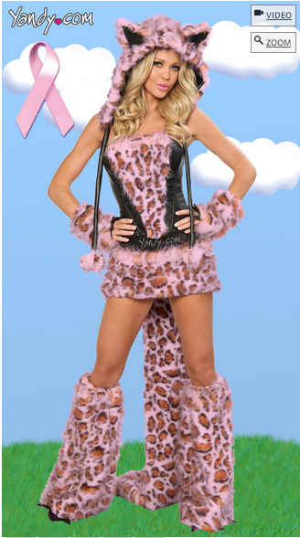
No costume could more perfectly capture this October at SocImages.  From The Ethical Adman’s collection of the worst sexy costumes of the year, this breast cancer-themed, absurdly sexy, looks-nothing-like-a-leopard costume.  Posts collide.

Breast Cancer Leopard Costume

When I clicked on the link, they tried to give me a free pair of panties.  Maybe you’ll get lucky.

Lisa Wade, PhD is an Associate Professor at Tulane University. She is the author of American Hookup, a book about college sexual culture; a textbook about gender; and a forthcoming introductory text: Terrible Magnificent Sociology. You can follow her on Twitter and Instagram.
This week I had the pleasure of being a part of Take Part Live’s discussion of “pinktober.”  Here’s a really interesting piece of research that I didn’t get a chance to talk about, sent in by Lindsey B.

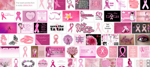
A paper in the Journal of Marketing Research suggesting that the current approach to raising awareness of breast cancer hurts more than helps.  You might have noticed, just maybe, I mean if you’ve been paying attention, that breast cancer awareness has become associated with the color pink.

Screenshot_1

Stefano Puntoni and his colleagues found that when women were exposed to gender cues, like the color pink, they were less likely than women who had not been primed with a gender cue to think that they might someday get breast cancer and to say that they’d be willing to donate to the cause.  Pink, in other words, decreased both their willingness to fund research and the seriousness with which women took the disease.

Puntoni explains this finding with a common psychological tendency. When people are faced with a personal threat, they tend to subconsciously go on the defensive.  In this case, when women are exposed to information about breast cancer at the same time that they are reminded that they, specifically, are vulnerable to it, they subconsciously try to push away the idea that they’re vulnerable and that breast cancer is something that they, or anyone, needs to worry about it.

Originally posted in 2010, with an extended version appearing at Ms.

Lisa Wade, PhD is an Associate Professor at Tulane University. She is the author of American Hookup, a book about college sexual culture; a textbook about gender; and a forthcoming introductory text: Terrible Magnificent Sociology. You can follow her on Twitter and Instagram.