SocImages has done deodorant a number of times. We’ve seen that Degree deodorant uses extreme gender stereotypes in their advertising (for their totally non-natural looking products). Analysis of deodorant advertising also reveals the compulsory nature of femininity and the beauty imperative for women.  Men don’t have to worry so much about their armpits because men’s and women’s armpits are completely different. Or rather, women’s armpits are different, and men’s armpits are just armpits.

Here’s another example of men-just-are / women-are-different, this time from Tom’s of Maine. Only, are these even different products?

True, the women’s deodorant mentions it’s “gentle on sensitive skin” (which is what you get when you shave your armpits, I guess). But that’s much less noticeable than the color difference. And, what’s the difference between “unscented” and “fragrance free”?

The label on the back of the human deodorant (left) says hops is not only “odor fighting” but also “helps inhibit the growth of odor causing bacteria.” The women’s product (right) has hops, too, but their’s apparently is only “odor fighting”:

As for the “chamomile and aloe” mentioned on the women’s, the ingredients labels show that they both have aloe as well as hops. But it is true that the women’s has chamomile while the human’s has cymbopogon flexuosus, or lemon grass, which actually is an antifungal agent.

Maybe it is reasonable to have these two products.  Maybe the average women beats up on her underarm skin so much that she needs something soothing in their deodorant, so the company that sells them a deodorant might not be the villain.  But, it doesn’t have to be all about gender (not all women shave, and some men do).  How about a totally gender-neutral ad that said, “if you’re a human being who has been shaving and/or waxing your armpits for years, and they get irritated by deodorants, this one is for you.”

When someone gave us this chunky dinosaur puzzle, I did a double-take. Yes, that’s a caveman there with the dinosaurs:

The blurb on the company’s website says that, along with the puzzle, “ The accompanying board book teaches young learners about dinosaurs.” Teaches, that is, with lessons like this:

A little harmless fun, or a little creationist indoctrination? (Do sociologists even believe in “harmless fun”?)

According to the Shure company, they deliver these “common threads” in all their products: “Originality and inventiveness; Excellence in design; Attention to detail; Exceptional quality; Educational merit.” So, not just entertainment.

A quick perusal suggests the rest of their products are not creationist — just the usual toy-gendering. They do have a Noah’s Ark puzzle, but it doesn’t claim to be educational. In that Shure is just keeping up Melissa & Doug (whose puzzle is at least Genesis-correct in not naming Noah’s wife):

And anyway, the story of Noah’s Ark is actually not a bad way to talk about reproduction.

But back to dinosaurs and people. Dinosaurs are not really more problematic for creationism than any other creatures that pre-date humans. But maybe because kids love dinosaurs so much, creationists spend inordinate energy trying to place them chronologically with people. Writes one such site:

The idea of millions of years of evolution is just the evolutionists’ story about the past. No scientist was there to see the dinosaurs live through this supposed dinosaur age. In fact, there is no proof whatsoever that the world and its fossil layers are millions of years old. No scientist observed dinosaurs die. Scientists only find the bones in the here and now, and because many of them are evolutionists, they try to fit the story of the dinosaurs into their view.

Up against this kind of propaganda, it is tempting to bring the hammer down on “harmless fun” featuring humans and dinosaurs playing together. That would mean no B.C. comic, no Flinstones, and no Barney either. That is basically the argument of James Wilson, a University of Sussex lecturer, who has a talk on the subject here on Youtube.

In any case, we may be so used to seeing toys or other products like this — with humans and dinosaurs side-by-side — that we forget to ask whether they’re teaching kids a lesson, one that is at odds with science.

————————

By the way, for non-biologists, like me, who like evolution and want some ammunition to defend it, I recommend Richard Dawkins’ recent book The Greatest Show on Earth. Some do find it a little dogmatic, and in the grand scheme I prefer Stephen Jay Gould, but it’s good for this purpose. Because rather than block access to dinosaur cartoons, I would rather arm myself – and the surrounding children – with the tools they need to handle them with confidence.

Philip N. Cohen is a professor of sociology at the University of Maryland, College Park, and writes the blog Family Inequality. You can follow him on Twitter or Facebook.

Cross-posted at Family Inequality.

I have criticized sloppy statistical work by some international feminist organizations, so I’m glad to have a chance to point out a useful new report and website.

The Progress of the World’s Women is from the United Nations Entity for Gender Equality and the Empowerment of Women. The full-blown site has an executive summary, a long report, and a statistics index page with a download of the complete spreadsheet. I selected a few of the interesting graphics.

Skewed sex ratios (which I’ve written about here and here) are in the news, with the publication of Unnatural Selection, by Mara Hvistendahl. The report shows some of the countries with the most skewed sex ratios, reflecting the practice of parents aborting female fetuses (Vietnam and Taiwan should  be in there, too). With the exception of Korea, they’ve all gotten more skewed since the 1990s, when ultrasounds became more widely available, allowing parents to find out the sex of the fetus early in the pregnancy.

The most egregious inequality between women of the world is probably in maternal mortality. This chart shows, for example, that the chance of a woman dying during pregnancy or birth is about 100- 39-times higher in Africa than Europe. The chart also shows how many of those deaths are from unsafe abortions.

Finally, I made this one myself, showing women as a percentage of parliament in most of the world’s rich countries (the spreadsheet has the whole list). The USA, with 90 women out of 535 members of Congress, comes in at 17%.

The report focuses on law and justice issues, including rape and violence against women, as well as reparations, property rights, and judicial reform. They boil down their conclusions to: “Ten proven approaches to make justice systems work for women“:

1. Support women’s legal organizations

2. Support one-stop shops and specialized services to reduce attrition in the justice chain [that refers to rape cases, for example, not making their way from charge to conviction -pnc]

3. Implement gender-sensitive law reform

4. Use quotas to boost the number of women legislators

5. Put women on the front line of law enforcement

6. Train judges and monitor decisions

7. Increase women’s access to courts and truth commissions in conflict and post-conflict contexts.

8. Implement gender-responsive reparations programmes

9. Invest in women’s access to justice

10. Put gender equality at the heart of the Millennium Development Goals

Cross-posted at Family Inequality.

It’s been a big week for stories of families denied and disrupted by the state.  Family denial came up in the form of bodily intervention (as in North Carolina’s eugenics program), border control (as when Jose Antonio Vargas‘s mother put him on a one-way plane for the U.S.), parents’ incarceration, or legal denial of family rights (the refusal to recognize gay marriage, or what I suggest we call homogamous marriage).

(1)  North Carolina’s eugenics program was the subject of hearings this week, dragging on with no compensation for the 7,600 people who were involuntarily sterilized between 1929 and 1977. A collection of literature at the State Library of North Carolina includes this 1950 propaganda pamphlet:

(2) Jose Antonio Vargas, a Pulitzer Prize-winning journalist, recounted his life as an undocumented immigrant. His mother put him on a plane for the U.S. with false papers, maybe never to see him again.

(3) While a judge declared the federal law against recognizing gay marriage unconstitutional, the New York legislature maybe moved toward legal recognition, and President Obama’s support of gay marriage apparently stalled.

(4) The 40th anniversary of the drug war was a bleak reminder of the millions of U.S. families separated by incarceration during that time.

The text says, “more women and mothers are behind bars than at any time in U.S. history,” from (www.usprisonculture.com).

(My graph from data in an article by Wildeman and Western in The Future of Children)

Philip N. Cohen is a professor of sociology at the University of Maryland, College Park, and writes the blog Family Inequality. You can follow him on Twitter or Facebook.

Cross-posted at Family Inequality.

A blue-collar worker gets laid off. Maybe he or she reads an article in the Boston Globe with an image of a wind farm, like this. So he or she types “wind energy jobs” into Google, and ends up at one of many websites promoting wind energy jobs, with an upbeat graph like this:

Was this a common pattern during the recession, during which Obama has promoted the idea of moving workers into the wind energy sector? Honestly, I never would have thought of that question if not for the results of today’s poking around.

Action in context

New kinds of data have the potential to open up vast new territory in the study of patterned individual behavior. Finding and understanding aggregate patterns in micro-level behavior is more feasible than before. My prior poking around has included tracking the relentless decline of the name Mary given to children born in the U.S., the search patterns associated with having a baby across millions of Google users leading up to the recession, or patterns of divorces across states according to their unemployment levels.

In each of these situations, individual behavior assumes a social form that emerges when the data are aggregated and analyzed in relation to other patterns or time periods. And in each case it appears that separate individuals are responding similarly to larger forces — allowing us to understand those forces in new ways.

In today’s exercise I plugged the weekly number of initial claims for unemployment into the Google Correlate tool, and asked it for the 100 search term trends that were most closely correlated with the unemployment trend since 2007.* On the list were “wind energy jobs” and “green jobs.” Beyond those, it was pretty easy to group the 100 search terms into categories: 38 of them were searches for songs and lyrics (especially MGMT lyrics), 17 were Internet/technology related (such as “roadrunner webmail login”). I have no explanation for those.

But the last large group was clearly recession-related: those about loan modifications (such as “loan modification,” “loan mod,” or “mortgage hardship.”) All of these were very highly correlated with the initial unemployment claims trend (.93 or higher on a scale of -1.0 to 1.0). Here they are, plotted by week since the start of 2007.

The Google search volumes are relative (on the right axis), so we don’t know how many people were doing these searches, only that they were doing it in the same weeks that unemployment claims occurred.

A final, small group of terms were related to porn. Maybe there are just so many porn search terms that something is correlated with any trend. But the search terms “snake tube,” “uncoached” and “coomclips” track initial unemployment claims very well, with correlations over .94. Here they are together:

Maybe some brave Sociological Images reader will explain why these particular terms might follow the unemployment trend. (It could just be that they were new sites that became popular and then tapered off in 2008-2009.)

What’s the point?

It’s not news to people interested in sociology that individual, intimate behavior follows common patterns, which are related to cultural forces. What’s interesting to me here is that capacity to find patterns we couldn’t before. For example, does losing a job lead to more porn consumption? Are those porn searchers different from the people typing in “green jobs”? I’m hoping that other people will dig further and turn these tools to productive uses.

——————————

* To avoid big seasonal spikes unrelated to unemployment, I used the seasonally-adjusted unemployment claims, which basically tamp down the big jump in layoffs after Christmas and when school gets out each summer.

Philip N. Cohen is a professor of sociology at the University of Maryland, College Park, and writes the blog Family Inequality. You can follow him on Twitter or Facebook.

Cross-posted at Family Inequality.

Sociologist, segregate thyself? A little inside-sociology post.

A report from the research folks at the American Sociological Association (ASA) got me thinking about gender-segregated sociology. I added a few numbers from other sources to provide a quick look at three moments of gender segregation within the discipline.

People may (or may not) want to be sociologists, they may or may not be accepted to graduate schools, thrive there (with good mentoring or bad), freely choose specializations, complete PhDs, publish, get jobs, and so on.  As in most workplaces, gender segregation represents the cumulative intentions and actions of people in different institutional settings and social locations.

#1: Phds

Since the mid-1990s, according to data from the National Science Foundation, women have outnumbered men as new sociology PhDs, and a few years ago we approached two-thirds female. In the three years to 2009, however, the number of PhDs has dropped by a third, and women have accounted for two-thirds of that drop. I have no idea what’s going on with that.

For the time being, then, we’re close to 50/50 in gender balance for producing PhDs. But academic careers can be long, so all those years in the 1970s and 1980s when men outnumbered women by so much still affect  today’s discipline. Among members of the ASA today, women are 7 years younger than men, on average. Which means the men are in higher positions, on average, as well.

#2: Specialization

Choosing what area of sociology to study is a combination of personal interest and ambition, institutional setting and mentoring, and happenstance of various kinds. (This is separate from the question of how narrowly to specialize in one’s specialization, which has a big impact on the quantity of publication, since switching topics is risky and costs valuable time.) So it wouldn’t be accurate to describe this as simply a free choice. But, once someone is a member of the ASA, which is open to anyone, then the choice of identifying with a certain area of research is free (or, actually, costs a few dollars a year), through joining sections of the association.

The pattern of section belonging shows a striking level of gender segregation. On a scale of 1 to 100, I calculate the sections are segregated at a level of .28. (That is the same level of segregation I calculated in the gender distribution between major fields for PhDs, such as engineering and social sciences.) Put another way, the correlation between the percentage of women and percentage of men across the sections is a strong -.64. And by both measures the segregation has increased since 2005.

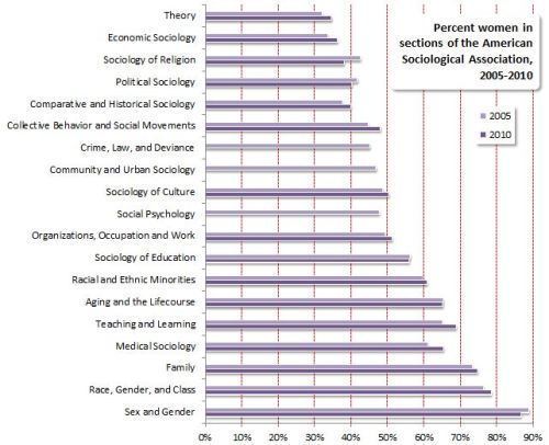
Joining a section means voting to increase the number of presentations in that area at the national conference, getting a newsletter, maybe an email list, being invited to a reception, and having the chance to serve on committees and run for office arranging all those things. At its best it’s a community of scholars interested in similar subjects. Anyway, the point is it’s not a restrictive club or job competition.

#3: Editorial boards

Finally, prestigious academic journals have one or more editors, often some associate editors, and then an editorial board. In sociology, this is mostly the people who are called upon to review articles more often. Because journal publication is a key hurdle for jobs and promotions, these sociologists serve as gatekeepers for the discipline. In return they get some prestige, the occasional reception, and they might be on the way to being an editor themselves someday. I didn’t do a systematic review here, but I looked at the two leading research journals — American Sociological Review and American Journal of Sociology, as well as two prestigious specialized journals — Sociological Methods and Research, and Gender and Society (which is run by its own association, Sociologists for Women in Society, whose membership includes both women and men).

(I included the editors, book review editor, consulting or associate editors, and editorial board members, but not managing editors. The number included ranged from 33 to 73.)

I’m not attributing motives, describing gender discrimination, or even making a judgment on all this. There are complicated reasons for each of these outcomes, and without more research I couldn’t say nature/nurture, structure/agency, system/lifeworld, etc.

But gender segregation never happens for no reason.

Update: Kim Weeden pointed me toward the complete list of section memberships by gender for 2010. So here is a a graph of the gender compositions expanded to include all 49 sections. Also, with that expanded data, I recalculated the segregation level, and it’s .25.

Cross-posted at Family Inequality.

I haven’t yet seen any definitive evidence that the recession has had an effect on divorce rates. But if I’m going to pick on other people for this, I should offer a few ideas.

In a previous post I cited a lot of reasons to expect divorce would increase as a result of family stress and instability. Others claim these hard times are bringing couples together in the face of adversity. And either – or both – of these influences is woven into the long term trends in divorce. Here are three graphs looking at the question.

Long-term trends

The overall divorce trend doesn’t seem to be moved much one way or the other by recessions (shown in blue), at least for the last 60 years:

That national data is only available through 2009, so a little early to see a major effect. Still, no disruption of the trend at the national level, just a continuous decline in the divorce rate. (Here’s a great recent Census report on divorce trends.)

State patterns

The official divorce rates are available from 38 states, but they’re only considered reliable through 2008 so far. By putting together two years of changes — 2006-2007 and 2007-2008 — this figure has 76 dots (two for each state), showing whether changes in divorce are related to changes in unemployment rates. This gives a rough idea of the relationship between how hard states were hit by the recession and any changes in divorce:

I made the dots larger according to the population sizes, and weighted the red trend line so that the larger states have more effect (this positive relationship is statistically significant at the 99% confidence level). This is just a start, but it leans in the direction of unemployment increasing divorces. At least it doesn’t look like the recession is driving divorce down.

Google

Finally, what about divorce on the American brain? For a glimpse inside, we turn to Google trends. If it works for the flu, it might work for divorce, too. Here are the trends for “divorce attorney” and “divorce lawyer”:

The trend for both searches looks basically flat except for seasonal variation, and some turbulence in 2008. But nothing to suggest a major trend one way or the other. (You can play with these yourself, starting with mine, here.)

My conclusion so far: no national evidence of a recession effect on divorce yet, but some suggestive hints worth keeping an eye on — leaning in the direction of recession causing more divorces — in opposition to a long-term downward trend. Maybe if and when the housing market loosens up more unhappy spouses will take the plunge and move out. The divorce rate may continue to fall, as it has been since the early 1980s, but that doesn’t mean this recession has a “silver lining” for families.

Cross-posted at Ms. and Family Inequality.

In the early 1990s, Arline Geronimus proposed a simple yet profound explanation for why Black women on average were having children at younger ages than White women, which she called the “weathering hypothesis.”

It goes like this: Racial inequality takes a cumulative toll on Black women, increasing the chance they will have health problems at younger ages. So, early childbearing might pose health risks for White women, but for Black women it makes more sense to start earlier — before their health declines. Although it’s hard to measure the motivations of people having children, her suggestion was that early childbearing reflected a combination of cumulative cultural wisdom and individual adaptation (for example, reacting to the health problems experienced by their 40-something mothers).

She showed the pattern nicely with data from Michigan in 1989, in which the percentage of first births that were “very low birthweight,” increased with the age of Black women, but decreased for White women, through their twenties:

Source: My graph from Geronimus (1996).

If the hypothesis is correct, she reasoned, the pattern would be stronger among poor women, who experience more health problems, which is also what she found.

The most recent national data, for 2007, continue to show Black women have their first children, on average, younger than White women: age 22.7 versus 26.0. And the infant mortality rates, by mothers’ age, also show the lowest risk for White women at older ages than for Black women:

Source: My graph from CDC data.

Note that, for White women, mothers have children in the early thirties face less than half the infant-mortality risk of those having children as teenagers. For Black women, waiting till their lowest-risk age — the late 20s — yields only a 14% reduction in infant mortality risk. So it looks like waiting is much more important for White women, at least as far as health conditions are concerned.

The implications are profound. If you base your perceptions on the White pattern, it makes sense to discourage early childbearing for health reasons. But if you look at the Black pattern, it becomes more important to try to improve health problems at early ages — and all the things that contribute to them — rather than (or in addition to) trying to delay first births.

—————————-

Cohen’s previous posts featured on SocImages include ones on the recession and divorce datathe relationship between cell phone use and driving deathsmeasuring the number of welfare recipients, delusions of gender dimorphism, and the gender binary in children’s books.