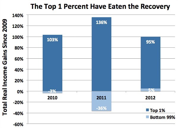
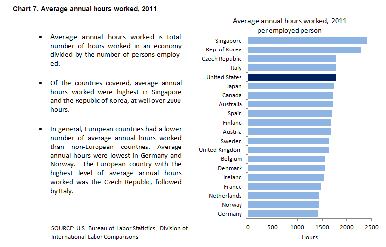
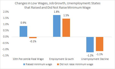
One of the arguments against an increase in the minimum wage is that it will lead to higher unemployment. One can make theoretical arguments for and against this proposition. And, of course, the income gains from an increase in the minimum wage are likely to produce overall benefits for both low wage workers and the economy as a whole even if there is a rise in unemployment.
Economists have tried to estimate the employment effects of a rise in the minimum wage. As a Vox article describes, two of them, Hristos Doucouliagos and T.D Stanley, looked at almost 1,500 estimates of the effects of minimum wage increases on employment and found that the estimates “clustered right around zero effect, but with more of those estimates showing a slight downward pressure on employment.”
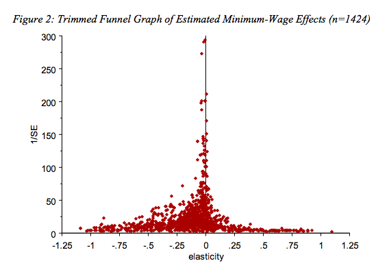
They concluded, “with sixty-four studies containing approximately fifteen hundred estimates, we have reason to believe that if there is some adverse employment effect from minimum wage rises, it must be of a small and policy-irrelevant magnitude.”
Originally posted at Reports from the Economic Front.
Martin Hart-Landsberg is a professor of economics at Lewis and Clark College. You can follow him at Reports from the Economic Front.