Wheelchair use equated with terminal misery (click to enlarge):
Wheelchair use will keep you from EVER having fun. So implies this ad for Goodyear Tires from the August 2, 1937 issue of Life. Everyone looks depressed about the fact that the boy’s in a wheelchair, from the boy himself to his sister and even the dog. I’d be kind of depressed too if I were teetering on the edge of a porch [notice that Sis has one leg up on a step] without a guard rail. This image could be used in a discussion of how perceptions of persons with disabilities have changed over the years…and also how they have stayed the same [witness the stubborn popularity of “wheelchair-bound” as a descriptor for wheelchair users].
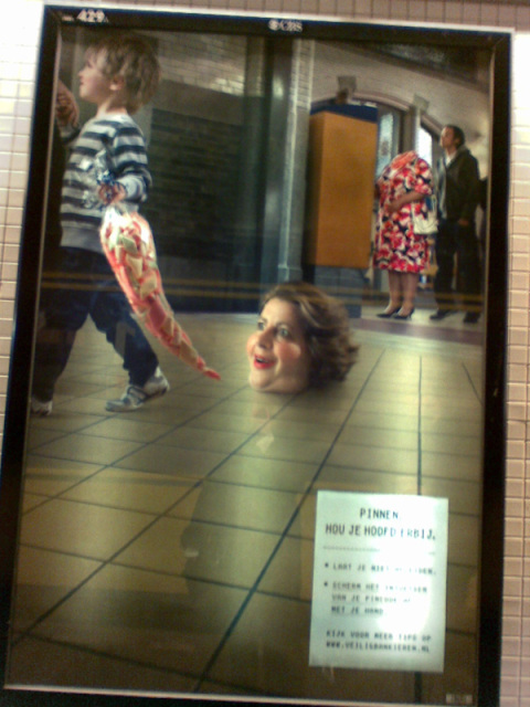
Over at Kate Harding’s site, user Daminique writes about an ad she saw in a Dutch train station:
The idea behind this ad: the fat lady gets distracted by a bag of candy, ‘loses her head’, and people could see her PIN number because she wasn’t paying attention.
I could get really analytical here, but I run the risk of vitriolic sarcasm. I’ll just say that this ad is a great illustration of the societal connection between “health” and moral goodness, not to mention a cheap-shot joke at the expense of fat people.
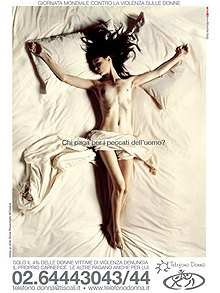
Telefono Donna, a rape crisis hotline in Italy, designed a poster to raise awareness of rape in honor of November 25, the International Day to for the Elimination of Violence Against Women. Some conservative politicians in Milan object to the Christ-like pose taken by the bare-breasted model in the poster. From the UK Telegraph:
“We’re calling for the poster to be withdrawn because an important day like this should not be debased by such a sexual provocation,” said councillor Carlo Fidanza, a member of the right-wing National Alliance party.
But the president of the Telefono Donna rape helpline, Stefania Bartochetti, said she was surprised by the controversy because the poster had raised no objections in other Italian cities.
“As a Catholic I can’t see anything offensive or blasphemous. We chose a strong image to encourage more rape victims to break their silence,” she said.
The poster poses the question: ‘Who Pays For Man’s Sins?’ and a caption which reads “Only four per cent of women who suffer sexual violence report their assailants.”
Left-leaning politicians said their opponents’ concerns were out of step with contemporary Italian society.
“If you applied these standards to Italian television, you’d have to get rid of 70 per cent of what the main channels broadcast,” said Pierfrancesco Majorino, of the Democratic Party.
Small reproduction of the poster, showing bare-breasted woman [NSFW], below the cut.
Beyond the question of whether such a campaign is blasphemous, I think it’s useful to ask if the imagery of objectification is appropriate to use to raise awareness of a crime that, in part, depends on the dehumanization and objectification of those who are raped.
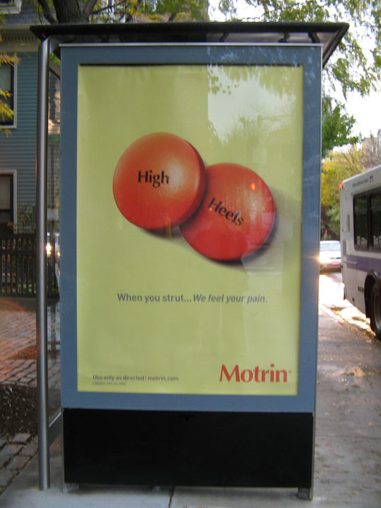
Motrin shows ads on the sides of bus shelters in the Boston metro area. Here’s one, which says, “High heels…when you strut, we feel your pain.”
Another ad in the series says, “30-pound stroller…when you lift, we feel your pain.” I can only find these 2 examples so far, and it seems they are both gendered feminine, associated with a shoe style worn almost exclusively by women and with an activity [stroller use = child care] connoted as feminine.
One of the preview ads for the Blackberry Storm is shot from the point of view of a guy approaching a Blackberry on a table. We hear his internal monologue, then see his hand reach for the Blackberry. As music wells up and the scene disappears, we’re supposed to assume that he’s been impressed or sucked into an alternate reality or something.
The framing of the ad puts the viewers in the man’s place. assuming that the viewers are heteronormative white bourgeois men and, if they aren’t, imposing this status upon them. It’s a nice example of how modern US middle-class society continues to assume that hetero white men are the default type of people.
The long-running Mastercard “Priceless” campaign follows the trope of putting prices on gifts, all of which are building up to an emotional state. The emotional state, which is assumed to be the culmination of one’s purchases, is labeled as “priceless,” but it’s pretty clear that the commercial equates the consumption of material goods with the emotional state. Therefore, the emotional state does indeed have a specific price tag.
The latest iteration of the “Priceless” series makes explicit the equation of intangible emotional expressions [of happiness] and material goods by showing a woman purchasing smiles, laughter, hugs and other expressions of satisfaction. The intangibles are made material and even buyable! Hmmm…What did that Beatles tune say…”Can’t Buy Me Love”?
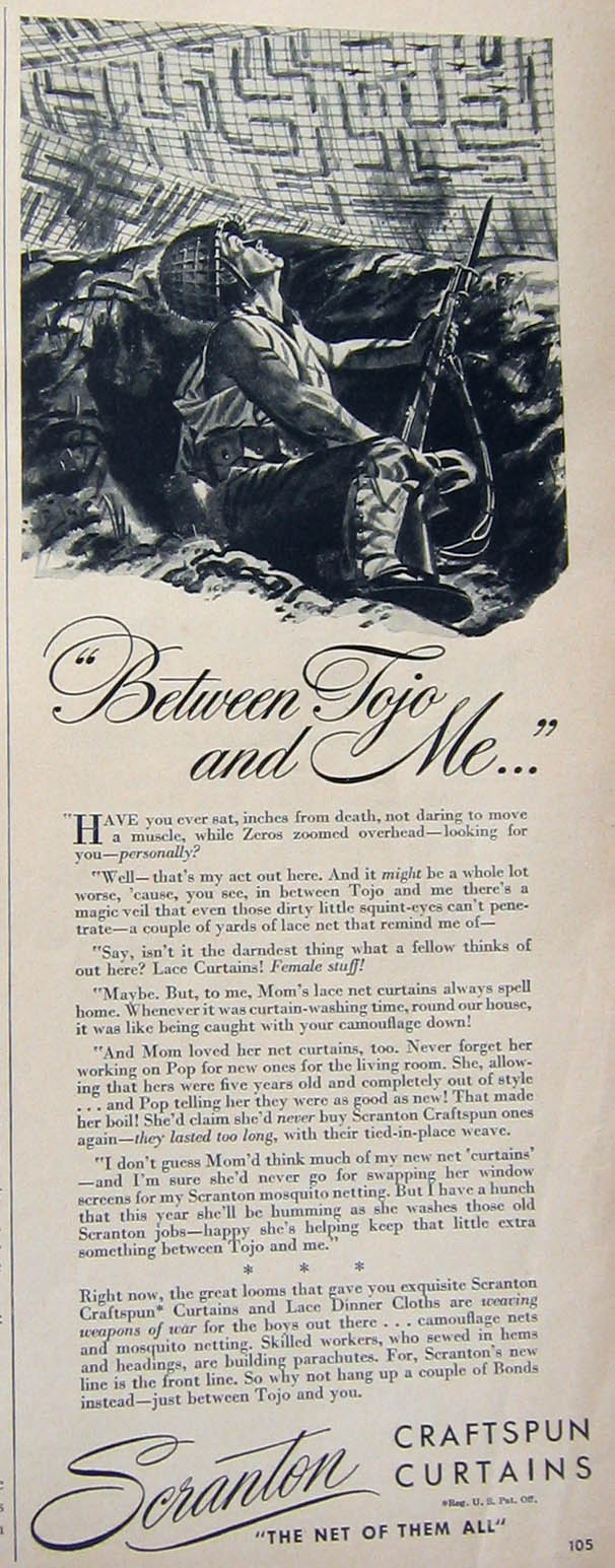
During WWII, many companies stopped producing the civilian goods that they were best known for. Instead, these companies contributed to the war effort by making products necessary for American soldiers. Scranton Craftspun Curtains, for example, switched from making lace curtains to camouflage covers, mosquito nets and parachutes. By touting their wartime conversions, companies kept their brands in the public’s mind, while achieving patriotic cachet.
Here’s a WWII-era ad for Scranton Craftspun Curtains. Click on the thumbnail to see it larger and read the narrative.
Scranton Craftspun curtains. Ad from Better Homes and Gardens, October, 1943.
The copy is written from the point of view of a trench soldier somewhere in Japan:
“Have you ever sat, inches from death, not daring to move a muscle, while Zeros zoomed overhead — looking for you — personally?
“Well — that’s my act out here. And it might be a whole lot worse, ’cause, you see, in between Tojo and me there’s a magic veil that even those dirty little squint-eyes can’t penetrate — a couple of yards of lace net that remind me of —
“Say, isn’t it the darndest thing what a fellow thinks of out here? Lace Curtains! Female stuff!
“Maybe. But, to me, Mom’s lace net curtains always spell home. Whenever it was curtain-washing time, round our house, it was like being caught with your camouflage down!
“And Mom loved her net curtains, too. Never forget her working on Pop for new ones for the living room. She, allowing that hers were five years old and completely out of style … and Pop telling her they were as good as new! That made her boil! She’d claim she’d never buy Scranton Craftspun ones again — they lasted too long, with their tied-in-place weave.
“I don’t guess Mom’s think much of my new net ‘curtains’ — and I’m sure she’d never go for swapping her window screens for my Scranton mosquito netting. But I have a hunch that this year she’ll be humming as she washes those old Scranton jobs — happy she’s helping keep that little extra something between Tojo and me.”
* * *
Right now, the great looms that gave you exquisite Scranton Craftspun* Curtains and Lace Dinner Cloths are weaving weapons of war for the boys out there … camouflage nets and mosquito netting. Skilled workers, who sewed in hems and headings, are building parachutes. For, Scranton’s new line is the front line. So why not hang up a couple of Bonds instead — just between Tojo and you.
You could spend a few hours talking about all the subjects and rhetorical devices brought up by this ad. The phenomenon of advertising without a product to sell is interesting, but you could go beyond that. You could talk about the gendering of war vs. housework, the racist characterization of the Japanese, the appeals to patriotism, the construction of a personalized, in-your-face theater of battle where homefront=front line, etc.
A recent installment in the Sexist Body Wash Ad category [see any Axe ad for others], Old Spice’s Double Impact body wash uses a centaur [man/horse hybrid] to suggest that the hybrid product will boost users’ sexual potency. The centaur calls himself “two things at once.” The first time, he says he’s “a man AND a smart shopper.” The second time, he says that he’s “a man AND a provider.” The viewer thus easily links the “man” with the human part of the centaur and the “smart shopper,” along with the “provider,” with the equine part by process of elimination. Drawing in the idea of a particularly potent man being “hung like a horse,” the ad implies that users of Old Spice body wash are not only “smart shoppers” and good “providers,” but also that they are heterosexual [notice the woman as prop, signifying the centaur’s heteronormative orientation] dynamos in the sack [stall?] with really big penises! The message, however, is complicated by the fact that the centaur is apparently composited from a male model and a female horse, who is obviously not hung. Hooray for polysemy!
For further interesting hybrids, you can see video at the product’s Web site shows the same male model combined with different animals, including a slug, an octopus and a snake, as well as non-animal things, such as a tree, a cannon and a fish stick [?]. I’m not sure what to think about them….
About Sociological Images
Sociological Images encourages people to exercise and develop their sociological imaginations with discussions of compelling visuals that span the breadth of sociological inquiry. Read more…