
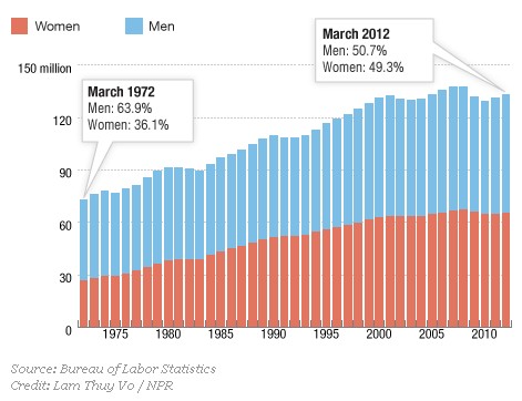
NPR’s Planet Money asks an interesting question. If there are more women in the workforce now than there were forty years ago (and there are), where did all the additional jobs come from?
The pie charts below tell some of the story. On the left are charts representing the percentage of women in various occupations in 1972. The size of the circle corresponds to the size of the sector: larger is equivalent to more total jobs; on the right are the same charts for 2012.
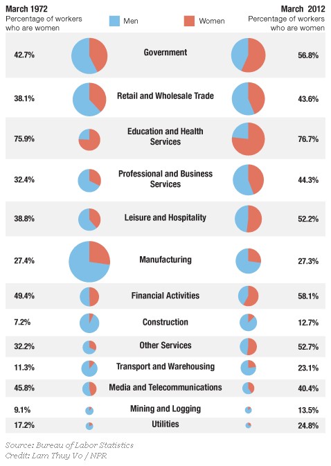
Notice two trends: first, in almost all categories today women are a larger percentage of the workers than they were in 1972 and, second, many of the occupational sectors that have high percentages of women have grown (e.g., education and health), whereas many in which men dominate have shrunk (e.g., manufacturing, media/telecommunications).
So, as women have joined the workforce, they’ve contributed to the overall growth of the American workforce and, specifically, filled the demand for employees in growing occupations.
Comments 23
gasstationwithoutpumps — June 2, 2012
Why are education and health lumped together? What do they have in common (other than the high fraction of female workers)?
Guest — June 2, 2012
If more women would choose to raise children full-time rather than working outside the home full-time would it be better for our economy? Would this free up jobs for the unemployed men out there? Or are these men unemployable in today's job market?
decius — June 2, 2012
Since when is 'government' an occupation?
Yrrosimayrin — June 3, 2012
Is there anyone who has done the analysis on what effect this has had on salaries? Increasing your number of people looking for jobs should generally have the effect of lowering salaries in general. And if we are in general going from single income families to dual income I would expect an effect on the price of shared consumer goods as well (housing and transportation especially).
The Changes of Size and Gender of Occupations Over Time « Welcome to the Doctor's Office — June 4, 2012
[...] from SocImages [...]