
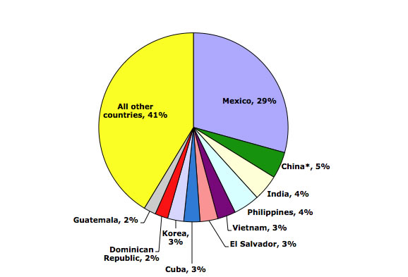
Dolores R. let us know that the Migration Policy Institute has a bunch of updated data and charts/graphs illustrating immigration trends in the U.S. through 2010 (via the KPCC website). So, in 2010, where did immigrants to the U.S. come from? As you may expect, the single largest source of immigrants was Mexico:
Looking at the region of birth of immigrants in the U.S. (in millions) over time reveals clear patterns:
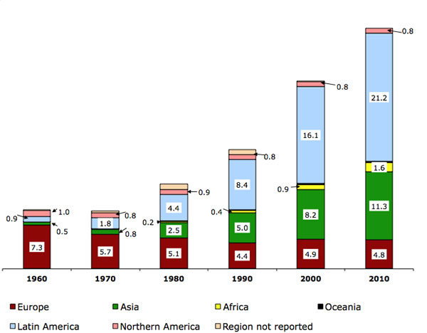
Notice the shift over time, with fewer immigrants coming from Europe (red) but a major increase in the number of immigrants from Asian and Latin America (green and light blue), noticeable already by 1980. This reflects changes to U.S. immigration policy in 1965 that got rid of the old quota system that openly favored northern and western Europeans. The result was a major change in the demographics of U.S. immigrants.
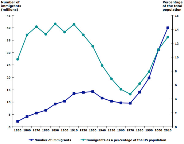
As of 2010, immigrants made up about 13% of the total U.S. population — the highest level in decades, but still not at the all-time high levels seen at several points in the late 1800s/early 1900s:
Lots more data at the MPI website, including a map where you can get very detailed information about the foreign-born population for each state. You might also want to check out our posts on U.S. immigration and geographic names, an interactive map of immigrant settlement patterns, English acquisition among U.S. immigrants, and a map of concentrations of speakers of various languages in the U.S.
Comments 7
Anonymous — January 3, 2012
What does "Northern America" refer to? Canada?
Ricky — January 3, 2012
Wow, thank God for Mexico. If it wasn't for Mexican immigrants we would be in the same downward spiral as Europe and Japan, but damn, is there anyone left in Mexico now? I mean other than the drug cartels?
Madeleine — January 3, 2012
If you want another interesting demographic story regarding immigration, look at Mexico's fertility rate. It was 6.7 children per woman in 1970, 3.4 children per woman in 1990, and 2.3 children per woman in 2009. http://www.unicef.org/infobycountry/mexico_statistics.html
Mexico is not unique in this respect, almost all countries outside of Subsaharan Africa are at less than 3 children per woman now (including India at 2.7 and China at 1.8). Brazil (1.8) has less than the United States (2.1)!
The common stereotype of large families in the developing world is seriously out of date -- and I believe that stereotype has played no small part in a perception of "huddled masses" clamoring for a life within the United States. A sharp reduction in the number of immigrants wanting to move to the United States looks like a demographic inevitability. As Ricky points out, losing that is going to be a problem.
Why the Death Penalty is Slowly Dying; U.S. Immigration Data; Putting Workers First; And More Stories « Welcome to the Doctor's Office — January 4, 2012
[...] 2010 U.S. IMMIGRATION DATA by Gwen Sharp, [...]
The graph was not uploading anyway aside from posting the URL. | voilentparty — February 6, 2014
[…] The graph was not uploading anyway aside from posting the URL. […]
» 全く知らない人の健康を心配すべきか?保険制度の二面性 — September 20, 2015
[…] Source: 2010 U.S. IMMIGRATION DATA […]
全く知らない人の健康を心配すべきか?保険制度の二面性 | 共創研究所くも — September 21, 2015
[…] Source: 2010 U.S. IMMIGRATION DATA […]