
Dmitriy T.M. send in a map from National Geographic that shows the wide disparities in national per capita income levels, as well as population density. Different colors represent different income groups, while shades within each color represent population density (darker = lower density):
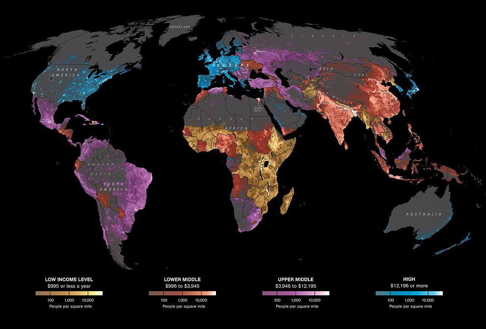
The map claims to be interactive, though I haven’t figured out any interactive features. They do provide a lot of data on various economic and social indicators for each income group. Of course, this type of representation hides the often wide disparities in income within countries. But it’s a striking general overview of global economic development.
Comments 6
guest — July 16, 2011
One obvious mistake on this map: Taiwan's color is wrong. It should be blue, similar to South Korea and Japan.
Bree — July 16, 2011
*Foams at mouth* Africa is not homogenous! FINALLY.
Guest — July 17, 2011
the interactivity comes from the top right hand corner, there are another 3 pages with more info