
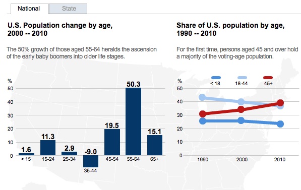
Dmitriy T.M. sent us a link to some images at the Brookings Institution, based on analysis by William Frey, illustrating the very uneven changes in average of of the population by state in the U.S. Overall, the U.S. population is aging, with rapid growth in the population over age 55 and individuals over age 45 surpassing those aged 18-44, according to the 2010 Census:
But this varies by region of the country. Here’s a map showing growth in the +45 population, illustrating the rapid growth in the Southwest and much of the South:
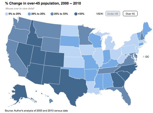
Nevada had the single highest growth in the 45+ population, with this group increasing by 50% between 2000 and 2010. West Virginia growth comes in last among this group (excluding Washington, D.C.), increasing by 15%. Of course, growth doesn’t tell you anything about the underlying numbers.
Many of the same states that had rapid growth in the 45+ population also saw significant gains in the under-45 range. But unlike with the 45+ population, where every state’s population was stable or growing, a significant number of states actually experienced a loss of the under-45 group:
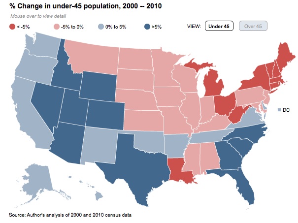
Again, Nevada’s #1, with 28% growth. Michigan, on the other hand, had an 11% loss.
These patterns have significant implications for individual states — everything from estimating how many elementary schools they’ll need to build in the future, to how many health care workers they’ll need to educate or attract, to a state’s or region’s ability to attract different types of employers, and so on. And states will be grappling with these issues under very different circumstances. It’s one thing to, for instance, address the potential health-care needs of the elderly in a state where every age group is increasing; it’s another if your working-age population is fleeing.
Brookings has a much more detailed interactive map that includes information on aging; you can look at the dependency ratio (population under 18 or over 65 per person of working age) and look at age changes by major metro areas in addition to states.
Comments 5
eduardo — July 4, 2011
Demographic changes are having a profound impact, but sometimes the solutions (e.g. "eliminate entitlements!") seem to be worse than the problem.
United states — July 5, 2011
[...] U.S. POPULATION AGING, BY STATE by Gwen Sharp, 1 day ago at 09:59 am Dmitriy T.M. sent us a link to some images at the Brookings [...]
U.S. Population Aging by State; Latinos Push for Political Influence; and More « Welcome to the Doctor's Office — July 5, 2011
[...] Influence; and More Posted by drhiphop85 ⋅ July 5, 2011 ⋅ Leave a Comment U.S. POPULATION AGING, BY STATE by Gwen [...]
Getshorty123 — July 5, 2011
Great. I just learned I am both getting older and younger simultaneously in two different regions.
Anonymous — July 6, 2011
When you compare this map with a map of fast food restaurants, you can see an issue: http://foodmapper.files.wordpress.com/2008/03/all-fast-food-map.jpg