
scatx sent in a link to the National Alliance to End Homelessness website, which includes a number of maps illustrating the increase in the homeless population over the past few years. The data come from community counts conducted each January of individuals in shelters as well as counts by outreach workers and volunteers of those sleeping in public places, in cars, abandoned buildings, and so on. Of course, counting the homeless will always be a challenging task, but these community counts provide at least some baseline data for those areas that take part.
This map shows the percent change in the homeless population by state:
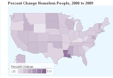
If you go to the website, you can hover over an individual state to see the relevant data. The page also has a map of the total number of homeless individuals by state.
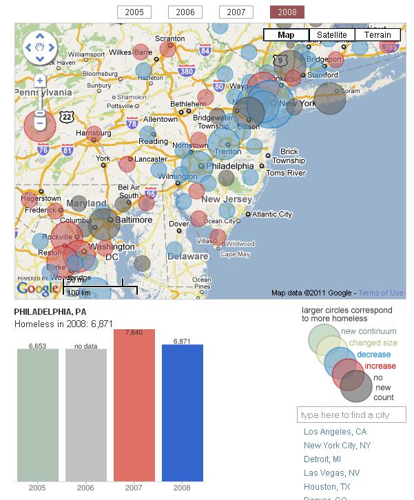
A more detailed interactive map lets you get information for individual communities. When you click on one of the circles on the map, a bar graph pops up underneath showing any data available for that city from 2005-2008. Here I selected Philadelphia:
A breakdown of the data shows that though most of those who are currently homeless are sheltered in some way, a significant number are living on the street, in a car, or in some other situation that wasn’t designed for human habitation:

The full report shows a striking increase in the number of people “doubled-up” — that is, staying with other families because of economic hardship (based on U.S. Census Bureau data):
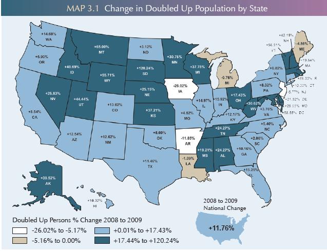
While moving in with others is a common strategy, it is also often temporary; significant proportions of individuals in shelters end up there when they can no longer stay with friends or family.
The website has tons of data on homelessness — risk factors, demographics, changes, and so on — so it’s worth a look.
Comments 2
Kate Ditzler — January 19, 2011
There are two major sources of data that the National Alliance to End Homelessness didn't use: the Homeless Managment Information System (HMIS) which is required of service providers who are entitlement communities, and in some states, like Michigan, anyone who uses state funds at all. They also did not use the Department of Education's numbers, which is actually more accurate for the doubled up population than HMIS or AHAR.
AHAR in Michigan is only done by 15 of our 60 communities -- and as a result the numbers that the NAEH reported are actually more reflective of the Metro Detroit Area than the state as a whole.
Michigan's Data: http://thecampaigntoendhomelessness.org/MichigansCampaign/MichigansData.aspx
AmandaLP — January 21, 2011
I have an issue with the "Community Counts," specifically as the instructions say to not go into buildings or areas in which the community workers feel unsafe. So, when the count is done in NYC in January, they miss the majority of homeless people in the city, because they are in buildings and other places to keep warm.
In addition, the cities and states like to use these numbers to show that the homeless population has dropped, while ignoring the fact that most homeless people are sheltered (either in the system or with temporary living situations), or are families and not just the "homeless guy on the street."