
Gizmodo posted an image created by Kamel Makhloufi based on the most recent data on the war in Iraq posted at WikiLeaks. The image divides deaths into categories illustrated by colors. Blue = U.S./Coalition forces, light green = “host” deaths (that is, members of the Iraqi government), gold = civilians, and gray = insurgents. On the left they’re arranged by totals; on the right, as the deaths have been distributed over time:
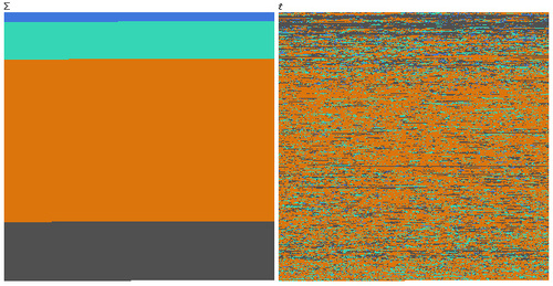
Of course, as the Gizmodo post points out, this doesn’t tell us who did the killing, so we don’t know what % of the civilians were killed by Coalition forces vs. insurgents. But it is a stark reminder of how much of the burden of war generally falls on non-combatant civilians.
Thanks to Jeff H. for the link!
Comments 24
Danny — November 8, 2010
Does the time line go up or down in the second image?
And can anyone tell me which order the colors go in on the left? None of them look light green to me...
Nijuro — November 9, 2010
It's clearly teal. Are you red-green colourblind?
Elias — November 9, 2010
I don't think it looks teal, more like turquoise.
zilla — November 9, 2010
I'm guessing the order is actually running on lines, left to right, starting at the top. Like text. See how there are horizontal lines where the same color runs for a while, then the color changes? I suspect each of those lines is some kind of attack/battle where all those people from that group were killed together. A bomb goes off and kills a bunch of people from one side or the other, along with some "collateral damage" ie civilians. The stuff at the top is from the start of the war when there was more organization and infrastructure on the gray side, before they were scattered and hiding in the civilian population.
Lindsey L. — November 9, 2010
I have one issue. I disagree that the image is "a stark reminder of how much of the burden of war generally falls on non-combatant civilians."
Perhaps we are forgetting about base rates. There are many, many times more civilians than there are insurgents in Iraq (as in, millions more). Even if it appears that the majority of deaths were non-military personnel, a higher percentage of the total insurgent population was killed (not to mention foreign and domestic soldiers).
I'm NOT saying that the burden has, therefore, not fallen on civilians. It might. But this picture doesn't show that.
Jeff Kaufman — November 9, 2010
It might be good to link to the original source: http://www.flickr.com/photos/melkaone/5121285002/
(The chain was:
http://thesocietypages.org/socimages/2010/11/08/iraq-war-deaths-by-category/
http://gizmodo.com/5684297/whos-dying-in-the-iraq-war-in-pixels
http://infosthetics.com/archives/2010/11/pixelating_the_casualties_in_iraq.html
http://www.datapointed.net/2010/11/iraq-wikileaks-death-graph/
http://www.flickr.com/photos/melkaone/5121285002/
)
jitpleecheep — November 9, 2010
So, let me get this straight: we're looking at war casualties here, and the majority of the commenters is argueing whether the colour is green, light green, turquoise, or teal?
And I thought the comments on gizmodo were awkward.
Goodlum — November 10, 2010
It seems like all of that color nonsense could have been avoided through a very elementary process of elimination. One color is clearly blue, another clearly orange, and yet another clearly gray. The remaining color, the second one, becomes "green" by elimination. Bravo.
Jeff Gill — November 11, 2010
It's very interesting to me that this article, and every other one I've read featuring this graphic, mentions that we don't know what proportion of the dead Iraqis were killed by which team. It's like we are all thinking: maybe it's not that bad. Maybe the dead people don't count as quite so dead if the baddies killed them instead of us.
decius — November 11, 2010
I wonder how they determined which deaths occured as a result of the war. Surely there would be some violent crime, and some violent deaths among civilians even without foreign influence. For that matter, some of the wartime suicides (and 'suicides') among coalition forces would occur in the absence of war; how can anyone claim to know what proportion of those should be attributed to the war.
And the second graph isn't distributed by time at all. It's simply ordered chronologically. A time-distributed graph would have periods of time in which there were no deaths, or over which the rate of deaths varied.