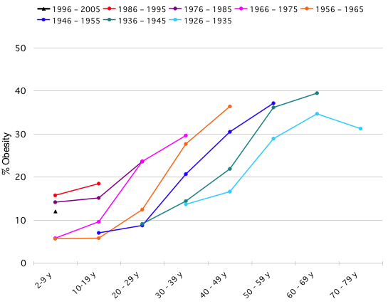
This graph, from Flowing Data, shows the obesity rates of different generational cohorts as they age. Each differently colored lines represents people who were born in different decades (between 1926 and 1935 and on up). Ascending lines represent higher percentages of obesity. Horizontal progress represents age.
So, first things first: rates of obesity go up as a cohort ages.
What else?
People born after 1975 are starting out with higher rates of obesity than people born between 1956 and 1975.
And.
Obesity rates seem to rise at a pretty consistent rate as cohorts age. So, if a cohort starts out with a high rate of obesity, they will have an ever higher rate 10 years later, and an even higher rate ten years after that, and so on.
The consequence: Higher rates of obesity overall for each cohort that follows the last.
The data for the most recent cohort, born between 1996 and 2005, however, looks like it might be bucking the trend.
Lisa Wade, PhD is an Associate Professor at Tulane University. She is the author of American Hookup, a book about college sexual culture; a textbook about gender; and a forthcoming introductory text: Terrible Magnificent Sociology. You can follow her on Twitter and Instagram.

Comments 32
ira — May 19, 2010
I'm curious -- I couldn't find this, so maybe I just missed it, but: how is "obese" defined in this context?
Steve — May 19, 2010
Too bad there isn't more data - I would be interested to see if that drop in obesity rates for the 1926-1935 cohort, between the 60-69 and 70-79 age ranges was characteristic of other cohorts.
Umlud — May 19, 2010
What I find interesting about the Flowing Data site is the responses below, that show (or attempt to show) different ways of representing the data itself (and how to deal with the fact that not all cohorts have longitudinal representation). It would have been nice (imho) if lisa had posted some of the alternative ways of depicting the above data, possibly lighting an additional discussion about how data are interpreted based on their presentation.
Eve — May 19, 2010
I think that older people do tend to lose weight, from loss of bone and muscle mass, and probably fat as well. I'm sure my grandma was lighter towards the end of her life. She also got shorter, though she didn't get thinner in the sense of losing fat. There are also wasting illnesses that older people tend to get more than younger people, which would decrease the number of obese people.
Jadehawk — May 19, 2010
ok, clearly I need more practice reading graphs... for some reason, this one was really hard for me to decipher. I guess part of the problem is that the oldest stats don't include children, so it's hard for me to compare them visually
:-p
PiquantMolly — May 19, 2010
What I find most interesting is that despite the fact that our society is currently obsessed with the OMG-WILL-NO-ONE-THINK-OF-THE-FAT-FAT-CHILDREN line of thinking, children aged 2-9 born between 1996 and 2005 actually have *lower* obesity rates than those born between 1986 and 1995 and 1976 to 1985. Sure, the have higher obesity rates than those born in the 60s and early 70s, but our society seems to be convinced that children are just ballooning before our eyes and every year childhood obesity grows in leaps and bounds. This data seems to prove that that's not the case.
I'd be interested in seeing how 2005-2010 will stack up.
Anonymous — May 19, 2010
@ Umlud:
I'm sorry, I didn't read your comment to the end before responding to it. That was wrong.
However, your suggestion that I read your blog (and presumably, that of every other person I respond to here) before responding to your comments is ridiculous.
Anonymous — May 19, 2010
Never mind that last comment.
Eve — May 19, 2010
I don't know if this means anything, but I thought it was interesting: those born between 1936-1945 and 1946-1955 seem to have different patterns of obesity as they age. One is skewed to a slightly lower weight in early years whereas the other starts out with quicker increases in weight and then levels off. It's subtle, but I wonder if these scientists have examined how rationing during WWII affected the way that parents fed their children in the years following the war? Perhaps kids were malnourished in utero and ended up being slightly thinner throughout their lives, or perhaps parents were more stingy afterwards if they had their kids during the war because having more mouths to feed during rationing meant that parents kept hyperfocusing on food when there was plenty. Whereas having kids after the war was celebratory, and came along with eating lots of good food, etc. Just a thought. Is this US or European/Commonwealth data? Was there rationing in the US?