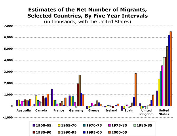
I found this graph illustrating levels of migration to several countries from 1960-65 to 2000-05 at the Migration Policy Institute:

Keep in mind, these are total numbers, not weighted by the size of the population of each country, so a country with a relatively small number of migrants compared to other countries may have a much larger percent of the population made up of migrants. But it is interesting to see the increases and decreases of migration over time in each country. The large increase in immigration to Spain especially caught my attention; see also our post on Spain’s voluntary return policy.
Other posts on immigration: the “Muslim demographic threat”, immigration and spouses, volunteer U.S. border guards, the “Battle for Britain”, refugees, immigration streams to the U.S., a horrid Border Patrol video game, Asian Americans and marriage, refugees in the U.S., anti-Puerto Rican statehood movement, pro-environment anti-immigration video, early German assimilation in the U.S., do immigrants work harder?, Muslims in Europe, world stats, and emigration from Mexico.

Comments 2
Elena — July 5, 2009
One interesting thing is that Spain has been a traditionally migrant country, both to Latin America and in the 1960s and 1970s to Germany (and other affluent European countries), in the heyday of the gastarbeiter. Until recently, Spanish people would also travel to pick fruit in the south of France.
Immigration to Spain (which has had a very homogeneous population in the last four-five centuries, with gypsies as the largest ethnic minority) picked up speed in the mid- to late 90s (although some groups, like the Chinese, started arriving in the 80s) and now immigrants make over 10% of the population of Spain, starting from testimonial numbers. The Wikipedia article has more information.
Verlinkenswertes (KW 27/09) | Criminologia — July 5, 2009
[...] Migration Trends in Selected Countries (Sociological Images, 05.07.2009) [...]