
Larry H. (of the L.A. Times‘ Daily Mirror blog) sent in a link to an interactive map at the NYT that shows December 2008 unemployment rates by county. Here’s a screenshot:
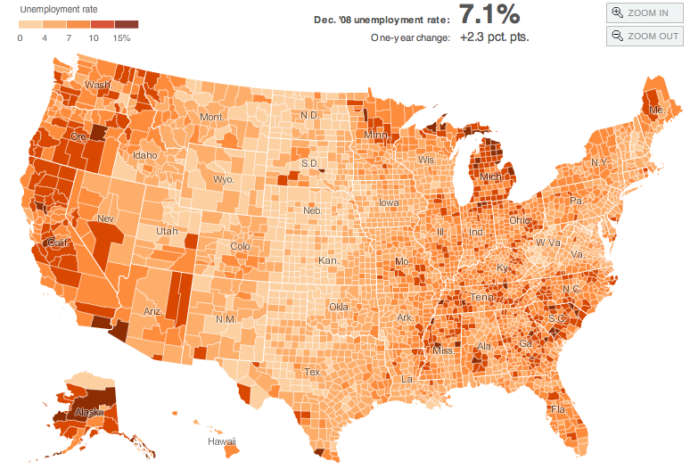
If you go to the link you can hover over counties and get their individual unemployment rates.You can also filter by manufacturing counties, rural counties, and counties that experienced a housing boom, as well as the 1-year change in unemployment rate.
Of course, you might want to combine this with a discussion of how unemployment is calculated–the 7.6% is most likely what is called the U3 rate, which is always lower than the more comprehensive U6. If we look not just at unemployment but at underemployment–people who can’t get enough hours to support themselves–and people who have given up looking for work, the rate would be higher.
Comments 2
OP Minded — March 5, 2009
I think the concept of counting folks who have "given up looking for work" in unemployment rates would be ridiculous. How could one EVER get employed again if you aren't even looking?
Further, who the heck gives up looking for work? Really, what self respecting person would give up if you have a family to take care of?
Gwen — March 5, 2009
Well, the government thinks it's useful information to know about discouraged workers (those who have stopped actively looking for work) because it does provide additional information about the state of the economy, expected productivey and GDP, etc. I grew up in a rural community with many of these types of workers--they had applied and applied and applied for jobs, but everything had left our area. For various reasons--family ties, lack of skills that seemed likely to lead to better opportunities elsewhere, fear, whatever--many didn't move away, and after a while just joined the ranks of people who would fall in that category. If you just counted the number of unemployed in the way the U3 does, those people would be left out, which would misrepresent just how bad our local economy was, so I think it's an important number to know.