
Erin Hatton sent in a 1937 redlining map of Philadelphia, so I decided to update our earlier post on segregation and redlining in the city.
—————
One historical cause of residential segregation was redlining. Lenders would color-code different neighborhoods on residential maps; red was generally the color used to designate a neighborhood as “dangerous,” meaning mortgages would not be approved in those areas, since they were considered to be high-risk areas for mortgage defaults. This was generally a blanket rule: people found themselves unable to get mortgages to buy property in redlined areas, regardless of their income or the value of the particular house they wanted to buy. And a high proportion of Black (and sometimes White immigrant) residents generally meant that a neighborhood would be automatically tagged as a high-risk area.
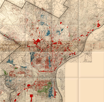
The University of Pennsylvania Redlining in Philadelphia project provides an example of a map created to guide lending in Philadelphia. The map was created in 1934 by J.M. Brewer, who owned a real estate consulting company and later was chief appraiser for Metropolitan Life Insurance.
This legend was adapted from the original for the U. of Pennsylvania website:
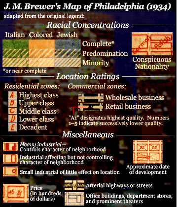
The legend looks like the “colored” areas are coded yellow, but it’s actually red on the map. Brewer created another map in 1935 and helped draw the federal Home Owners’ Loan Corporation (HOLC) map of Philadelphia in 1937.
Erin Hatton sent a link to that 1937 HOLC map, which reflects the governmental institutionalization of racism, marking some groups as inherently undesirable:
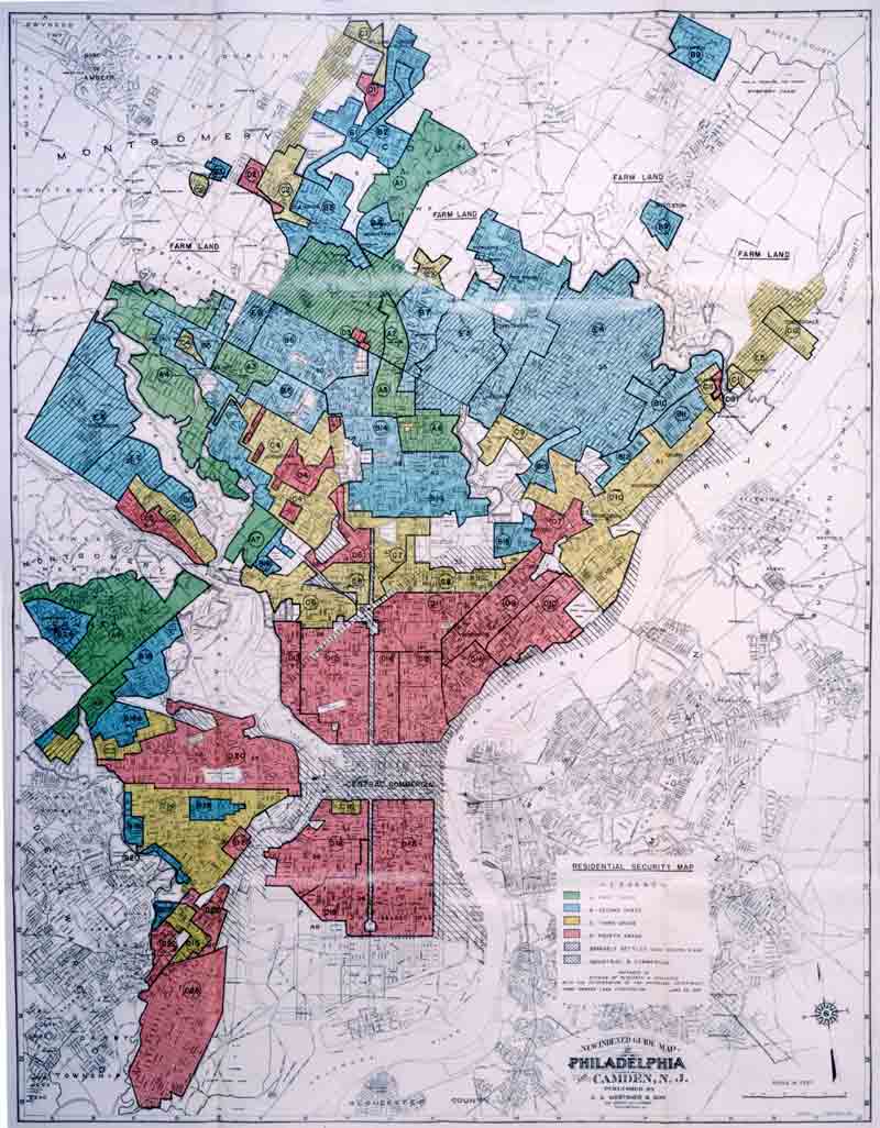
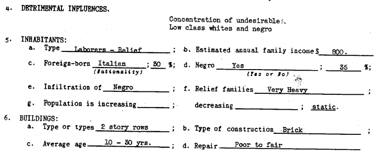
If you go to Redlining Philadelphia and click on areas of the map, it links to the survey sheets used to rate each neighborhood. All include a section on detrimental elements and a demographics breakdown, with areas to note the presence of immigrants, African Americans, poor families, and so on, such as this section of a survey sheet for area 22, giving a security grade of D:
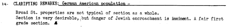
African Americans were not the only group targeted by redlining. For instance, the survey sheet for area 5 mentions the “danger of Jewish encroachment”:
Redlining made it difficult for Blacks (and some White ethnics) to buy homes. Racial discrimination meant Blacks often couldn’t buy homes outside Black neighborhoods, but Black neighborhoods were often redlined by lenders, meaning Blacks couldn’t get mortgages to buy houses inside them, either. As a result, African Americans were disproportionately barred from one of the major avenues to acquiring wealth (building equity through home ownership), leading to increasing racial disparities in wealth and home ownership over time.
Also check out our post on segregated Durham.
Comments 35
Sean — November 30, 2008
Thanks for posting things like this!
gasstationwithoutpumps — April 25, 2012
It wasn't just Philadelphia not did it end in the 30s. There was almost identical discrimination happening (at least with respect to Jewish potential homeowners) in the suburbs of Chicago into the 50s.
myblackfriendsays — April 25, 2012
I want to meet some people from the "decadent" class.
Anonymous — April 25, 2012
I'm curious, does anyone have data on what the default rates for the type of people (socioeconomic) wanting to buy homes in these redlined neighborhoods? I'm wondering if this was profit-maximizing behavior on the part of lenders or was it really just simplistic racism? It wouldn't surprise me if due to institutional repression many of the people applying for loans in these homes did have extraordinary high default rates such that it might be rational just to redline the area entirely. Essentially, I'm asking, is redlining a side-effect of institutional racism or part of it directly (indirectly it will be a part of it because it will act as a re-enforcing mechanism of institutional racism).
Sara Stewart — June 7, 2012
It's really interesting to me that you have used "ethnics" in exactly the same way as the WASP bigots local to me do, to describe people who can't be defined entirely out of whiteness, but aren't the right sort of white. Around here, that would be Greek people, Italian people, and Portuguese people, mostly. I'm not sure whether the local bigots think Jews are white or not.
The "right sort of white" would be British Isles-extracted Protestants generally -- around here people of Scottish extraction can and do consider themselves "WASPs."
Les data en forme » OWNI, News, Augmented — June 19, 2012
[...] 30, qui démontrent comment, à cette époque, déjà, des firmes immobilières établissaient une cartographie discriminante (“redlining maps”) et comment cette pratique pourrait expliquer en grande partie la [...]
The Week in Data » OWNI.eu, News, Augmented — June 25, 2012
[...] half of the 1930’s, which demonstrate how at that time real estate firms were establishing a discriminantory cartography (“redlining maps”). This practise might go some way to explaining the residential [...]
Philadelphia Redlining Maps » Sociological Images | World Map — July 8, 2012
[...] Read More: Philadelphia Redlining Maps » Sociological Images [...]
J — April 14, 2013
This is absolutely fascinating. Everyone in Philly should know this information. Thank you for sharing your research.
Command of Etiquette—No Place for Strange Fruit : Hipsters of the Coast — June 24, 2015
[…] average white family’s net worth in 2007 was fully ten times that of the average black family. As I’ve learned over the years, our country’s racist foundations have left chasms of inequality that will take much longer than […]
BestAcademicPapers.com | Gentrification and changing nature of cities — May 3, 2016
[…] https://thesocietypages.org/socimages/2012/04/25/1934-philadelphia-redlining-map/ […]
Gentrification and changing nature of cities - Write My Assignments — May 14, 2016
[…] Philadelphia Redlining Maps […]
Bestessayexperts | Gentrification and changing nature of cities — June 5, 2016
[…] https://thesocietypages.org/socimages/2012/04/25/1934-philadelphia-redlining-map/ […]
John R — March 29, 2017
Seriously though. Who really wants to live around blacks?
Topic: Gentrification and changing nature of cities – Homework — June 22, 2017
[…] Philadelphia Redlining Maps […]
Red Lining Note by Seyni Ndaw – Our Philadelphia, Our America — January 19, 2018
[…] for college, employment opportunities or other reasons. The term redlining spurs from a method federal agencies used to distinguish ‘safe’ neighborhoods that were good for business from ‘danger areas’. These danger areas were often occupied by […]
Gentrification and changing nature of cities » University Masters Essay — September 17, 2018
[…] Philadelphia Redlining Maps […]
Customised EssaysGentrification and changing nature of cities – A1 — December 17, 2018
[…] Philadelphia Redlining Maps […]
Joan — December 19, 2018
It is illuminating to compare Dubois’ maps of the 7th Ward in his 1899 book with Brewer’s map of 1934. Both maps show the same basic data: ethnicity, household income, and value judgements about degree of “decadence.” Yet Dubois’ maps are hailed as sociological breakthroughs, while Brewer’s are maligned as redlining maliciousness. Both maps are just data, what today is taken for granted as GIS learned in high school.
City Of Austin Zoning Map | All About Map - Ceamass.Org — October 1, 2019
[…] Download Image More @ thesocietypages.org […]
Topic: Gentrification and changing nature of cities | Assignment Essays — November 18, 2019
[…] Philadelphia Redlining Maps […]
Topic: Gentrification and changing nature of cities - MastersEssaySharks — April 30, 2020
[…] Philadelphia Redlining Maps […]
Mapping Philadelphia – Katie F. O'Dell — October 3, 2020
[…] Home Owners’ Land Corporation. (1937). Philadelphia Redlining Maps. [Online Image]. The Society Pages. https://thesocietypages.org/socimages/2012/04/25/1934-philadelphia-redlining-map/ […]
Topic: Gentrification and changing nature of cities - Topcollegeanswers — December 10, 2020
[…] Philadelphia Redlining Maps […]
Topic: Gentrification and changing nature of cities | LondonTermPapers — January 26, 2021
[…] Philadelphia Redlining Maps […]
Topic: Gentrification and changing nature of cities - superioressaypapers — March 2, 2021
[…] Philadelphia Redlining Maps […]
Topic: Gentrification and changing nature of cities - blog.essaysagency.com — January 1, 2022
[…] Philadelphia Redlining Maps […]
A Brief-ish History of Housing Policy in the United States – Madelyn Mae — January 8, 2022
[…] Redlining Map of Philadelphia. Source: Sociological Images: Philadelphia Redlining Maps Survey used to rate neighborhoods. Source: Sociological Images: Philadelphia […]
Gentrification and changing nature of cities - Ultimate Scholars | Ultimate Scholars — February 24, 2022
[…] Philadelphia Redlining Maps […]
House Inequality & Redlining in Philadelphia – Housing Inequality & Redlining in Philadelphia — May 4, 2022
[…] Map/Legend from: https://thesocietypages.org/socimages/2012/04/25/1934-philadelphia-redlining-map/ […]