
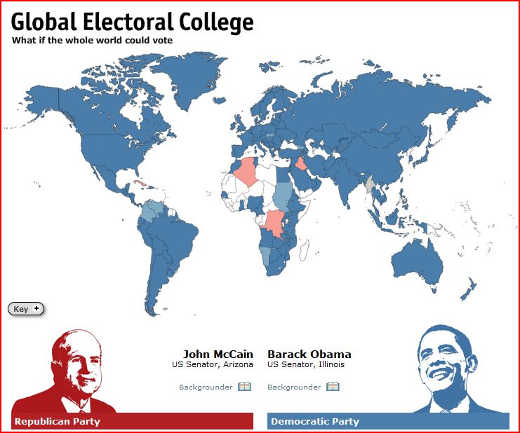
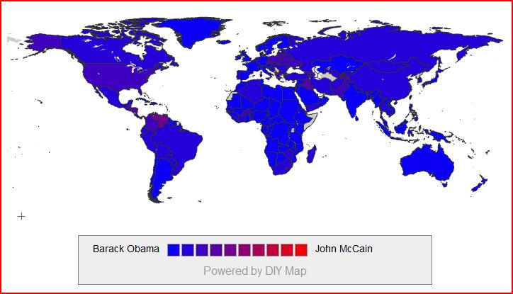
Matt S. sent in a link to a global electoral map showing how the world would vote in the U.S. presidential election. The images below–the first from The Economist and the second from two guys in Iceland–might be useful for illustrating the relationship between the U.S. and the rest of the world.
Thanks Matt!
Comments 5
Bagelsan — November 5, 2008
I especially appreciate the irony of the first map, with most of the "red" countries being in... Africa. What, Africans aren't voting based on skin color?? Shock!! It's almost like that whole meme is a completely ridiculous concept...
Anonymous — November 5, 2008
cuba is blue bitch
Anonymous — November 6, 2008
Yeah, really. Why would Cuba be leaning towards McCain, and why would Venezuela be unsure???
Tricia — November 8, 2008
Before you continue with your sexist rant you should follow Lisa's links. These red/blue maps were not created by her. The first map is from http://www.economist.com/Vote2008/ and the second map is from http://www.iftheworldcouldvote.com/results. I'm going to suggest that you do some reading.
Noumenon — November 10, 2008
That first map does not represent how the world's voters would have voted! It's a poll of the Economist's readers in those various countries.
BARACK OBAMA has won at least one election by a landslide. Voters in The Economist's Global Electoral College favoured the Democratic candidate over his Republican rival, John McCain, by more than five to one...
Rich countries tended to vote earlier than poorer ones (a reflection of where most online readers of The Economist are found), with African countries among the last to fall for either candidate. Unsurprisingly, countries where internet access is limited registered fewer votes.
So the post is kind of misleading -- which I'm happy to discover; I don't want to see America do what the rest of the world is doing, for fear of a monoculture.