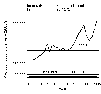
This first graph shows the relative increase in the incomes (inflation adjusted) of the top 1% of income earning households, the middle 60% and the lowest 20% (percentages, presumably, approximate) since 1979.
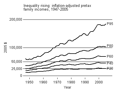
This second graph shows a more detailed picture of the relative increase in the incomes (inflation adjusted) of households in the 95th , 80th, 60th, 40th, and 20th percentile since 1949. Note how household incomes were rising at about the same rate prior to 1970, at which point those households in the 95th percentile started out growing other percentiles, those in the 20th stayed stagnant, and those in between were somewhere in between.
I borrowed these graphs from Lane Kenworthy, who also offers a truly excellent and detailed explanation of the measures.
.


Comments 17
Sociological Images » Happy graduation! — May 14, 2008
[...] Might this be related to the shrinking middle class? [...]
Sociological Images » SOCIAL CLASS AND THE TAX BURDEN — April 19, 2009
[...] more great illustrations of income inequality in the U.S., see here, here, and here; for a comparison of income inequality in the U.S. and elsewhere, [...]
Anonymous — February 8, 2010
hello
More Men and Fewer Women Earning Poverty Wages, 1979-2007 » Sociological Images « Firesaw — May 22, 2010
[...] 22, 2010 · Leave a Comment more evidence of the shrinking of the middle class; solid working class jobs that will allow you to buy a modest home are disappearing. via [...]
Vivek Ydv — May 16, 2018
Thank you.
vedant — March 19, 2019
If you want to delete your history for any reason windows 10 support then you can do it easily by this site.
Ikea kitchen Builder — June 25, 2020
Bridge City is a Reputable Cabinetry & Renovations Contractor. We Provide Services in IKEA Kitchen Design and Construction. Bridge City is a Reputable Cabinetry & Renovations Contractor. We Provide Services in IKEA Kitchen Design and Construction. We are a Quality Renovation Contractor that Renews and Brings Life back to Existing Properties no Matter what kind of Space you are Looking to Renovate: Bathrooms, Living Rooms, Kitchens, or Other Living Spaces.
little snitch crack — October 9, 2020
I had the honor of receiving a call from a friend who received advice shared on your site.
Reading your blog post is a truly amazing experience. Thanks again to readers like me and I wish you good luck as a professional.
altova xmlspy crack — October 9, 2020
Hmmm, is there something wrong with the images on this blog? At the end of the day, I try to figure out if this is a problem or a blog.
Any answers will be greatly appreciated.
SMADAV 2020 CRACK — October 14, 2020
I really thank you for the valuable info on this great subject and look forward to more great posts. Thanks again.
lashboot crack — October 15, 2020
Exploring in Yahoo I ultimately stumbled upon this
web site. Reading this information So i’m satisfied to express that I’ve an incredibly just right
uncanny feeling I found out just what I needed. I so much indubitably
will make certain to do not disregard this web site and provides
it a glance regularly.
cyberlink powerdirector crack — October 15, 2020
Thanks , I’ve recently been looking for information approximately this
topic for ages and yours is the greatest I’ve came upon so far.
But, what about the conclusion? Are you sure in regards to the source?
turbo studio crack — January 17, 2021
I have to thank you for this very good book !! I
absolutely loved every bit. I've mentioned you in the book to see the new stuff you post
andicam crack — January 17, 2021
Hello, this weekend is nice to support me as I am currently reading this impressive informative article right here at my house.
https://proproductkey.co/bandicam-crack-full-registration-key/
spotify premium crack — January 17, 2021
Hi! I could have sworn I was on this blog before, but then
after looking at some posts i realized it was new to me.
https://getsoftwares.co/spotify-premium-crack/
Andre — May 18, 2021
The first graph is is spectacular
Müllbox
Terrassenüberdachung — July 23, 2023
thanks for the great job