
Four decades ago, the United States launched a grand policy experiment. The nation began locking up an unprecedented share of its citizens, increasing its rate of incarceration by more than 400% over the period. According to the Bureau of Justice Statistics, the number of U.S. prisoners finally stabilized in 2009, showing small declines for the first time since the 1970s. The long-term effects of this experiment are only beginning to come into focus, but they are so powerful and so concentrated in communities of color that scholars such as Michelle Alexander liken mass incarceration to a “new Jim Crow”—a wide-ranging and racialized system of social control.
This boom was unparalleled among Western developed nations. On any given day, about 2 million U.S. citizens are now behind bars and more than 3 million former prisoners are contending with labor market discrimination, loss of voting rights, difficulty securing housing, and problems reconnecting with family. In some states, as many as 10% of adult African Americans have served prison time. This is not to mention the millions of other “legal bystanders” (to use sociologist Megan Comfort’s fine phrase) who come into contact with the criminal justice system through their relationships with its clients.
With a story so big, one might expect mass incarceration to garner regular front-page headlines. One reason it has not received such coverage might be because, until recently at least, there has been little incentive to question this trend. The United States is a wealthy nation and can, by and large, afford the exorbitant expenses incurred by locking up millions of citizens for long periods of time. Only since the Great Recession have states begun to cut back on correctional spending and, in some cases, close facilities due to tight state budgets. A second reason may be that Americans, as legal scholar Michael Tonry and others have pointed out, tend to support punitive policies, especially in reaction to moral panics over particularly egregious crimes. Finally, the relative lack of attention to the punishment boom may be due to its magnitude; its scale is just too immense for most people to grasp. Millions of people, billions of dollars—it’s no wonder even interested eyes glaze over.
Data visualization can begin to address this third point, since a good picture is often worth a thousand statistical tables. Journalists, social scientists, and data gurus such as Hans Rosling are using Geographic Information Systems and other visualization tools to move from “boring” statistics to eye-catching and intuitive images. For example, the New York Times and the Guardian regularly communicate complicated social issues and trends using attractive maps, tables, and graphs. Our task here is to visualize the story of mass incarceration, illustrating shifts in punishment over time, space, and the populations most affected by its rise.
Time
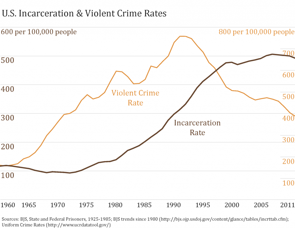
The U.S. incarceration rate was relatively stable throughout most of the twentieth century, fluctuating in a narrow range around 100 per 100,000 people. In the early 1970s, however, its steep climb began. Imprisonment increased by an average of 6% per year to reach its current rate of about 500 per 100,000 people. Over the past few years, incarceration rates have stabilized and even fallen slightly. Still, you can see in the graph below that the nation continues to imprison people at five times the rate it did in the early 1970s.
Social scientists attribute the bulk of this rise to changes in sentencing policies and politics, rather than changes in the underlying rate of crime, which has fallen dramatically over much of the mass incarceration era. Violent crime rates experienced growth, fluctuation, and substantial decline over the past 50 years, a very different pattern than incarceration (especially after 1990). So while crime clearly plays some part in the story, most punishment scholars agree that social policy changes, such as the War on Drugs, mandatory minimum sentences, and other “get tough” measures, are most responsible for the growth.
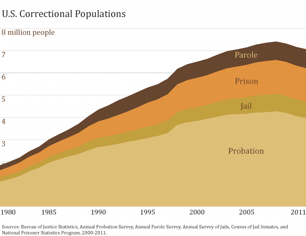
Beyond incarceration, other forms of criminal punishment have also shot up in recent years. As the next graph shows, the vast majority of people who are under supervision by the criminal justice system are not in prison or jail at all. Instead, they are living in their communities while supervised on parole (a conditional early release from prison) or probation (a sentence in place of jail or prison time). All of these populations have grown, rising from less than 2 million people under correctional supervision in 1980 to about 7 million in 2011.
In addition to these increases in punishment rates, the likelihood of arrest has also risen over time. In a 2012 Pediatrics article, Robert Brame and his colleagues estimate that the likelihood of arrest for Americans under 23 has grown from less than one in four in the 1960s to one in three by the 2000s.
Space
Social facts are located in space as well as time, as the “Chicago School” of sociology has demonstrated for almost a century. With today’s tools for collecting and analyzing geographic data, it has become much easier to see exactly how spatial context matters for a host of social problems. Criminologists and police departments use crime mapping and “hot spot” analysis, for example, to identify, understand, and address patterns of crime in urban areas.
Rates of punishment vary greatly by geographic location, and there are radical differences in imprisonment rates across nations and states. The map below is a cartogram, which distorts the shape and size of land area based on an alternative statistic—in this case, incarceration rates. Changing the familiar dimensions helps us visualize where punishment is unusually high and low, since the nations appear as bloated or emaciated on the incarceration-adjusted cartogram.
The legend at the bottom shows that, in 2011, the United States was the only nation with a combined rate of prison and jail incarceration of over 600 per 100,000. Thus, the United States, with the world’s highest total rate of incarceration (743 per 100,000, including jail inmates), is greatly inflated on the cartogram. Despite the fact that prison populations have grown worldwide, the United States has outpaced every other country, exceeding the incarceration levels of other democratic nations by five to seven times. Our closest competitors in 2011 were Rwanda (595) and Russia (568).
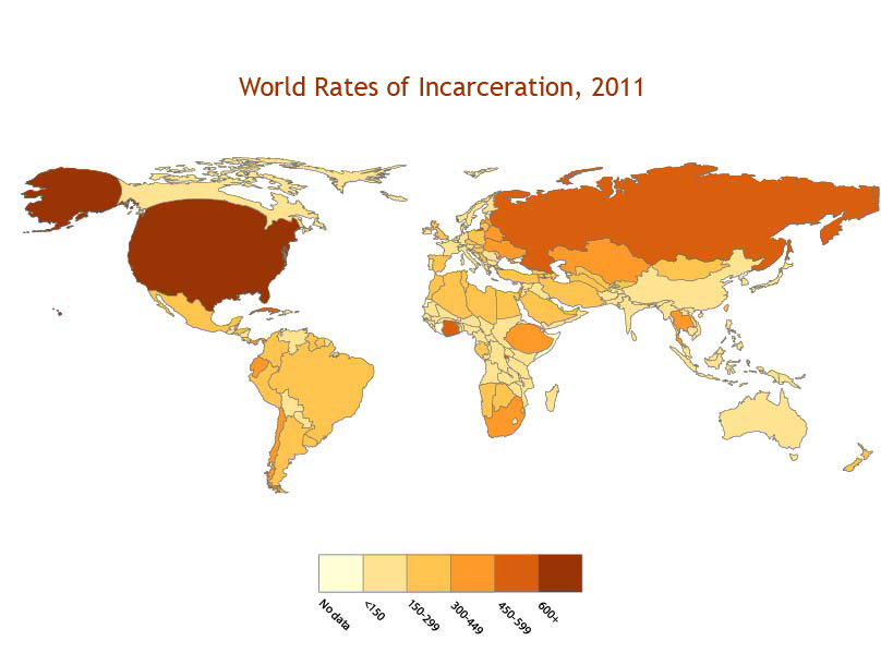
As compared to a more typical map, the cartogram brings more punitive nations into bold relief. It also dramatically downsizes nations with incarceration rates below 150 per 100,000 people, such as Canada and much of Europe and Africa. Other nations that are large in land area but lower in incarceration rates, such as China and India, are also notably diminished in size.
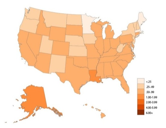
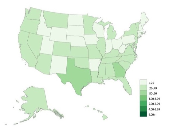
The next set of maps shows how rates of punishment vary almost as dramatically within the United States—and over time—as across the globe. In many, you can use a slider to compare rates of imprisonment from 1980 to 2010. In the map below, the percentage of the adult population in prison in 1980 was below .5% in all states; by 2010, it ranged from less than .25% in Maine and Minnesota, to over 1% in Alaska and Louisiana. The lion’s share of these differences can be attributed to policy choices about which types of crimes trigger which types of sentences; states that impose life sentences after “three strikes,” for example, tend to have higher incarceration rates. These policies are influenced by differences in crime rates, political culture, economics, and demographics. For example, sociologists David Greenberg and Valerie West traced state incarceration growth to rates of violent crime and conservative political cultures.
Percent of U.S. Adults in Prison by State, 1980 and 2010
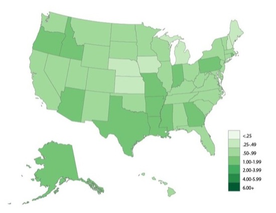
This state-level imprisonment variation is amplified and altered when depicted by race. The next map displays the percentage of adult African Americans who were imprisoned in each state in 1980 and then in 2010. Overall, in 2010, this map is more darkly shaded than the map for total incarceration, since most states incarcerate at least 2% of their African American residents. In contrast to the overall map, predominantly white states such as Iowa, Wisconsin, and Vermont appear in darker shades, with each locking up more than 4% of African American adults. These high rates are not the simple result of African Americans committing more crime. There are also race differences in the responses of the criminal justice system, especially in situations where its workers have great discretion. For example, research by criminologist Jeffrey Fagan and colleagues suggests that police officers are more likely to stop and to arrest African Americans for low-level drug crimes.
Percent of U.S. African American Adults in Prison by State, 1980 and 2010
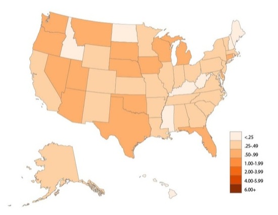
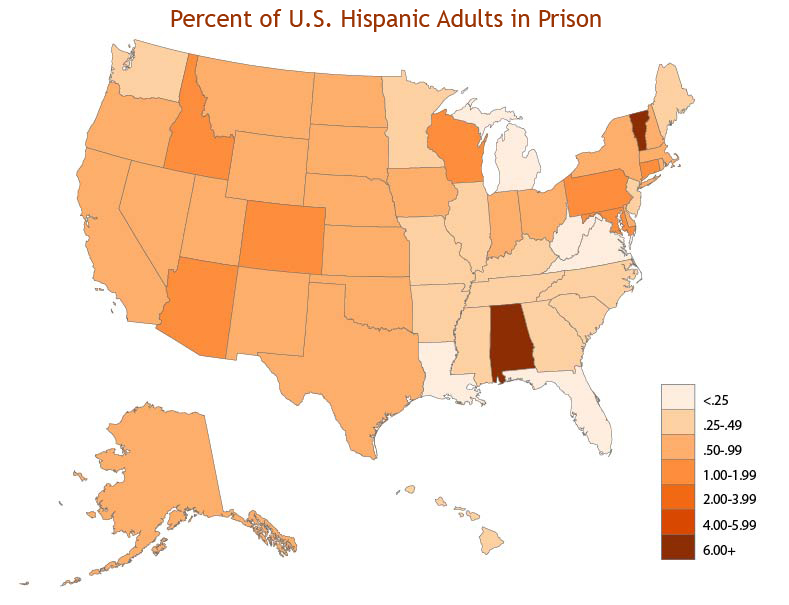
Hispanic incarceration is trickier to plot because states have not consistently collected information on Hispanic ethnicity, often confounding it with racial categories (this is also why we cannot provide a “slider” to compare 2010 incarceration against 1980 rates). But the simple map below shows that the percentage of adults of Hispanic origin also varies significantly by state, with a strong geographic pattern of higher rates in the western half of the country.
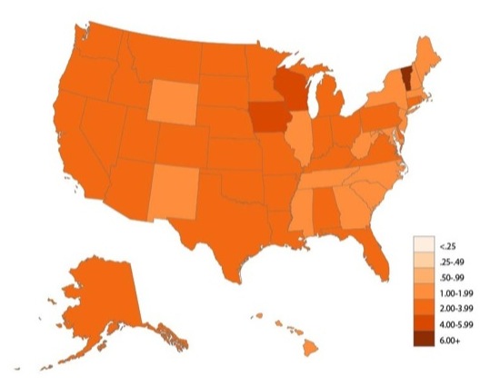
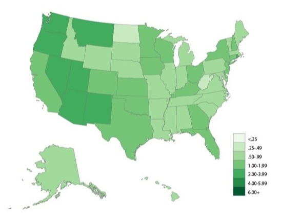
Somewhat different patterns emerge when we map percentages of the adult population under correctional supervision for felony-level crimes, regardless of whether they are behind bars or in the community. States like Georgia and Minnesota have high rates of probation supervision, so they appear darker on this map than in the incarceration map above. Compare 1980 to 2010.
Percent of Adults Under Correctional Control for Felonies by State, 1980 and 2010
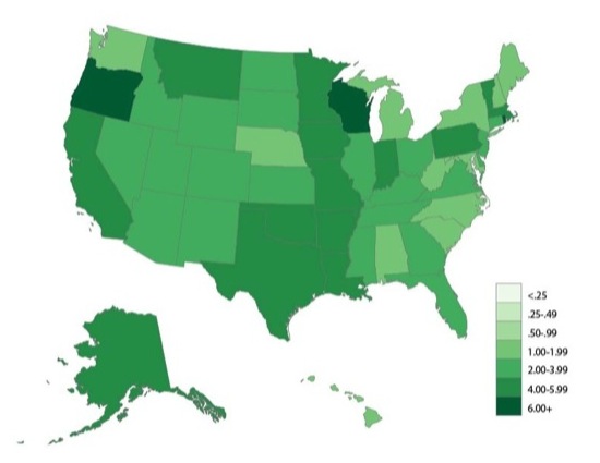
As with incarceration, there are big racial differences in correctional supervision. The next map shows the percentage of adult African Americans under correctional control for felonies in each state in 1980 and 2010. By 2010, more than 4% of adult African Americans were under supervision for felony convictions in at least 16 states. Compared to the previous maps of the overall population, states such as California, Iowa, Oregon, and Wisconsin are darker, revealing especially high rates of African American correctional supervision. A similar map of Hispanic correctional supervision would show particularly high rates in the southwest and upper plains states.
Percent of Adult African Americans Under Correctional Control for Felonies by State, 1980 and 2010
Visualizing punishment across the states shows that there is no single picture of punishment in the United States. States make diverse policy and sentencing choices, each of which affects the scale and composition of their correctional populations. While a national picture is useful for comparing countries and displaying trends over time, the most important decisions about who is punished and how punishment is carried out are often made at the state or local level.
Social concentration
The maps above illustrate the astonishing concentration of punishment by race in the United States, especially among African Americans. But when race is combined with other demographic factors, the social concentration of punishment is even more pronounced. The intersection of race, social class, and incarceration is especially powerful.
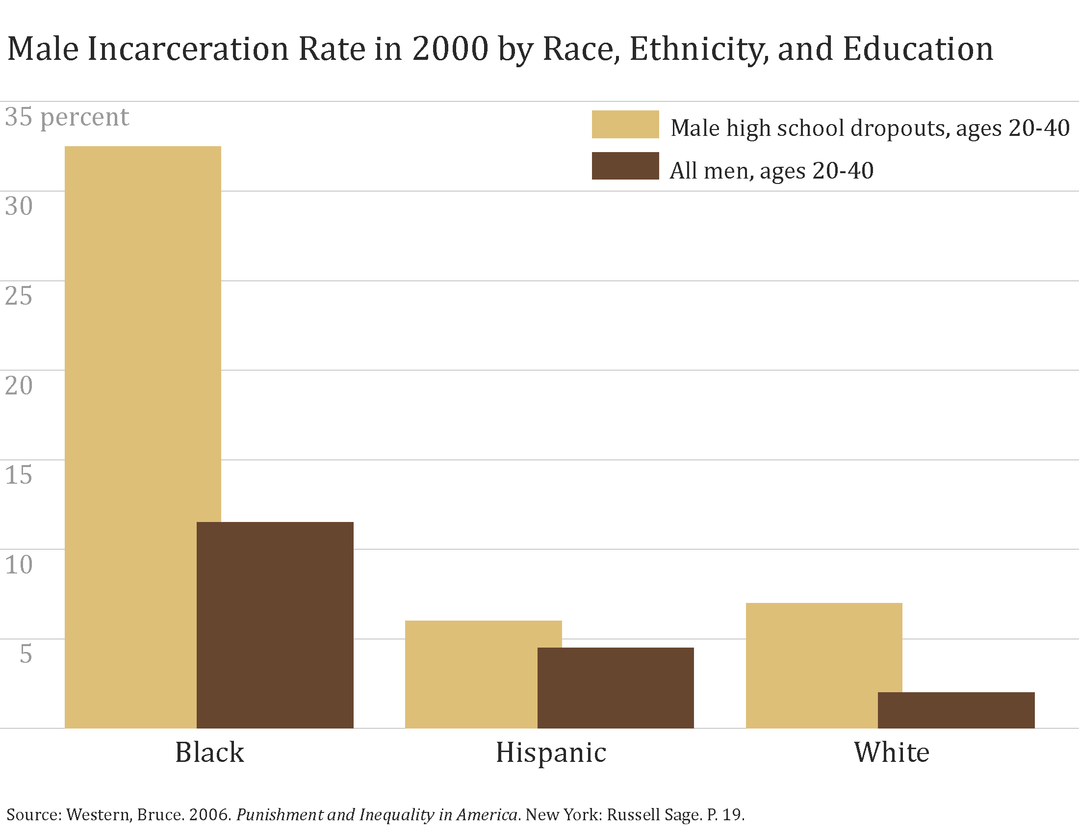
Sociologist Bruce Western and his colleagues have estimated that, for recent cohorts of African American men with no high school degree, the lifetime likelihood of going to prison is roughly 60%—about five times higher than the corresponding rate for white high school dropouts. Spending time in prison has become a statistically normative life experience for young African American men with low education. The chart below illustrates these disparities, showing that one-third of young African American male dropouts were incarcerated in 2000, compared to about 6% of whites and Hispanics. According to Western’s analysis, twice as many African American men born in the late 1960s had prison records as had college degrees by 1999.
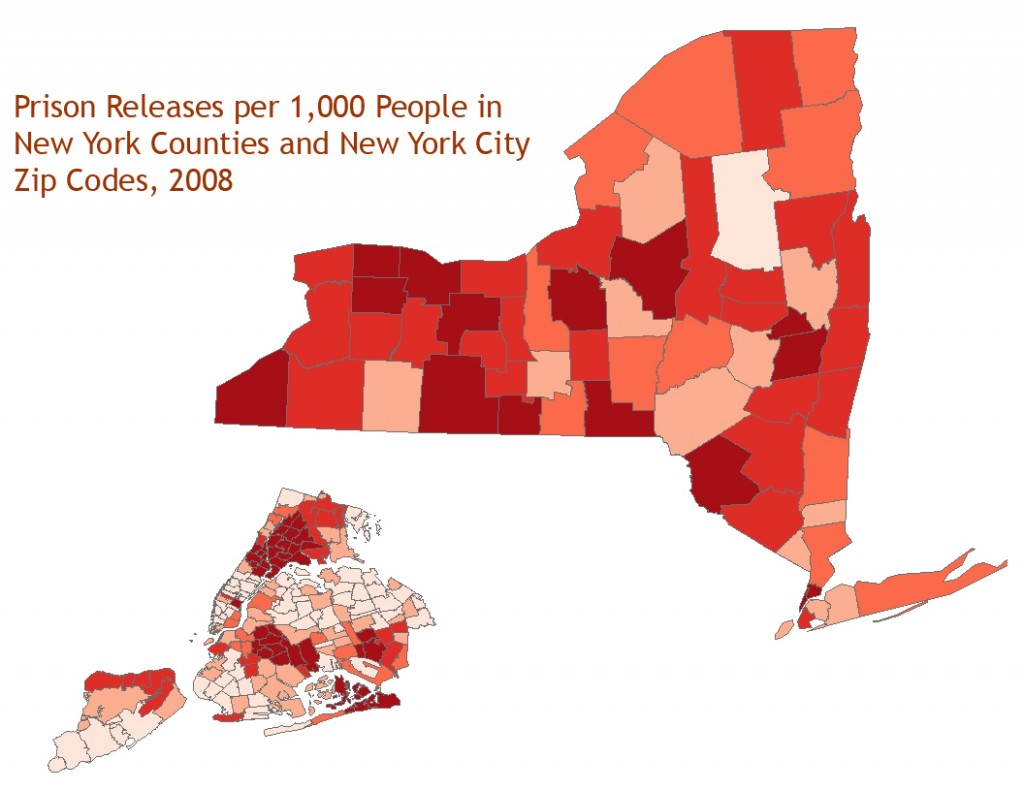
Punishment is also socially concentrated in low-income, urban areas. Criminologist Todd Clear reports that more than 18% of male residents in some Cleveland and Baltimore neighborhoods are incarcerated and one in five adult men in Washington, DC are behind bars on any given day. Similarly, over half of all prisoners released in the states of Illinois and Maryland return to the cities of Chicago and Baltimore, respectively. According to Jeremy Travis, President of John Jay College of Criminal Justice, more than a third of these returning prisoners are concentrated in just a handful of neighborhoods. Eric Cadora and colleagues at the Justice Mapping Center have gone further to show that correctional control varies not just by neighborhood but by city block. Some states spend upwards of a million dollars each year incarcerating the residents of just one city block. As residents of these “million dollar blocks” move in and out of prison, the communities lose valuable social and human capital, a process Clear and others describe as “reentry cycling.”
The map of New York state and New York City (inset) shows how rates of prison release vary at the county and zip code level. Counties with urban centers such as Albany, Syracuse, and New York appear darker on the map, indicating higher rates of prison releases. In New York City, these releases are clearly more concentrated in low-income neighborhoods and those populated by persons of color, including Harlem, the South Bronx, Bedford-Stuyvesant in Brooklyn, and Jamaica in Queens.
Each of these visualizations reminds us that punishment is not randomly distributed across the population, but is instead highly concentrated among certain subpopulations and locations. As David Garland puts it, mass incarceration in the United States is not simply defined by the imprisonment of large numbers of people, but by the “systematic imprisonment of whole groups of the population.”
Punishment Effects
The social costs of the U.S. policy experiment with mass imprisonment are widespread and staggering, especially for the most disadvantaged segments of the population. Recent evidence from sociologist Becky Pettit suggests that previously touted gains for young African American men, such as higher voter turnout and lower high school dropout rates, diminish (and, in some cases, disappear completely) once the figures are adjusted to include incarcerated persons.
Incarceration deepens existing inequalities and even creates new inequalities on multiple dimensions, including the labor market, family, and political participation. Stigma gained by virtue of contact with the criminal justice system lasts well beyond the completion of sentence, especially for African Americans. Collateral sanctions, such as exclusions from employment, voting, and public assistance, make it even more challenging for people with criminal records to gain a foothold in society. As a result, many criminologists view both prisons and their collateral consequences as criminogenic—ultimately contributing to more crime rather than less as people cycle in and out of the system with little access to the economic, social, and political resources that would help them “make good” on the outside.
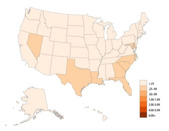
States are pursuing radically different alternatives to many collateral sanctions. This variation serves as a good illustration of the dramatic range of options at a state’s (or a nation’s) disposal. For example, a remarkable 5.85 million Americans are forbidden to vote because of “felon disenfranchisement,” laws restricting voting rights for those convicted of felony-level crimes. Of this total, which represents about 2.5% of the U.S. voting age population, over two million are African Americans. But as the cartogram below shows, these laws vary significantly by state. More than 7% of the adult population is disenfranchised in states like Alabama, Florida, Kentucky, Mississippi, Tennessee, and Virginia where people lose their voting rights for life, but none of the population is disenfranchised in Maine and Vermont, where even current prisoners retain the franchise.
Percent of the Adult Population Disenfranchised Due to Felony Conviction by State, 2010
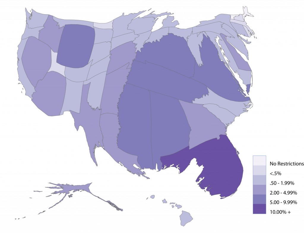
Public opinion research shows that most Americans favor voting rights for probationers and parolees, as well as for former felons who have completed their sentences. If state laws were changed to reflect these principles, voting rights would be restored to well over 4 million people—and the cartogram would more closely resemble a standard U.S. map.
Alternative Visions
Given the scope and magnitude of America’s experiment with mass incarceration, it will be some time before social scientists chase down all of its effects. Most societies seem to require some degree of incarceration to preserve public safety, but mass imprisonment implies a degree of excess punishment beyond what’s required to control crime—leaving observers searching for alternatives. How crime is punished is a social policy choice, and other visions of punishment are possible, given the political will to change. Such alternative visions might include redirection of low-level offenses away from the criminal justice system, fewer long prison sentences, judicious use of early release, a general shift from prison to community corrections, a budget transfer from corrections to law enforcement and crime prevention, and a reduction in the scope and number of collateral sanctions.
If we are to see our way toward a new vision of crime and its control in the United States, we must first see punishment as it is. Images are an important means for telling the story of racialized mass incarceration—its rapid growth over time, its variation across space, and its concentration within particular populations. Ideally, such visualizations will not only help us to grasp the state of punishment, but to begin to envision how it might be changed.
Recommended Reading
Todd Clear. 2007. Imprisoning Communities: How Mass Incarceration Makes Disadvantaged Neighborhoods Worse. An authoritative analysis of punishment and urban communities.
David Garland. 2001. The Culture of Control: Crime and Social Order in Contemporary Society. Shows how criminal justice policies of mass incarceration exemplify the basic problems of governance in the modern world.
David F. Greenberg and Valerie West. 2001. “State Prison Populations and their Growth, 1971-1991,” Criminology. A careful quantitative study of the factors driving changes in state imprisonment rates.
Becky Pettit. 2012. Invisible Men: Mass Incarceration and the Myth of Black Progress. A cogent analysis of how mass incarceration conceals racial inequalities in education, employment, and politics.
Bruce Western. 2006. Punishment and Inequality in America. Powerfully documents the growth and social costs of incarceration for individuals and communities.
Comments 16
Kyle Green — February 19, 2013
This is great. Very effective, powerful and disturbing way of visualizing the high rates of incarceration.
Madison Van Oort — February 19, 2013
Will likely use many of these figures when teaching my intro class about race and incarceration. Thanks!
Suzy — February 19, 2013
I've spent the last several minutes moving the sliders slowwwwly westward - great way to visualize change!
Tim — February 19, 2013
This is an incredibly detailed analysis. Thanks for sharing.
Chris Uggen — February 20, 2013
@ kyle, madison, suzy,
thanks much. sarah has done some great work on this. we're both hoping folks will use the visuals in teaching about race and punishment. more to come ...
Sarah — February 20, 2013
Yes, thanks everyone! I would love for this to be used in teaching.
mary katzenstein — April 26, 2013
Really superb, Chris and Sarah - (just posted to f'book)
chris uggen — April 26, 2013
many thanks, mary -- hope it is useful...
Sarah — April 27, 2013
Thanks, Mary! It was great fun to write and, as Chris said, we hope it will be very useful.
Trent Jonas — June 6, 2013
I am a (now) former attorney and business owner who had the dubious honor of experiencing what you have stated so clearly above from a more "inside" perspective. I was a white, white-collar "incarceree" at FPC Duluth. I was astonished not only at the number of inmates of color (by percentage) but at the the reasons for their incarceration; often for egregiously long sentences that wreaked havoc on their families. I met many inmates who were primarily users of controlled substances, who were caught up in the overbreadth of federal conspiracy laws; as well as a few marijuana growers who were subjects of selective prosecution by the federal government in states where their actions were otherwise legal.
It would seem in cases such as these that options other than incarceration would be available. If the media is to be believed -- and there's a lot of evidence supporting it -- the economics involved in mass incarceration create a disincentive to implementing such alternatives.
Thanks for your work and your writing! Well done!
Robert — June 6, 2013
Fantastic. What a greatly informative work. It is obvious that the USA has become a Police State. While some might argue that the USA is but a two-party dictatorship, there is obviously no doubt that it is no longer a "free society".
Comparatively, there is a higher population in various forms of punishment than were in Gulags under Stalin, under the Peoples Supervision under Mr. Mao, in Concentration Camps under Adolph Hitler, and under incarceration under Idi Amin. These are all very disturbing.
Disenfranchisement is a terrible thing, but there is a good side. If a felon cannot vote, then they do have to pay taxes. They simply write to the IRS and fill out a form. No more taxes... of course, they are also unable to find work. No one will employ a felon except for the most low paying, and degrading job.
Friday Roundup: July 19, 2013 » The Editors' Desk — April 1, 2014
[…] “Visualizing Punishment,” by Sarah Shannon and Chris Uggen. An actual look at disparities in imprisonment across states, over time and by race. […]
Our Increasingly Uncomfortable Topographies of Incarceration | Musings on Maps — June 12, 2014
[…] in a cartogram of imprisonment devised by The Society Pages, to inflates the size of countries with the greatest incarceration rates, and shrink those […]
Visualizing punishment and the US prison population (feimineach) — January 5, 2015
[…] By Sarah Shannon and Chris Uggen (thesocietypages): […]
Visualizing Punishment: A Visual Breakdown of How We Lock Up People | Welcome to the Doctor's Office — March 7, 2015
[…] by Sarah Shannon and Chris Uggen, from TheSocietyPages […]
Mia Smith Bynum — July 20, 2015
I discovered your page via a google search - so helpful to other researchers looking to explain this problem. Thank you!!