
What works
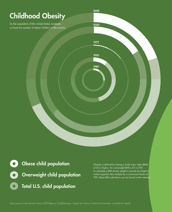
This infographic was part of a competition put forth by GOOD magazine on their transparency blog. This graphic didn’t win (winners are here), but I thought it was worth talking about the way Sarah Higgins represented changes in childhood obesity over time. She realized that in order to provide an accurate portrayal of the percentages of children who are overweight and obese, she would do well to display the overall change in the population of children in the US. Where there are just more kids in the US, there will be increases in the absolute number of children who are overweight/obese even if the percentages stay the same. Sometimes people care most about absolute numbers, sometimes they care more about proportions. It can be difficult to tell which is more important than the other. Figuring out a way to display both is often useful.
She shows us the total population as a function of the diameter of the circle. Then the proportion of kids who are overweight and obese are shaded in. We don’t know what the change in the absolute number of kids who are overweight and obese is. Let’s say you are an insurance company and you have to cover the cost of treating kids with, say, early onset Type II diabetes. In that case, you might like to have both the proportions and the absolute figures.
What needs work
If I were Sarah, I would have included some absolute numbers in each of the portions of the circle.
My larger concern is that I don’t believe the size changes in the circle are moving in step with reality. I don’t think the population of children in America is increasing as fast as the graphic suggests. I’m guessing that in order to make the concentric circles comply with the imagination that they ought to be clearly concentric, some fudging happened. Where fudging happens, using actual numbers to clarify is critical. But I don’t support fudging at all. Good infographics pick a rule that works numerically and visually. In this case, I’m guessing that if she had figured out a scalar that worked, her concentric circles would have overlapped one another and been very hard to read. She might have been able to find another scalar factor that would have been able to translate her datapoints into a 2D shape, but without trying it myself, I’m not sure this would have been so easy.
I still think this kind of concentric circle concept is worth considering when you’re confronted with an overall change in your population (more kids!) as well as changes within that population (more overweight and obese kids). If she had simply portrayed changes in the proportions of overweight and obese children we would have missed the idea that the absolute numbers are growing even faster because the underlying population is getting bigger.
References
Higgins, Sarah. (July 2010) Childhood Obesity. [Infographic}