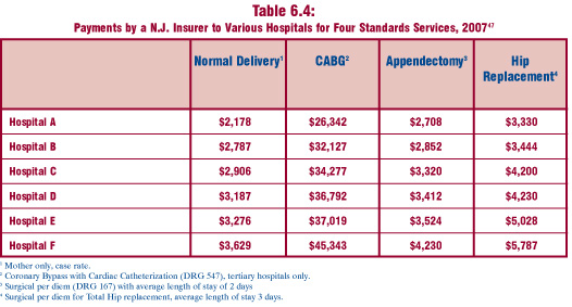
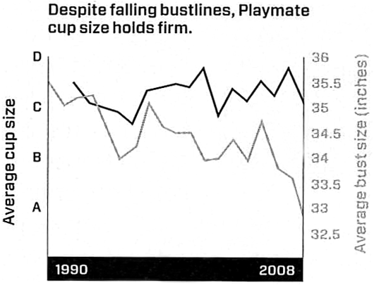
graphs

Wired Magazine Features Infoporn - Playmates' Diverging Bust-to-Cup Size Ratio
Wired Magazine Features Infoporn - Playmates

What Works

This graph does a nice job of representing three different linear scales without having to be in three dimensions. Time is on the x-axis, as it usually is. Then we see cup size on the right y-axis and bust size on the left y-axis. These two measurements use quite different scales – bust size is measured in inches and cup size is measured in two different ways, both of which are mapped onto an equidistant lettered scale. The distance between an A and a B on the left y-axis is actually about the same (1″) as the distance between 33 and 34 on the right y-axis. If you were going to set up a similar graph, it would be important to maintain the ratio between the two y-axes measurement scales. In this case, the ratio is 1:1, but you could imagine that the same style graph would work if the ratio were 1:2 or 1:3, just about any linear relationship will do.

What Needs Work

I suppose it may be more risque, but it strikes me that the same information could be conveyed with more pizzazz if the relationship were communicated visually. Most people, women included, don’t have a good sense of just what changing both cup size and bust size at the same time is going to look at. Humans are good at perceiving symmetry and proportion. Thus, I’d rather see this information as a series of clay models than as a chart. Bottom line: the information is visual to begin with, we’re talking about the way playmates look, after all. So why translate visual data (the pictures of women) into a chart?

Relevant Resources

Katharine Gammon for Wired Magazine (2009) Issue 17.02 “Infoporn: Today’s Playmates Are More Like Anime Figures Than Real Humans”

Carol Rados for the Food and Drug Administration Consumer Magazine (2005) Making an Informed Decision About Breast Implants

<a href=
New Jersey Commission on Rationalizing Health Care Resources
Hospital Pricing Graph - SF Bay Area originally published in Health Affairs by Uwe Reinhardt

What Works

This comparison is a fairly straightforward examination of the relative merits of tables vs. charts.  Both of these images are trying to help explain the tricky business of health care pricing.  The bar graph comes from an article in Health Affairs by Uwe Reinhardt that starts by taking a look at the cost of a single procedure across hospitals within a small sample of hospitals in the state of California.  The table does the same sort of thing but it was written by the New Jersey Commission on Rationalizing Health Care Resources so it looks at hospitals in New Jersey.  It also looks across a number of treatments, not just one.

Each of these presentation styles has its merits.  The graph is an instantly legible message:  the cost of a chest X-ray varies a lot from one hospital to the next.  The table doesn’t have the same instant legibility but it provides much more detail across a range of treatments, demonstrating that the pattern of discrepant charges is not restricted to a single treatment.  Further, the table demonstrates a pattern – the relative cost of hospital treatments is fairly stable.  If a hospital charges at the low end for one treatment, it probably charges at the low end for all treatments.

What Needs Work

The bar graph does a good job of providing instant legibility but it doesn’t give much detail.  It works in the introduction of the paper to orient the reader but would not be nearly as useful in the results section because it shows only one treatment.

The table provides a lot of detail, but unless someone is already deeply interested in the problem of health care costs, they may not take the time to read it. No patterns are immediately obvious – it’s just a boxy sea of numbers. The presentation of the table as a graphic does little to help the eye.  At least the columns are arranged from lowest payment to the greatest payment.  They might have been made more visually legible if the font increased or the boxes got progressively darker as payment values increased down the columns.

Relevant Links

Chaos Behind a Veil of Secrecy in Health Affairs by Uwe E. Reinhardt

How Do Hospitals Get Paid – A Primer” on Nytimes.com Economix blog  by Uwe E. Reinhardt

New Jersey Commission on Rationalizing Health Care Resources, Final Report 2008 by the State of New Jersey Department of Health and Senior Services