graphs

Figure 5. Average Salaries in New York City | Report 12, Office of the New York State Comptroller, Thomas DiNapoli

What works

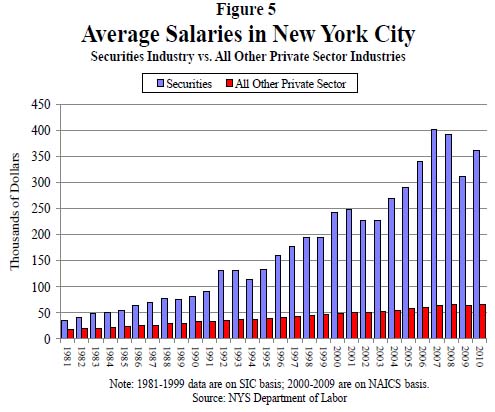
This may not be the worldest most attractive graphic, but it makes its point: financial workers have much, much higher annual income than the rest of us and the gap is growing over time. The text of the New York State Comptroller’s report said the same thing in words.

Wages (including bonuses) paid to securities industry employees who work in New York City grew by 13.7 percent in 2010, to $58.4 billion. Nonetheless, wages remained below the record paid in 2007 ($73.9 billion), reflecting job losses. In 2010, the securities industry accounted for 23.5 percent of all wages paid in the private sector even though it accounted for only 5.3 percent of all private sector jobs. In 2007, the industry accounted for 28.2 percent of private sector wages.

In 2010, the average salary in the securities industry in New York City grew by 16.1 percent to $361,330 (see Figure 5), which was 5.5 times higher than the average salary in the rest of the private sector ($66,120). In 1981, the average salary in the securities industry was only twice as high as in all other private sector jobs.

You be the judge. I think the graphic leaves a greater impact than the text alone. The two together are striking. Maybe we should…occupy Wall Street to demand a decrease in inequality?

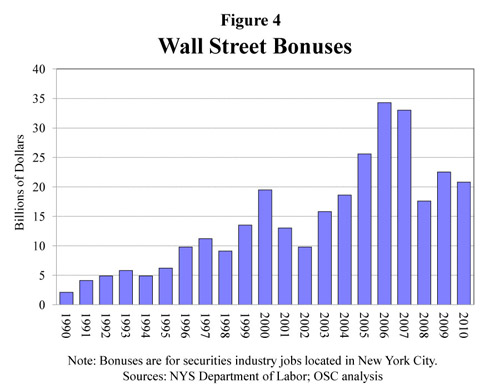
The short report has a few more interesting graphs. First, they throw together a quick graph of Wall Street bonuses. These bonuses are tied to performance and so big that they often represent more than a finance worker’s annual salary. As you can see, they took a dip, but they didn’t disappear even though the US economy is still not great.

Wall Street Bonuses | New York State Comptroller's Report No. 12, 2011

The other interesting metric the report contains is a compensation-to-earnings ratio graph, which is the right context for this discussion. Bankers often defend their large salaries and even larger bonuses by pointing out how much money they have made for their banks. I agree with the bankers that this is the place to look. The question should not be: “How much are individual bankers making?” Rather, it should be, “How much does the banking sector make and is that the way we as a society want to distribute our surplus, primarily to banks and bankers through processes of financialization?”

Ratio of banker's (and insurer's) compensation-to-net-revenues | New York State Comptroller's Report No. 12, 2011

What needs work

The graphs are not attractive and the first one reads as cluttered. I generally go with line graphs for this kind of trend data to cut down on the clutter impact, something I have repeated again and again so I won’t hammer on that point too much. I like the information behind these graphs so I am not going to swat at them too much. Excel is not a graphic design tool for graphs; I have occasionally made some sweet tables with it.

I’m glad the report put these data points into graphs, glad that the report is available during the discussions brought on by the OccupyWallStreet crowd, and glad that the New York State Comtroller’s office rolled right on ahead with the release of some fairly damning evidence against the status quo.

Want more?

Another Society Pages blog, Thick Culture, ran a post including graphs that deal with the compensation and wealth differentials between the tippy-top echelon of financiers and the rest of us at Tax Gordon Gekko.

References

DiNapoli, Thomas and Bleiwas, Kenneth. (October 2011) “The Securities Industry in New York City” Report No. 12, Office of the State Comptroller.

See also: A blog I wrote – Americans estimate our wealth distribution and fail. Horribly. using a Dan Ariely graphic about how bad Americans are at estimating the distribution of wealth in this country. Teaser: we think it is much more equitable than it actually is.

The most popular blog post of all time on Graphic Sociology: Champagne Glass Distribution of Wealth

American Generation Age Timeline (Age measured in 2009) | Pew Research

What works

Pew Research has created a tidy series of interactive graphics to describe the demographic characteristics of American generational cohorts from the the Silent Generation (born 1928 – 1945) through the Boomers (born 1946 – 1964), Generation X (1965 – 1980) [this is a disputed age range – a more recent report from Pew suggests that Gen Xers were born from 1965-1976), and the Millennial Generation (born 1981+ [now defined as being born between 1977 and 1992]). The interactive graphics frame the data well. They offer the timeline above as contextual background and a graphic way to offer an impressionistic framework for understanding generational change.

Then users can flip back and forth between comparing each generation to another along a range of variables – labor force participation, education, household income, marital status – while they were in the 18-29 year old age group OR by looking at where each generation is now. The ability to interact makes the presentation extremely illustrative and pedagogically meaningful. It is much easier to understand patterns that are changing over time versus patterns that are life course specific.

Marital status

Marital status by generation measured when young | Pew Research
Marital status by generation measured in 2009 (snapshot) | Pew Research

For instance, marital trends have been hard to talk about because the age at first marriage moves up over time, so it’s hard to figure out at what age we can expect that people will have gotten married if they are ever going to do so (I tried looking at marriage here).

What I like about the Pew Research graphics is that they show us not only what the generations looked like when they were between 18 and 29 years old (above) but also what they look like now (below). Not only does it become obvious how many millennials are choosing to remain unmarried (either until they are quite a bit older or forever – hard to say because the oldest millennials are still in their 30s), but it also becomes clear that in addition to divorce, widowhood is a major contributor to the end of marriage. Keep that in mind: somewhere around half of all marriages end in divorce so that means the other half ends in death. I would guess that a vanishingly small number of couples die simultaneously which means there are quite a few single older folks who did not choose to be single (of course, even if they didn’t choose to outlive their spouses, they may prefer widowhood to other alternatives, especially if their spouse had a long illness).

Labor force participation

Here’s another set of “when they were young” vs. “where they are now” comparisons, this time on labor force participation. It appears that the recession has walloped the youngest, least experienced workers the hardest. They have the highest unemployment rate AND the highest rate of educational attainment (and school loan debt), which leaves them much worse off as they start out than their parents were in the Boomer Generation. Even if their parents were in Generation X, they were still better off than today’s 20-something Millennials.

American labor force participation by generation (2009) | Pew Research
American Labor Force Participation by Generation (measured in 2009) | Pew Research

What needs work – Are generations meaningful?

My first minor complaint is that the graphic does not make clear *exactly* what “when they were young” means. If we look at the first graphic in the series, the timeline, it appears that “when they were young” was measured when each generation was between 18 and 29 years old. I hope that is the case. I might have had an asterisk somewhere explaining that “when they were young = when they were 18-29 years old”.

The concept of generations, in my opinion, is a head-scratcher. The idea that I had to come update this blog because the definition Pew was using to define Millennials and GenXers changed (without explanation that I could find) adds to my initial skepticism about the analytical purchase of generational categories. What is the analytical purchase of looking at generations – strictly birth-year delimited groups that supposedly share a greater internal coherence than other affinal or ascribed statuses we might imagine? If we believe that social, technological, and most all kinds of change happen over time, of course there are going to be measurable differences between one generation and the next. I imagine, though I have never seen the comparison, that if social scientists split people into 10- or 20-year pools based on their birth years they would end up with the same sorts of results. So why not think of generations as even units? And is it clear that the meaningful changes are happening in 20-year cycles? Or would 10-year age cohorts also work?

The real trickiness comes in when we think about individuals. Say someone is like myself, born in a year on the border between one generation and the next. Am I going to be just as much like a person born firmly in the middle of my cohort as a person on the far end of it? Or will people like me have about as much in common with the people about 8 years above and below us, but less in common with the people 15 years older than us who are considered to be in the same generation, and thus to have many similar tendencies/life chances/characteristics?

A better way to measure the cohort effect would seem to be to consider each individual’s age distance from each other individual in the sample – the closer we are in age, the more similar we could be expected to be with respect to things like labor force participation and educational attainment. Large structural realities like recessions are going to hit us all when we have roughly similar amounts of work force experience, impacting us similarly (though someone 10 years older and still officially in the same generation will probably fare much better). Since it is computationally possible to run models that can take the actual age distances of individuals in the same into account, I don’t understand the analytical purchase of the concept of generations.

The take-away: great graphics, bad premise.

References

Taylor, Paul and Keeter, Scott, eds. (24 February 2011) The Millenials. Confident. Connected. Open to Change. [Full Report] [See also: Executive Summary and Interactive Infographic] Washington, DC: Pew Research Center.

New Drug Wave Takes Toll | Star Tribune "A Lethal Dose" series

This graphic was subset from a larger graphic. I trimmed off the third drug comparison because it was problematic for reasons I explain below.

New Drug Wave Takes Toll | Star Tribune "A Lethal Dose" series

What works

Tracking illegal behaviors can be extremely difficult because the people participating do not want to be arrested or fined. How then, do health investigators find out what risky behaviors people are doing in their leisure time? In this case, the investigative team on the Lethal Dose series at the Minneapolis – St. Paul Star Tribune newspaper used calls to the poison control center as a proxy for tracking the rise of newly available synthetic drugs. As journalists rather than, say, doctors, they do not have access to patient data. Using poison control center calls is not a perfect indicator of the spread of the new synthetic drugs, but they have followed up these charts with an entire series in which they interview parents and friends of victims as well as a retailer more than willing to defend his right to sell.

What works for me about this graphic is that the investigators found a fairly unbiased source of information about this drug use, something that helps tie the other articles in the series together. Interviewing stubborn retailers and grieving friends and family is part of what journalists do, but those interviews are so emotionally and politically charged that it I appreciate the presence of trend information.

Because these drugs are new, it was necessary to spell out active ingredients because the average person will not know. I appreciate that they included that in the graphic rather than in a footnote.

What needs work

The shading behind the bar graphs is frivolous. It adds no information and is not necessary to guide the eye. It could be dropped and nothing would be lost.

Trend data is better as a line graph than a bar graph because it is easier for the eye to follow a line and to compare one line to another line than to follow a series of steps and compare one series of steps to another.

This blog post focuses on two drugs that use the same axis. I would have kept the same axis for the third drug even though it’s use numbers are lower. Note that all of the drugs started with low numbers and rapidly climbed – perhaps the third drug family “synthetic chemicals” is simply lagging behind by a year or so. It is hard to make that comparison when the axis is so dramatically different from the other two. There is a danger in lying with graphics here – making the third graph seem comparable to the first two implies that the third drug poses an equal threat. The numbers do not support that assumption.

References

Star Tribune staff writers. (2011) A Lethal Dose: The war on synthetic drugs Investigative reporting series.

Star Tribune. (2011) “New Drug Wave Takes Toll” [Information Graphic] American Association of Poison Control Centers, DEA.

Blog reading and writing graph by gender, 2000-2010 | Pew Internet Research
Blog reading and writing by gender, 2000-2010 | Pew Internet Research

What works

This graphic was created using a wonderful, if not entirely complete, massive Excel spreadsheet summarizing interview results from the Pew Internet Project. There are many more questions than the three I looked at. I am primarily interested in how many adults write blogs and I was happy to see that the Pew Internet Research center has been asking adults about their blog reading and writing practices for about a decade. Just to give it context, I also plotted the percentage of adults using the internet at all.

I am also interested to see that women and men write blogs at about the same rate, these days, even though I know that they aren’t writing the same kinds of blogs. Food bloggers, for example, are overwhelmingly women as are baby bloggers (aka mommy bloggers, but using the term ‘mommy’ is too gender-restrictive). Political bloggers and tech bloggers tend to be male more often than not, though I know less about them.

What needs work

The interviews are different from year to year – some years I was averaging five or seven data points on the same question and some years I had only one (or, sadly, none). I wish there had been more years of data available on blog reading, for instance.

If I had one takeaway point it would be that we need to keep funding places like Pew to conduct detailed, ongoing research. I have found it invaluable to have access to their research and it makes the work I am currently conducting about food bloggers relatable to a wider body of practices.

References

Pew Center for Internet Research. Usage over time spreadsheet.
— If you cannot click on that link and automatically start a download, try downloading it from the Pew website

Food Blog Study | Web Crawler Progress Egg

Food Blog Study Update

I heard there was a graduate student once who used egg timers to break her dissertation down into writeable chunks. She had these timers all over the apartment, flipping one over to start a new bout of writing. Once it ran out, she might keep on writing since there was no buzzing or beeping to interrupt her. If she looked up and the sand had all run through, she would flip over another egg-timer to measure out a dose of ‘free-time’. Maybe I had her strategy in mind while I was trying to come up with a way to monitor progress on the food blog study. Large, long-term projects can envelope me, making it hard to see either where (and why) I started the project and where I mean to end up while I’m toiling away in the trenches of the day-to-day. This post is not about a final product. Rather it is about how I use information graphics to help me keep my mind on both the questions I started with and the place I mean to end up when all is said and done.

The food blog study is broken into three parts. The interviews (N=22) have all been conducted and are out being transcribed. The survey cannot begin until the web crawler has gotten to a stopping point. So where do things stand with the web crawler? That is not an easy question to answer except to say that it is doing what good bots do, chugging along finding food blogs to add to its growing collection with minor down times for maintenance here and there.

The graphic above demonstrates how the network set is growing – I simply used the file size of the daily cumulative db output to tell me how big to make each day’s egg. Still, looking at file size is kind of silly – it does not help me figure out when the network has been sufficiently crawled. It simply represents the absolute size of the database and because I do not have some target absolute size as my endpoint, knowing the current absolute size is mere trivia and not analytically useful.

Rather than considering absolute size or the linear growth of the network data, it is a lot more meaningful to examine the rate of change of new nodes from one day to the next. For comparison sake, I graphed both the linear growth of the network (top graph) and the number of nodes added per hour for each day in July (bottom graph) with the exception of July 17th when the crawler was down for maintenance. The linear growth is chugging along consistently enough with a few exceptions for reasons like maintenance and accidents (someone unplugged my computer from the internet for six hours one day. oops.). The rate of new food blogs added to the network set per hour is finicky, a pattern that is much easier to see in the bottom graph. That graph was calculated by taking the number of new food blogs added to the network during a given run and dividing it how long the run lasted to generate an hourly rate of growth. That hourly rate is what is plotted below – the crawler’s sweet spot seems to be when it is adding about 60 – 90 new food blogs per hour.

Food Blog Study | Graphs of Web Crawler Progress

The plunge in the rate of new blogs added per hour around the 18th of July is artificial. I happened to add a command that day which retroactively removed all of the blogs primarily focused on cocktails, wine, and beer. Their removal nearly outweighed the new food blogs that were added to the network that day so the overall rate of new blogs added appears to be extremely low at only 6 per hour.

This graph is extremely useful for keeping in mind where I started and helping me to figure out when I have gotten some where. I will know that the food blog bot is exhausting new nodes and that I have started to run into the bounds containing the food blog network when the rate of newly discovered food blogs per hour starts dropping and does not recover. Right now, the crawler is still pulling in new entries fairly rapidly so I know I am probably going to be babysitting it for at least another week. Thus far, the roughly-cleaned network includes about 32,000 nodes. Yes, folks, that means there are greater than 30,000 food blogs out there in the world. Probably a lot more, especially because the bot speaks food in English, Spanish, French, Italian, and German so the network under consideration is multi-national though not quite global.

Note on graphics

Could that egg have been perfectly round? Yes. And would perfectly round circles have been easier for average humans to measure with their eyes? Yes. So why did I choose an egg shape? Because I feel like this project is an incubation period. Data collection can be a delicate process – I would say that is especially true with respect to the web crawler because it was a tool custom-built for this project and thus has not been used and tested elsewhere. I also chose an egg because it is not important if viewers understand exact figures – this graphic was intended to provide an impressionistic view of the rate of growth of the network that the crawler is gathering. It grows incrementally, not by leaps and bounds. Like tree rings, the concentric nature of these eggs demonstrates that some days generate fatter rings than others.

As for the two graphs, I wanted to try using the same horizontal access because I wanted to make sure people understood that those two graphs are best understood as a pair. Basically, one is the derivative of the other, though there’s no need to pull out your calculus textbook just to understand these two. The top one just shows the total number of food blogs in the network so far. The bottom one shows how fast new blogs are being added from day to day. I didn’t want to clutter up the graphs with too many words so I opted to go with a single horizontal access, short titles, no labels for the vertical access (they are implied in the title), and I kept the two points about strange days outside of the bounds of the bottom graph. I don’t know if it is acceptable to stick asterisks in a graph, but I did it.

References

Noren, Laura. (2011) Food Blog Study.

How happy are parents vs. non-parents? | Graph
How happy are parents vs. non-parents? | Graphic by Norén based on Margolis and Myrskyla

Kids and happiness

Thanks to my twitter feed I landed on Philip Cohen’s blog post “Children beget happiness, eventually” on his blog Family Inequality. In the post, Cohen discusses A Global Perspective on Happiness and Fertility which appeared in Population and Development Review last March.

Margolis and Myrskyla used the World Values Survey from 1981 – 2005 for a total of 201,988 responses across 86 countries to perform their inquiry into the relationship between having kids and being happy. They measured happiness by asking people “taking all things together, would you say you are very happy, quite happy, somewhat happy, or not at all happy?”. They controlled for all sorts of things that probably matter like socioeconomic status, country level effects, and state welfare regimes. This is global evidence, folks, not US-only.

Cohen included the graph below and discussed the author’s findings which, in summary, are as follows:

1. Having kids does not lead to happiness when parents are actively involved in raising said children.
2. Older parents consistently report being happier than their childless counterparts. [My editorial comment: It is reasonable to believe that, for the most part, the children are no longer living with their parents by the time their parents start to report increases in happiness. At the very least, the kids are at least spending more time out of the home by the time mom and dad are between ages 40 and 49. The majority of kids are almost surely out of the house by the time their parents are 50+ which is the ‘happiest’ time to be a parent. Perhaps it’s because parents are proud of their kids’ accomplishments, perhaps it’s because the parents are no longer anxiously worrying about their kids well-being on a day-to-day basis. Who can say.]
3. Results in the 15 – 19 age cohort have fewer data points and are thus somewhat less representative. It’s hard to have three or four kids while in that age cohort.

Happiness and number of children by age of parent | Margolis and Myrskyla

An experiment

I used the exact same evidence to create the graph at the top of the blog because I wasn’t satisfied that the results were being clearly communicated by the graph above. Instead of plotting the happiness of age cohorts, I flipped it around and looked at happiness by number of children. Since I used the exact same information – pulling it directly from the graph because I couldn’t find a corresponding table in the paper – I do not have distinctly different findings to report. Duh. However, this is an excellent example of why visualizations are meaningful. It’s the same information, plotted in two different ways.

In my version, it is clearer to see that having 1 – 3 children represents extremely similar patterns of happiness across the life course. I discount the results at the very low age range because we know that the data at that end is less-than-representative. If we just look from the 20-29 cohort through to the 50+ cohort, we see that having more kids eventually represents more happiness for parents but that they are about equally unhappy during the most active years of child-rearing.

Having four or more kids breaks the pattern. This is evident in both graphic representations. In my opinion, it is more evident in the first version of the graph than the second version, as they appear in this post. I used a similar sensibility for the colors of 1, 2, and 3 children trends and a different kind of color for the 4+ kids scenario.

The graphs do not explain why having four (or more) kids would be so different than having, say, three kids. More study is needed.

My #1 take-away: do not have four or more children if you value your happiness.
My #2 take-away: Think twice about having any children at all if you would prefer to be happy for the twenty or so years it’s going to take those kids to move out.
My #3 take-away: Thanks, mom and dad. I hope you’re happy now.

References

Cohen, Philip. (14 May 2011) Children beget happiness, eventually [blog post] on Family Inequality.

Conley, Dalton. (2005) The Pecking Order: A Bold New Look at How Family and Society Determine Who We Are, New York: Vintage.

Margolis, Rachel and Mikko Myrskyla. (9 March 2011) A Global Perspective on Happiness and Fertility in Population and Development Review, Vol.37(1): 29-56.

Original Version of the bar graph

How is the scoring system determined?

British researchers affiliated with the Independent Scientific Committee on Drugs met for a one day workshop and constructed a composite scoring system to determine which drugs are most harmful both to individuals and to society collectively. Scores can range from 0 – 100. Authors David Nutt, Leslie King and Lawrence Phillips found that,

heroin, crack cocaine, and metamfetamine were the most harmful drugs to individuals (part scores 34, 37, and 32, respectively), whereas alcohol, heroin, and crack cocaine were the most harmful to others (46, 21, and 17, respectively). Overall, alcohol was the most harmful drug (overall harm score 72), with heroin (55) and crack cocaine (54) in second and third places.

The full list of factors that were included in the composite score are here:

  • Mortality
  • Damage
  • Dependence
  • Impairment of mental functioning
  • Loss of tangibles
  • Loss of relationships
  • Injuries to others
  • Crime increase
  • Environmental degradation
  • Family breakdowns
  • International turmoil
  • Economic cost
  • Loss of community cohesion and reputation

Though it is possible to go into an explanation of how each of these was measured and subsequently combined to produce the composite scores, I am going to leave that discussion to the authors of the original study. There’s an overview graph below and the full article Drug Harms in the UK: A multi-criteria decision analysis is at the Lancet.

Composite scores showing contributions from harm to individuals and harm to society

What can be done?

I found it interesting that there was no attempt made to distinguish between legal and illegal drugs. Yes, of course, some drugs are not clearly legal or illegal. They are legal when prescribed and supervised by a doctor but illegal when used off-label or outside the medical authority system (like anabolic steroids, methadone, and marijuana in California). I assumed that most methadone users are under some kind of supervision but that most anabolic steroid users are using the steroids off-label (ie illegally). You can quibble with my choices below. The point here is that I found the graph to have more context if the legality issue was visually inscribed into it.

Photoshopped version of graph that highlights legal drugs

There are age limits and places where it’s illegal to smoke or drink, but for the most part everyone will be able to use alcohol and tobacco legally for most of their lives. Methadone is probably being used legally in most cases. That’s why I shaded those bars grey. I am not expert on methadone, but I see that it is much less harmful to users and to society than heroin, the drug it stands in for, so I guess if this were the only data I had to make a decision about continuing methadone treatment programs, I would keep them going. I would also call for close scrutiny of methadone programs. Something is clearly not working as well as it could be.

As for alcohol and tobacco…well…it’s hard to argue *for* the continuing legality of alcohol. How large do detriments to society have to be to trigger additional control mechanisms? The authors of the study noted that alcohol is part of society and it isn’t going anywhere. I agree. Prohibition was a failed experiment in this country and I’m not suggested we try it again. However, I would like to reopen the debate about how the negative impacts of alcohol can be alleviated. I recommend that all new cars must have breathalyzers in them. If the driver cannot blow a legal sample, the car won’t start. Yes, people could game that system by having their friends blow for them, but often one’s friends are also drunk. And hopefully, friends really wouldn’t let their friends drive drunk. Once upon a time, seatbelts were considered extraneous and seatbelt laws were considered constraints upon American’s rights to freedom and the pursuit of happiness. Well, when a drunk driver kills one of your family members, you might decide that the sudden loss of your mother or son or niece puts a much bigger crimp in your pursuit of happiness than a breathalyzer in your car ever would have. Will breathalyzers make cars cost more? Probably. But the cost of dealing with car accidents caused by drunken driving, even when they aren’t fatal, is absorbed by random individuals who happened to be in the wrong place/time as well as tax payers who pay to repair guard rails, subsidize public hospitals and EMTs, pay cops’ salaries, and so on.

References

Nutt, David J, Leslie A King, and Lawrence D Phillips. (6 November 2010) “Drug harms in the UK: a multicriteria decision analysis” The Lancet, Vol 376(9752): 1558 – 1565.

Magnatune Pricing | Evidence from Voluntary Musical Album Pricing

Voluntary Pricing

I put this simple bar graph together to illustrate the following text that I got from Yochai Benkler’s paper and he got from a paper about Magnatune pricing,

In the recent paper on Magnatune, the data revealed that over a five year period, 48% of users paid $8 per album where $5 was the minimum, and only 16% paid the minimum. Another 15% paid $10, 7.3% $12, etc., up to 2.6% who paid $18 per album. Payments were highly anchored around coordination focal points — for example, the drop down menu called “$8” the “typical” donation. While 48.05% of fans paid $8, only 2.93% paid $7.50 and 0.34% paid 8.50.

I wanted to see how these numbers looked as a graphic because it was a little hard to make sense of what was happening just reading about them. What concerned me was that Benkler seemed to have crafted his text to imply – but not state directly – that voluntary music pricing schemes lead people to pay more, not less, for their music. This would make a fantastic story, but for some reason I wasn’t entirely comfortable just going ahead with that implication tucked into my subconscious mind.

When I graphed it, I added a block on the lower end of the scale to help illustrate the fact that Magnatune will not sell albums below $5. So, if we were expecting a bell curve of payment choices, all of the people who might have paid less than $5 were bunched up at the $5 mark or priced out altogether. Maybe they grumbled and agreed to pay $5 when they would have chosen $2 or $3 or perhaps they just didn’t buy the album at all. It’s hard to say.

Of course, I wouldn’t really expect people to distribute their payments for an album along a bell curve. I would have expected more clustering around the lower numbers – why would people pay more if they could pay less? Especially because they may not have taken the time to listen to the whole album for one reason or another…so they are paying for something that is not completely known. We’ve all been there before – some songs on albums just aren’t as good as others.

On the other end of the spectrum are the people who not only have taken time to get so familiar with the music that they aren’t worried about the dreadfulness of the unknown. Benkler’s paper indicates that people who develop close relationships with the musicians through collaborative efforts or fansites might be willing to pay more as a sign of respect and admiration.

Getting back to the graphic as a mechanism for making sense of the information, the point is that there are actually FEWER people in the lower range than in the higher range. Nearly half of people paid the requested amount ($8) but where they deviated from the requested amount, more people paid decided to give more, rather than less.

How can we explain that irrational behavior? I’m guessing that it has something to do with the free riders, the people who aren’t paying anything at all. These are not people who are getting their music from Magnatune, these are the friends of those paying people who are sharing iTunes accounts and getting their new music for free. There are other ways to get music for free besides sharing iTunes accounts but I’m not trying to get into all that. My point is that, after having graphed this information, I feel reasonably assured that there are quite a few people who are listening without paying a thing. It doesn’t really matter to me how they are doing that.

What matters is that the shape of the graph and the distribution of payments that we can see leads me to believe that there ought to be a substantial proportion of people – at least 14% – who are free riders. That’s a very rough estimate, but it complicates the happy story that if musicians pursued voluntary pricing they might stand to make more. It’s hard to say if that’s true or not. I guess it’s nice to allow your biggest fans to ‘vote with their dollars’ and just shrug off the free-rider problem as being outside the pricing structure. If people don’t want to pay, they are going to find ways not to pay no matter how the pricing structure is set up. But if people DO want to pay more, they can only do so under a voluntary pricing scheme. If the prices are set, they cannot opt to ‘vote’ with their dollars and pay more.

*I stick ‘vote’ in scare quotes when I am linking it up to economic activity because I like to reserve the term voting for direct political participation rather than for political participation that is supposedly possible by participating in capitalist exchanges. I hardly think that consumer behavior is as critically important as electoral behavior. Not everyone agrees with me, but that’s not a topic for this post.

References

Benkler, Yochai. (2011) “Voluntary Payment Models” in Rethinking Music. Cambridge, MA: Berkman Center for the Internet and Society at Harvard University.

Loneliness and Fat Consumption among middle-aged adults | Cacioppo and Williams

What works

Written by a social neuroscientist, the book Loneliness contained this heartfelt graph on page 100. Yes, even I feel the phrase ‘heartfelt graph’ is an oxymoron. But the way that the graphic artist worked over the details here – the way the edges of the butter columns are rounded, the way that the paper is folded back, even the way that the grid lines are rendered makes this two bar graph captivating. I am also intrigued by the mix of digital and hand-rendered – most everything was hand-drawn except the axial numerals and the text labels. I like the mix. I probably would have liked it better if the lettering had also been hand-rendered but I think that’s just me being a bit too precious about hand-rendered images.

The book describes the way that loneliness is a neurological event, one that overlaps with social and psychological parameters to produce a more or less predictable set of occurrences. In this graph, authors Cacioppo and Williams are discussing recent findings that indicate lonely middle-aged adults tend to get more of their calories from fats than non-lonely middle-aged adults. For younger adults, loneliness does not seem to have an effect on either food consumption patterns or exercise patterns.

Socially contented older adults were thirty-seven percent more likely than lonely older adults to have engaged in some type of vigorous physical activity in the previous two weeks. On average they exercised ten minutes more per day than their lonelier counterparts. The same pattern held for diet. Among the young, eating habits did not differ substantially between the lonely and the nonlonely. However, among the older adults, loneliness was associated with the higher percentage of daily calories from fat that we noted earlier (and that is illustrated in Figure 6).

Perhaps because this book is about empathy-inducing loneliness, it is especially nice to see a tenderly hand-drawn graph rather than something far less engaging, the standard excel-produced item. The same numerical information would have been conveyed – and in fact that information was conveyed fairly well in the text itself – but the hand drawn element indicates that the topic is worthy of more than quantitative concern alone.

I am about halfway through this book and so far, I recommend it. Even if you are not interested in loneliness, the book does a good job of demonstrating how diverse research fields can be woven together to examine a topic common to all. The book draws from psychology, sociology, evolutionary biology, and neuroscience to help explain why some people are lonelier than others and what the impact of loneliness can be on the short-term and long-term health and social outcomes for individuals.

What needs work

For the record: I cannot draw or render or do anything good with a pencil besides finding a way to hold my hair out of my face. I tend to be overly appreciative of drawings and people who can draw. My critique here is of myself and others like me who swoon over the hand drawn.

I also wish there might have been a way to get the exercise information included, if not on the same graph, than on a companion graph right next to the butter sticks.

In a public announcement sort of way: folks lonely and nonlonely seem to take much solace in eating. That’s a large amount of fat consumption.

References

Cacioppo, John T. and William Patrick. (2009 [2008]) Loneliness: Human nature and the Need for Social Connection. New York: W.W. Norton.

Market data for natural gas, 1990 - 2011
Market data for natural gas, 1990 - 2011 | The New York Times

What works

If one graphic cannot tell the whole story, use three. Or four. Or four static graphics plus an interactive graphic (keep reading)! Most people would have stopped creating graphics after they produced the first graph – the one that tracks oil and natural gas prices from 1990 up to 2011. I appreciate the second graph which compresses the salient point from the first graph into a single line. It hammers home the point that what we are meant to notice is not the fluctuation in natural gas prices so much as the fluctuation in the difference between gas and oil prices. The other two graphics both deal with oil consumption only, something I find slightly odd given that the story is about natural gas. Yes, it is clear that there is a relationship between oil and natural gas consumption – we see that with the first two graphs. But we also see from the first two graphs that the relationship between oil and gas is not always predictable, especially not right now where natural gas is significantly cheaper than oil, cheaper than we would have predicted if we had to use the past as a guide. Yes, of course oil prices might go up as they respond to increasing demand from “the rest of the world” (weird terminology that means NOT US, Japan, or “developed Europe”).

It’s also true that oil prices are sensitive to political unrest in the middle east, which has been underway lately in a number of countries. It is difficult to tell if these graphs are using numbers crunched before the revolution in Egypt and unrest in Middle Eastern countries or after. The graphic was published 25 February 2011, well after the Egyptian revolution began. But the weekly price is listed in January 2011 dollars which means the rest of the information might have preceded the Egyptian revolution. Still, the path towards divergence appears to have begun in 2009, which renders the timing question I raised a bit beside the point. And this is why we look at trends over long periods of time. Point estimates can be misleading.

More is more

Natural Gas Fracking

The Times has been covering natural gas regularly, and it seems they decided that more is more in pursuit of a fully comprehensive understanding of natural gas not just as a brute commodity being traded in a free market, but as a potentially harmful environmental toxin, especially when it is seen as being at the center of brutal extraction practices. There is an elegant slideshow-animation that describes how natural gas is extracted and explains what the consequences of this practice can be as a result of the mechanical changes the drilling process leaves behind.

The combination of slideshow and animation works well here. If it were just an animation, it would be hard to fit the explanatory text within the temporal flow. Giving the viewer a chance to watch a small segment of animation and then read an explanation about what is supposed to happen and what can go wrong brings appropriate pacing to the explanatory experience. What’s more, I think it is a great idea to force the viewer to keep clicking in order to advance the slides. It’s barely above a fully passive learning experience, but anything that raises the level of participation – like reading or having to click somewhere – helps keep the viewer’s body and mind more fully engaged and pumps up retention.

My favorite slide came near the end – these people built up some narrative tension. I kept wondering where this drilling process went wrong. So when do the toxins hit my drinking water? That’s what I was wondering, and this slide filled me in. It’s a simple question, one that we know we’ll find the answer to based on the title of the slideshow, but it’s always good if your viewer goes in with some direction. An obvious question is fine. Getting viewers to envision a more complicated question might be better, but overall I think this approach works well.

Natural Gas Fracking - Water problems

Please click through to make sure you understand why fracking presents environmental problems. I do not want to spell it out here because I think that would lessen your experience of the interactive graphic as a learning tool.

References

Norris, Floyd. 25 February 2011 Two Directions for the price of natural gas and oil New York Times.

Graham Roberts, Mika GrÖndahl and Bill Marsh. 26 February 2011 Extracting Natural Gas from Rock [Interactive Graphic]. The New York Times.

PS

It feels like swearing to talk about fracking. Thank you, Battlestar Galactica.