graphic comparison

Figure 1 from "Diet, Energy, and Global Warming" by Eshel and Martin

US Greenhouse Gas Inventory Report - Executive Summary, Figure ES-11

Why This?

Continuing what I have decided will be an agriculture theme for the week, I went looking for data related to energy efficiency of diets. This concept first became news in the 1970’s during the energy crisis, championed in the book “Diet for a Small Planet” by Frances Moore Lappé which has recently been released as a 20th anniversary edition. I was interested in getting to the bottom of the planetary (rather than the personal) part of her argument which is that to produce unit weight of protein in the form of beef/veal, the animal is going to need an input equivalent to 21 units of protein and we’d be globally better off if we just ate the plant sources ourselves in terms of energy consumption and intelligent stewardship of the planet. I didn’t quite find what I was looking for to back up that data (yet) but I did find the contemporary twist on that argument which relates dietary choice to greenhouse gas emissions.

What Works

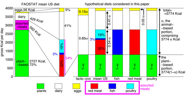
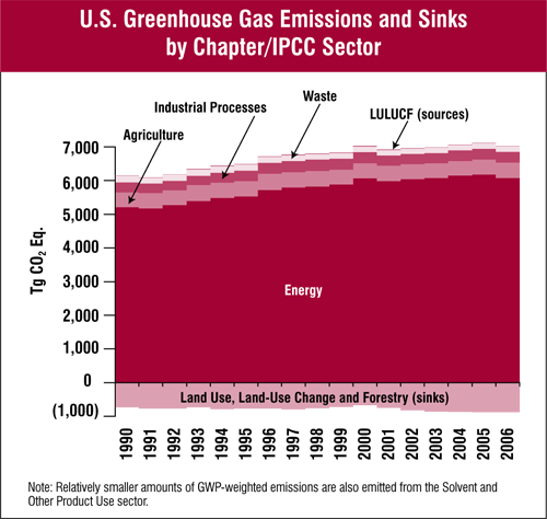
The first graphic doesn’t work all that well and probably makes no sense to you so we’ll come back to that. The second graphic, from the EPA, is not particularly pretty, but it has strength in simplicity and it makes intelligent use of the x-axis to represent greenhouse gas sinks. (Note: The visual representation does a great job of communicating that are emissions dwarf our sinks better than reading a number on a page would do.) Whereas the first graphic fails miserably to represent the difference in the energy efficiency of diets, the second graphic at least conveys the conclusion of the report that went along with the first graphic which is that the difference between eating the standard American diet and a vegan diet is, “far from trivial, …[it] amounts to over 6% of the total U.S. greenhouse gas emissions.”

The details of the report accompanying the first graphic are worth perusing and I only wish they would have spent more time trying to represent them graphically. The authors, Eshel and Martin, compute the comparative impacts of transit choice vs. dietary choice and find that, “while for personal transportation the average American uses 1.7 × 10⁷–6.8 × 10⁷ BTU yr−1, for food the average American uses roughly 4 × 10⁷ BTU yr−1.” That would make an excellent graphic in about ten different ways and catapult them past the problem that many readers are going to get tripped up looking at the orders of magnitude and units and miss the point.

What Needs Work

The first graphic is supposed to show the composition of the hypothetical diets considered. The mean American diet as reported by FAOSTAT has a little break-out component that provides more detail about the constituents of the animal products category but it took me a long hard look to figure that out. The break out part should have been constructed so it wasn’t exactly the same scale as the rest of the graphic (which it isn’t, by the way) otherwise it just reads like another column with viewers liable to assume that they can follow the scale on the y-axis. But the y-axis doesn’t relate to the break-out part at all – only the percentages listed alongside it are salient.

My bigger problem with the first graphic are the next five bars. Just to help you navigate α represents the proportion of the standard 3744 kcal diet that comes from animal sources. See α, think animal. A key would have been nice. Now that you know that, looking at the graph, it appears that each of the diets gets the same amount of kcals from plant sources because the green segments are all the same size. However, this is not actually what the authors are trying to convey. You have to read through the text quite carefully to pick out what proportion of each diet comes from animal sources overall. Once having done that, this graphic can help you further breakdown how those animal sources are apportioned. For example, the ovo-lacto group gets none of their animal protein from animal flesh – only from dairy (.85 of animal protein total) and eggs (.15 of animal protein total). But it took a good ten minutes of going between text and graphic to figure out what they have charted here. In all honesty, I’m still a little confused about whether the last three diets just switch out fish for meat for poultry and keep the same total number of kcalories in the animal flesh category relative to dairy+eggs. And I certainly can’t tell if any of those hypothetical diets have a greater or lesser proportion of kcals coming from plants by looking at this graphic.

In summary, the two graphics here were not trying to make the same point. The first one was trying to explain how the authors modeled their hypothetical diets in order to convince you that, in the end, and in conjunction with some other writing and graphic representation, if Americans moved to vegan diets the national greenhouse gas emission rate would drop by 6%, on par with what would happen if everyone started driving a Prius. The second graphic does this much better using aggregate data (and thus a totally different approach than Eshel and Martin).

Relevant Resources

Eshel, Gidon and Martin, Pamela. (May 2005) Diet, Energy and Global Warming. Submitted to Earth Interactions.

United States Environmental Protection Agency. (April 2008) Inventory of U.S. Greenhouse Gas Emissions and Sinks: 1990-2006

Moore Lappé, Frances. (1971, 1991) Diet for a Small Planet Ballantine Books.

USAID map of the area in and around Darfur
BBC map of Gaza 4 January 2009

What Works

The best thing about the map of the camps around Darfur is that it exists at all. After looking at some of the elaborate maps that have been part of the news coverage of Gaza (see the one here, click through on the caption for a larger image) and earlier, of the bombings in Mumbai, I assumed I would be able to find something of similar quality related to the camps around Darfur to sate my curiosity about how big the camps are, where they are, how they are supplied, whether or not they are targets, and so on. But this map from USAID is one of the only things I could find around these interwebs that presented a basic map narrative of the camps in Darfur. Notably, I found many graphics promoting concerts that were fundraisers or awareness-raisers for the people in Darfur. Some of these concert posters and t-shirts got around the (apparently) tricky question of where Darfur is by just using an outline of the continent of Africa.

What Needs Work

The lack of a decent map-narrative around the problems in Sudan/Darfur indicates an uncomfortable fissure in the epistemology of crisis. I’m willing to conjecture that there may be an inverse relationship between perceived cultural differences and the production of ‘fact’ based information around crises. There isn’t an easy way to measure social/cultural difference, but it seems that the greater the degree of “otherness” of the people undergoing a crisis, the more likely the story is to be covered not with an onslaught of ‘hard facts’ that can be diagrammed, mapped, combed, regressed, permuted, computed, etc. but rather the story will be covered by emotive tools like first person narratives, photographs, and even awareness raising concerts, vigils, and that sort of thing.

I would love to hear what readers think about this theory of mine and I’ll continue to look for examples of differences in the use of information graphics across seemingly similar data sets.

Relevant Resources

BBC Map of Gaza Offensive – Week One (5 January 2009) with narrative time line.

NYTimes.com Israel and Hamas: Conflict in Gaza (4 January 2009) with narrative time line.

USAID map of camps in Sudan

USAID page on Sudan

The United States Holocaust Museum Mapping Initiatives Crisis in Darfur. This is a plug-in to googleEarth that layers photos, videos, quotes, and a bit of 2004 information about the camps on the googleEarth map of Sudan/Chad.

NYtimes.com - College Endowments Loss Is Worst Drop Since ’70s
Remixed College Endowment Graphic

What Works

Stories like this one that cover a data driven report should always include an info graphic. But, of course, this is coming from an avid fan of info graphics. Kudos to the NYTimes for including a graphic and for including not only the punchline – the huge drop in college endowments in the very recent past months – but also some context about what college endowments were doing before. I would have liked even more context because fiscal year ’08 was already seeing some of the downturn in the market. Total movement for all endowments, or endowments divided into fewer categories, since ’00 would have been even better.

What Needs Work

It is intuitive to portray data that “drops” (according to the headline) or rises with the change along the y-axis. I did a little remix just to show you what I mean. In the first glance at the data, the increase or decrease is going to be more legible when it’s happening on the vertical axis. It’s just the way we learn to read charts and graphs. Before that, I suppose our tendency to associate the vertical axis with things rising and falling came from gravity. The laws of physics aren’t going to change – stick dropping/rising data on the y-axis until gravity causes changes in the x-axis.

The other thing I might have changed was the choice of categorization. What is gained by splitting the data into the uneven increments that appear here? First, increments should either be even or should have some reason for being uneven. We’ve got a $500m range, a $400m range, a $50m range…it’s all very unclear why these are the important categories, especially when there is no immediately obvious significant difference between them. They all seem to have been more or less flat in FY’08. Then they all plummeted ~21-22% between July and November of ’08. I would have opted for more historical context and fewer categories.

The Wall Street Journal is running basically the same story with a different graphic though they still stick with the horizontal arrangement. I like there’s even less because they

Relevant Resources

Katie Zezima (27 January 2009) Data Show College Endowments Loss Is Worst Drop Since ’70s at the NYTimes.com

John Hechinger (27 January 2009) College Endowments Plunge Wall Street Journal Online

National Association of College and University Business Officers 2008 NACUBO Endowment Study Available for Purchase.

Eye Color Map from Peter Frost (2006) via Beals & Hoijer (1965) An Introduction to Anthropology
Eye Color Map of Europe - In color!

What Works

Color works. It helps that in this case, the characteristic being mapped is eye color, so it’s kind of a no-brainer to shade the areas where blue eyes are prevalent in blue and the areas where brown eyes are prevalent in brown. Even if this graph were to be printed in a grayscale journal (which is probably why the one on the left tries to use hatching to distinguish the areas), using degrees of full shading is easier to distinguish than using hatching patterns. Most printers can handle printing 10% gray, 50% gray, and so on.

What Needs Work

The areas that need some work, even in the color version, are the areas between blue and brown. Right now, those areas are lighter blue and lighter brown. The problem is that because the blue is mapping directly to the characteristic in question – blue eyes, blue area – it’s easy to think that the lighter blue areas represent areas where people have really light blue eyes. But, in fact, those areas are full of a mix of people, some with light eyes, some with dark eyes. I might have gone with a staggered blue/brown pattern or just chosen a color that doesn’t have anything to do with eye color, like purple.

Relevant Resources

Peter Frost (2006) Why Do Europeans Have So Many Hair and Eye Colors?

Western Paradigm blog (February 2008) The Blue Eye Map of Europe [Note to Readers: I couldn’t find the original version of the color map so I am linking to the blog where I found it rather than the original source.]

<a href=
New Jersey Commission on Rationalizing Health Care Resources
Hospital Pricing Graph - SF Bay Area originally published in Health Affairs by Uwe Reinhardt

What Works

This comparison is a fairly straightforward examination of the relative merits of tables vs. charts.  Both of these images are trying to help explain the tricky business of health care pricing.  The bar graph comes from an article in Health Affairs by Uwe Reinhardt that starts by taking a look at the cost of a single procedure across hospitals within a small sample of hospitals in the state of California.  The table does the same sort of thing but it was written by the New Jersey Commission on Rationalizing Health Care Resources so it looks at hospitals in New Jersey.  It also looks across a number of treatments, not just one.

Each of these presentation styles has its merits.  The graph is an instantly legible message:  the cost of a chest X-ray varies a lot from one hospital to the next.  The table doesn’t have the same instant legibility but it provides much more detail across a range of treatments, demonstrating that the pattern of discrepant charges is not restricted to a single treatment.  Further, the table demonstrates a pattern – the relative cost of hospital treatments is fairly stable.  If a hospital charges at the low end for one treatment, it probably charges at the low end for all treatments.

What Needs Work

The bar graph does a good job of providing instant legibility but it doesn’t give much detail.  It works in the introduction of the paper to orient the reader but would not be nearly as useful in the results section because it shows only one treatment.

The table provides a lot of detail, but unless someone is already deeply interested in the problem of health care costs, they may not take the time to read it. No patterns are immediately obvious – it’s just a boxy sea of numbers. The presentation of the table as a graphic does little to help the eye.  At least the columns are arranged from lowest payment to the greatest payment.  They might have been made more visually legible if the font increased or the boxes got progressively darker as payment values increased down the columns.

Relevant Links

Chaos Behind a Veil of Secrecy in Health Affairs by Uwe E. Reinhardt

How Do Hospitals Get Paid – A Primer” on Nytimes.com Economix blog  by Uwe E. Reinhardt

New Jersey Commission on Rationalizing Health Care Resources, Final Report 2008 by the State of New Jersey Department of Health and Senior Services