Editing process in graphic design
The editing process in graphic design is somewhat different than the editing process in writing. Writers tend to start with a skeleton, make sure the bones are all in the right places, and then slowly add and sculpt musculature and skin through iterative processes. Graphic designers start with a whole bunch of skeletons, subtract a few, add musculature to the rest, subtract a few of those, add skin to the remaining ones, and then only late in the process will a single design go through a final polishing process.
One of the ways social scientists teach students to become skeptical about the things they read is by teaching them how to edit their own work and the work of others. Students start to see how pieces of written work represent a series of choices. They see that what they’ve read could have gone in other conceptual directions, used different evidence, been shortened, lengthened, stripped of jargon, or otherwise constructed and styled in new ways that could have changed the meanings taken away by the readers. Learning to construct, critique, and polish writing is a major part of how readers develop the tools they need to understand and analyze the works they read.
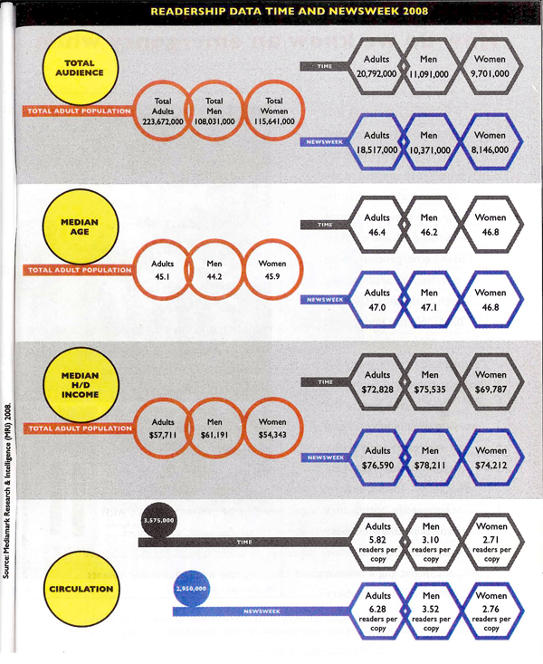
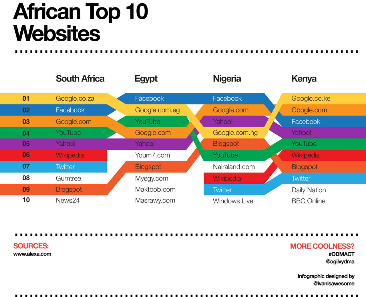
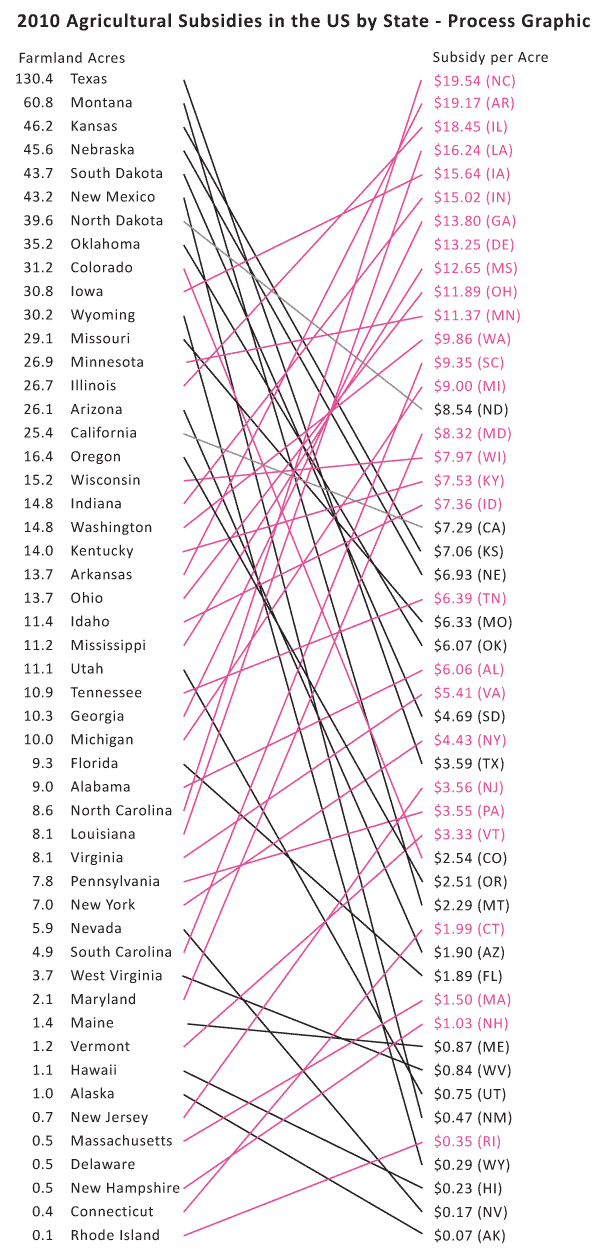
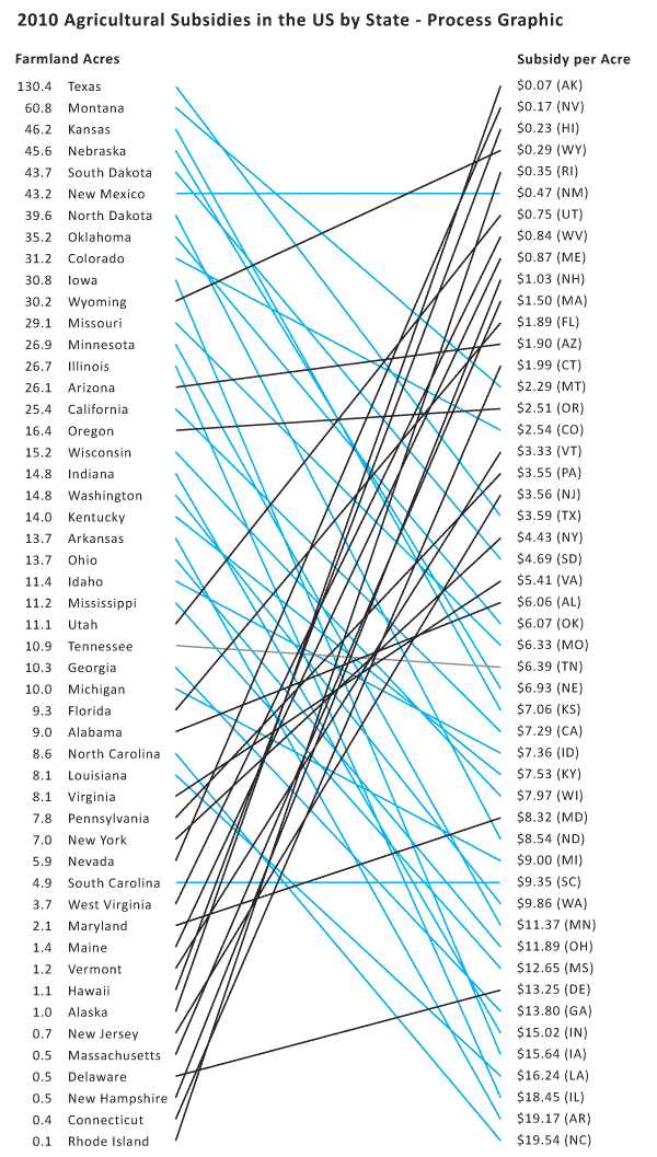
There is far less educational time spent teaching students how to create visual work, especially visual work outside of the realm of personal expression (I feel like most arts programs emphasize personal expression which is different than creating visual work with the intent of displaying data or even political messaging). It is not surprising that we end up with a bunch of people who struggle to apply an analytic lens to information graphics. This leads to a communications power imbalance that privileges certain kinds of visual devices, including information graphics, over writing inasmuch as information graphics are more likely to be accepted without too much scrutiny since most folks do not have a good idea where to begin to scrutinize them. Information graphics combine the moral authority of numbers with the cognitive inertia of sight that lies behind the cliche that ‘seeing is believing’.
In the service of pulling back the curtain on graphic design, I thought it might be useful to save an entire series of drafts in the development process of a graphic that describes the email traffic in a small design work group. The purpose is to break the seal around the image and reveal it is a series of decisions that might easily have been otherwise.
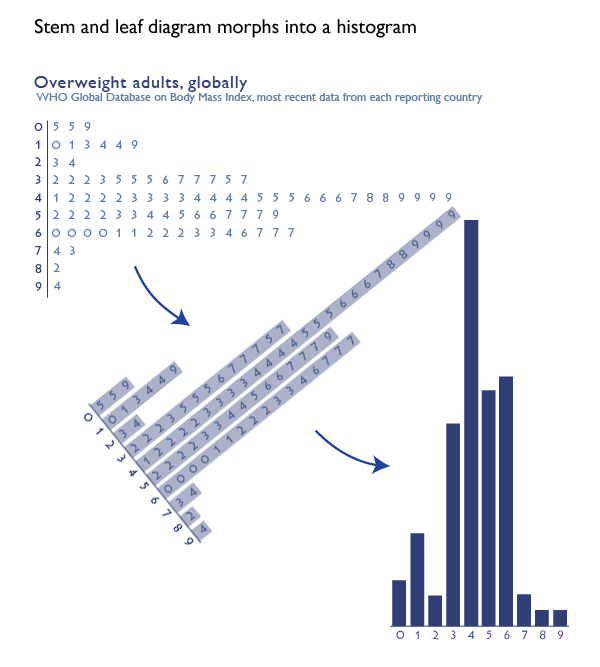
First Draft
First, I thought a stem and leaf diagram might work.
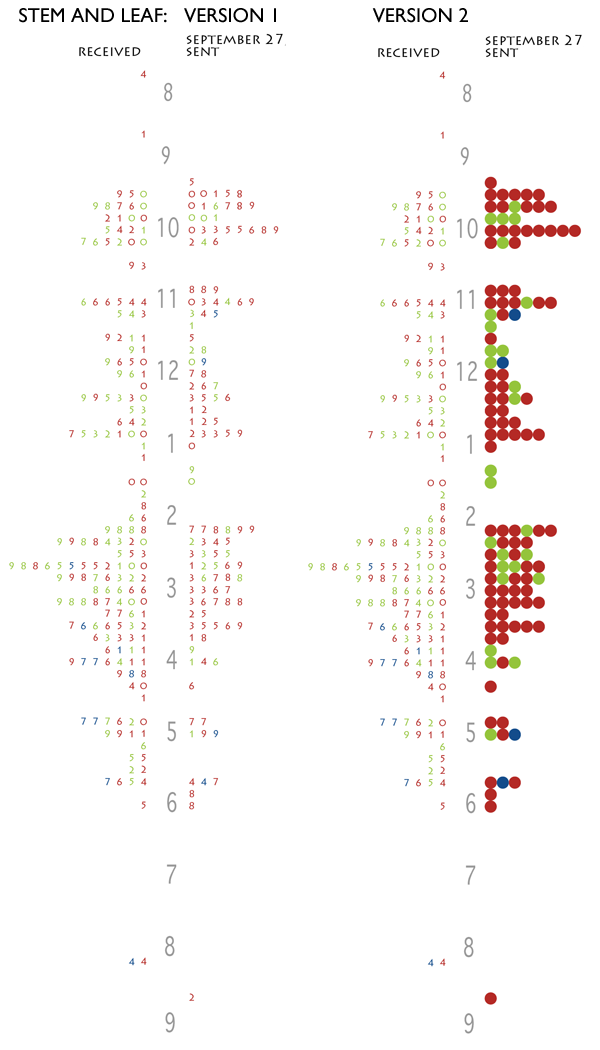
But these graphics failed because there was no way to keep strings of receiving or sending visually united. If the people in the office happened to be sending (or receiving) a series of email that spanned between one ten-minute period and the next ten-minute period, that run would be visually broken. I also wasn’t thrilled with the way the sent email matched up with the received email. It was hard to see that when one person in the office sent an email, it would often land in the inbox of someone else in the office.
Still, I liked the version where I turned the numbers into balls and that idea came back in a different form later in the development process.
Second Draft
I decided to abandon the stem and leaf for a timeline. I initially imagined triangles as markers for the email because I thought the shape would indicate the directionality of an email going out into the internet.
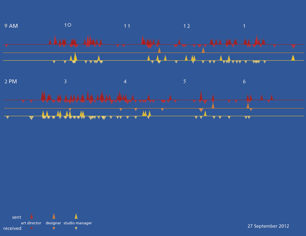
And I tried some different color schemes.
The triangles did not work and some of the color schemes created a sense of vibration. A trained graphic designer might have tried the triangles (and rejected them, of course), but they would not have made the mistakes with color that I did.
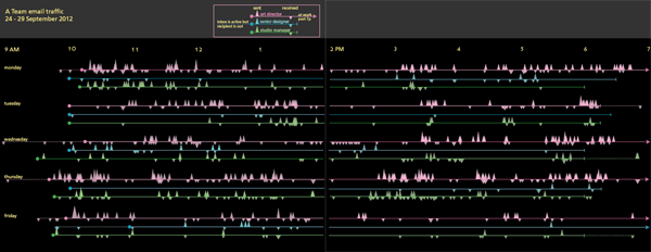
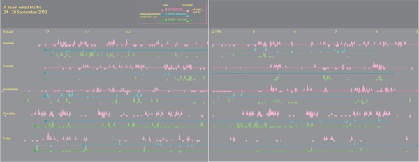
Third draft
I replotted the graphic with circles, not triangles, and added up all the emails that were received in 5-minute periods instead of plotting each individually. This lost a bit of granularity, but it made it easier to see where traffic was greatest because it allowed the height of the circles start to draw the eye.
There is another page to the right of this one but viewing the image at this scale displays more detail.
This version is much closer to the final but something was missing.
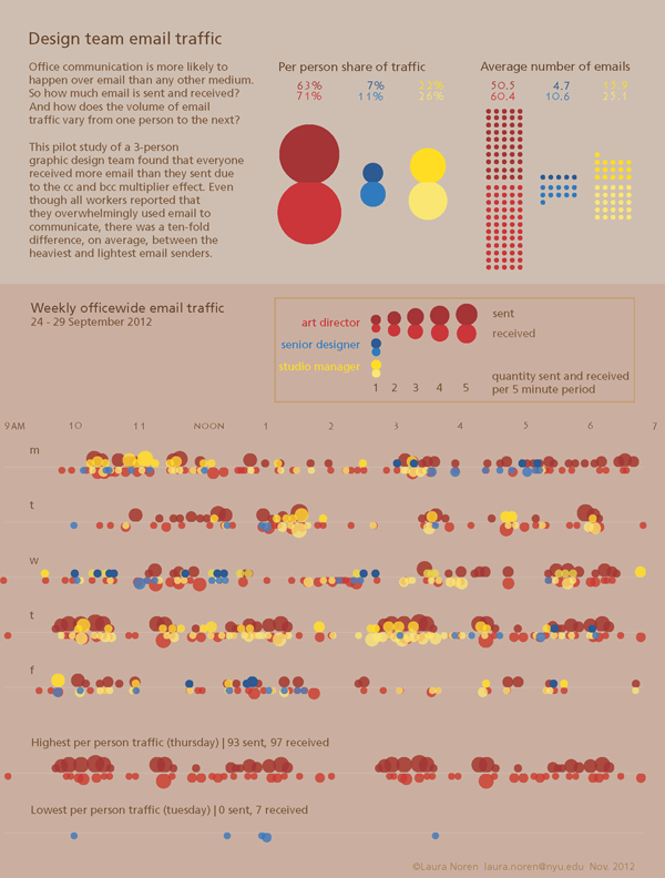
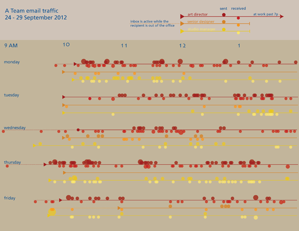
Fourth draft
I started to realize that the timelines were difficult to analyze so I went back to the data and pulled out some summary statistics about the average number of emails each person sent and received. I also thought it would be interesting to see how much of the officewide traffic each person generated. While I was looking for new ways to help people understand what they were looking at, I also showed them the range of reality in the same timeline format by pulling out the lines for the highest traffic person-day and the lowest traffic person-day. I also remembered one of the lessons I learned from reading Nathan Yau’s Visualize This and added some descriptive text. [A full review of that book is here.]
This is as far as I have gotten. But if I get good suggestions in the comments, I’ll keep improving.
What can writers learn from graphic designers
Getting through this many drafts alone was hard. It is very hard to see the same thing with new eyes. I got some help from two different people and even though neither of them said much, their opinions made a huge difference in the process. I encourage writers to find a way to share their work with others earlier in the process. It is humbling. If the comparison to graphic design is apt, earlier sharing either of the whole draft or of smaller sections will also likely lead to a stronger piece that gets written faster.