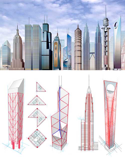
Skyscraper comparison diagram | Beau Daniels and Allen Daniels
What works
Following my post about Kate Ascher’s new book, “The Heights: Anatomy of a Skyscraper” I realized that one of the things I liked best about her take on skyscrapers was that she found a way to compare skyscrapers to their alternatives. Usually skyscrapers are just compared to one another, usually stripped of their urban contexts. So there will be a graph like the one below with skyscrapers from all over the world – different cities and climates and purposes – all lined up in height order.
Skyscraper Height Comparison | Unknown source
What I like about the graphic at the top (that originally appeared in Scientific American) is that it goes beyond the all-too-common height comparison and describes how weight and other architectural engineering concerns are handled.
What needs work
Given that the graphic by Beau and Allen Daniels was commissioned to appear alongside an article in a magazine that I have not read, I am qualified to discuss what is NOT working. I retrieved the image from their digital portfolio which did not mention the date or title (or author) of the Scientific American piece with which it ran.
References
Ascher, Kate. (2011) The Heights: Anatomy of a Skyscraper. New York: Penguin Press. [see my blog post about Ascher’s new book here]
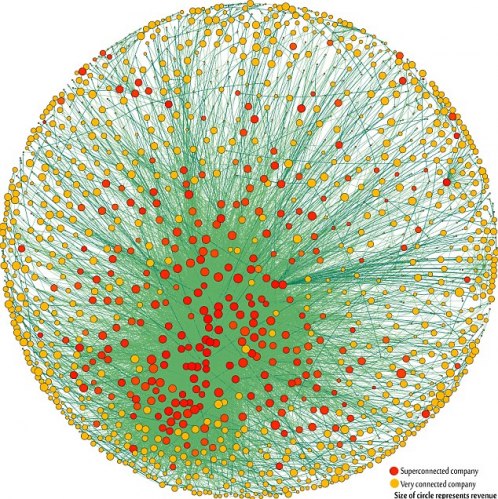
Network Map of Largest Global Capitalists | Vitali, Glattfelder, and Battiston
Note: The 1318 transnational corporations that form the core of the economy. Superconnected companies are red, very connected companies are yellow. The size of the dot represents revenue (Image: PLoS One).
The top 50 of the 147 superconnected companies
1. Barclays plc
2. Capital Group Companies Inc
3. FMR Corporation
4. AXA
5. State Street Corporation
6. JP Morgan Chase & Co
7. Legal & General Group plc
8. Vanguard Group Inc
9. UBS AG
10. Merrill Lynch & Co Inc
11. Wellington Management Co LLP
12. Deutsche Bank AG
13. Franklin Resources Inc
14. Credit Suisse Group
15. Walton Enterprises LLC
16. Bank of New York Mellon Corp
17. Natixis
18. Goldman Sachs Group Inc
19. T Rowe Price Group Inc
20. Legg Mason Inc
21. Morgan Stanley
22. Mitsubishi UFJ Financial Group Inc
23. Northern Trust Corporation
24. Société Générale
25. Bank of America Corporation
26. Lloyds TSB Group plc
27. Invesco plc
28. Allianz SE 29. TIAA
30. Old Mutual Public Limited Company
31. Aviva plc
32. Schroders plc
33. Dodge & Cox
34. Lehman Brothers Holdings Inc*
35. Sun Life Financial Inc
36. Standard Life plc
37. CNCE
38. Nomura Holdings Inc
39. The Depository Trust Company
40. Massachusetts Mutual Life Insurance
41. ING Groep NV
42. Brandes Investment Partners LP
43. Unicredito Italiano SPA
44. Deposit Insurance Corporation of Japan
45. Vereniging Aegon
46. BNP Paribas
47. Affiliated Managers Group Inc
48. Resona Holdings Inc
49. Capital Group International Inc
50. China Petrochemical Group Company
* Lehman still existed in the 2007 dataset used
What works
This graphic has been running all over the internet so I will point you to the New Scientist to get the back story. I will focus on the graphic itself.
Network graphics are difficult to produce. They are inherently challenging to graph because network space is Euclidean, not Cartesian. What I mean by that is that the distance between any two nodes in a network cannot be measured in miles or any other linear sort of distance. The distance between two nodes in a network is measured by how many other nodes you would have to go through in order to get from one node to the next. If the two nodes are connected they have a distance of one. If we would have to take a path that hits four other nodes before we can connect our node A to our desired node B, we have a distance of four. That distance does not relate to actual space. The distance between two people in a dorm social network is not the distance between their rooms, it depends on how many friends and friends of friends you would have to talk to if you wanted to get from one person in a dorm to some other randomly chosen person in a dorm.
Representing these paths that are not related to physical distance is hard. Network diagrams are often quite difficult to produce – how do you plot the 1318 nodes in this network of capitalists? Usually people do not create network diagrams by hand, they write code (or use someone else’s code) to make these visualizations. In this case the authors, Stefania Vitali, James Glattfelder, and Stefano Battiston, used the Cuttlefish program developed in their research group and the services of someone acknowledged as D. Garcia.
This graphic is done relatively well. It is easy to see that there is some kind of red cluster though the red cluster is not located in the middle. I think it is better off to the side – if it were in the middle it would be harder to identify it as a cluster because it would just look like the red nodes in the middle. The point of this diagram is to communicate that clustering within these 1318 powerful, globally dominant companies is inherently dangerous because the impact of a copy-cat phenomenon is greater when all the most powerful companies are well-positioned to copy one another. It’s hard for them to get new information when all of their information is coming from within the same highly clustered group of companies.
What would a more stable arrangement look like? In theory, it would look like a network with, oh, say about 4-6 clusters spread around the larger network of these 1318 companies. Rather than one big cluster of the most powerful, there would have been smaller clusters composed of both really big, powerful companies and smaller, less powerful companies. Companies that are not yet at the peak of their power (or trying to get to a new peak of capital under management) are going to look for different kinds of information and thus have different information to share and different management/development strategies in place than the larger, more well-capitalized companies. These two groups might do well to share their information with one another, even if – and maybe especially because – they will not act on it in the same way. The entire capitalist system would be more stable if there were more strategies being tested and rejected simultaneously.
I’m not sure the graphic actually communicates that point on its own, but it certainly makes the case in the text stronger by visually displaying the concentration of capital. It also makes this research more accessible to a broader audience who would not be able to understand the meaning of a clustering coefficient.
What needs work
I like the white background version better than the black background version because it is much easier to see the edges.
1318 biggest capitalists in the world | Glattfelder
Seeing the edges is nice – without being able to see all the little edges scattered around it is possible to think that all edges lead to that central cluster and that there are hardly any connections between nodes that are not in the center.
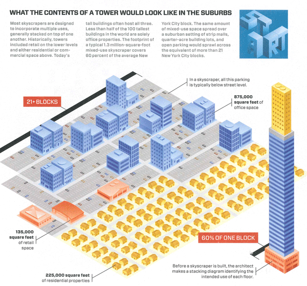
Kate Ascher has a new book coming out soon – The Heights: Anatomy of a Skyscraper – which is hopefully just as good as her previous book: The Works: Anatomy of a City. The Works dissected the infrastructure cities need – from solid waste to electricity to water mains – using information graphics and relatively brief textual discussions. In that book Ascher did an incredible job of answering questions everyone has – where does all the garbage go? – and adding information that we probably ought to know but would never think to worry about (like: how can we design cities to mitigate the threat of flash flooding which is exacerbated by all the hard surfaces and the relative dearth of water-absorbing terrain?)
This graphic is from her new book which, from the looks of it and the kind words in Wired Magazine, will be just as good as her previous work. What she does here is display the land-use efficiency of skyscrapers. One of the things skyscrapers do particularly well, their raison d’etre depending on who you ask, is to concentrate activity and resources in a very small footprint. Ascher shows us what that footprint would look like if it were spread out in a typical suburban density. The typical skyscraper in the diagram takes up 60% of a New York City block. Unstacked and spread in a typical suburban-style configuration it would take up 21+ blocks.
What needs work
Nothing needs work here. This is a clever diagram, easy to understand at first glance, easy enough to translate out of the New York City grid by using the number of square feet dedicated to each purpose that Ascher has listed. The colors are well used, the textual explanation provided is necessary but not too much, and the diagonal layout makes the image much more dynamic.
I would love to say more about the diagrams in the rest of the book but I haven’t yet seen it. Hopefully, they are all just as good as this one.
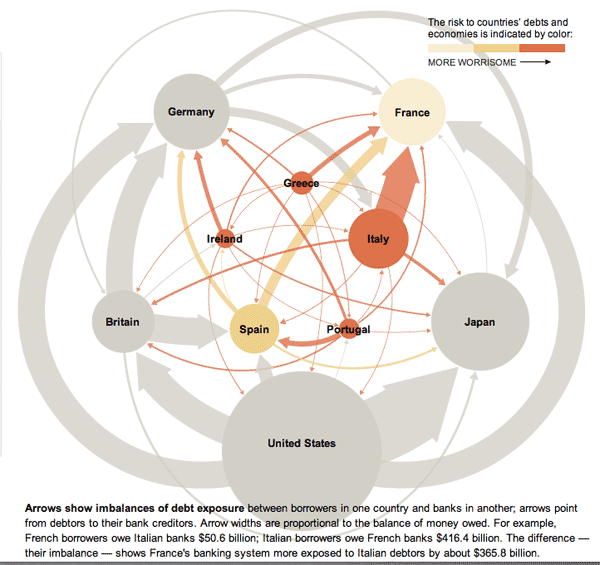
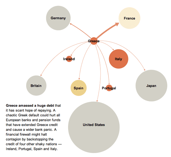
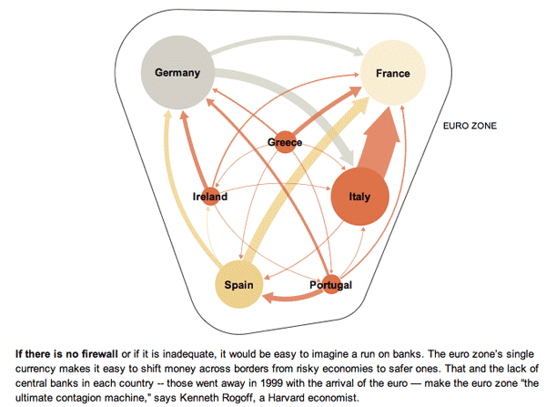
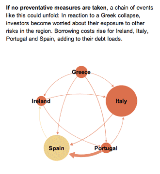
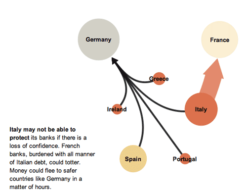
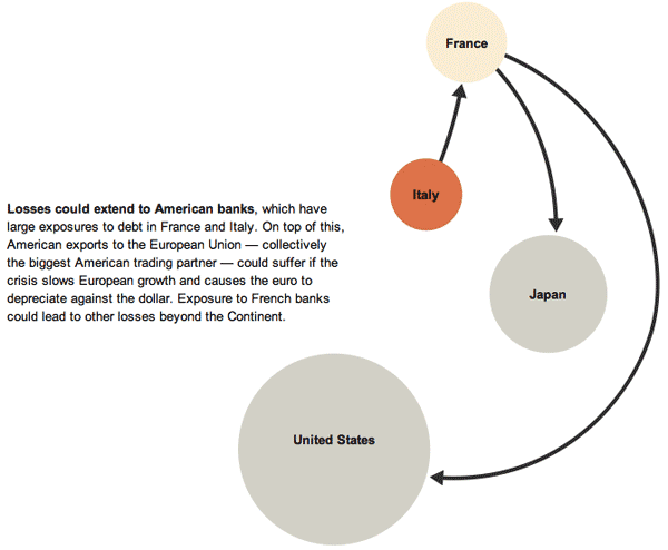
Euro Zone Debt Crisis Visualized | Overview: It's all connected
Euro Zone Debt Crisis Visualized | The Immediate Trouble
Euro Zone Debt Crisis | The Risk of Contagion
Euro Zone Debt Crisis | A possible scenario
Euro Zone Debt Crisis | Continental Contagion
Euro Zone Debt Crisis | Global Reverberations
What works
This series of graphics by the New York Times Sunday Review does an excellent job of explaining the European debt crisis in terms of the banking relationships that exist among partners within the Eurozone as well as between Eurozone members and their trading partners outside of the Eurozone. I hardly feel like commenting. The one graphic design decision I loved the most – because it is subtle and easily overlooked – is that after the overview graphic, the total size of the graphic starts small and grows larger. This mirrors the way the crisis itself develops and reinforces that element of the message visually. It would have been extremely easy to simply use the full paste-board available for each of the images in this progression. The designers decided to use the available white space to tell part of the story.
In the overview graphic, the countries that are not impacted or impacted only slightly are represented in grey. In the more detailed graphic progression, these grey elements are dropped out and represented by white space. This is a somewhat counter-intuitive move. Information graphics are supposed to be chock-full of information, right? So why would the designers *drop* countries, especially the US, when running a graphic about the global impact of the European debt crisis in an American newspaper? Because the way they are able to use white space helps drive home one of the key elements of the debt crisis – that it is so far small and could either get much bigger or stay relatively small in the coming months, depending on what steps are taken now to mitigate the rippling out of negative impacts.
What needs work
Nothing needs work. This is a great graphic.
References
Marsh, Bill. (2011, 22 October) “It’s all connected: An overview of the Euro crisis” in nytimes.com Sunday Review. Other authors/designers listed include: Xaqun G. V., Alan McClean, Archie Tse, Seth Feaster, Nelson Schwartz, and Tom Kuntz.
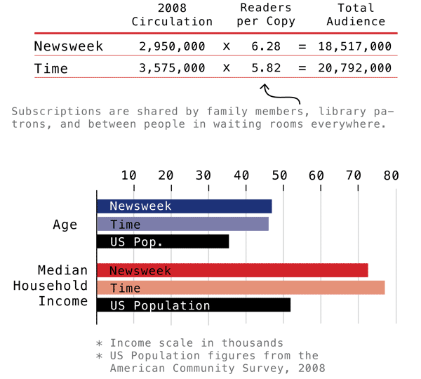
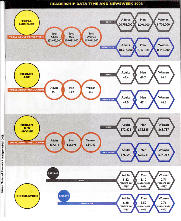
Time and Newsweek Circulation Figures | Graphic by Laura NorénNewsweek and Time Circulation Figures | Graphic by Yolanda Cuomo
Which one works?
These two graphics portray some of the same information – household income, median age, audience and circulation – though the first one does not break down information between genders. Though it probably goes without saying, I like the one I designed best. The second one has some tantalizing shapes – I applaud the visual appeal – but it does nothing to aid people’s eyes as they try to compare relative sizes between the salient categories. I also happen to think it is easier to understand the complexity of the difference between audience and circulation with the textual explanation provided in the first one. I find the white-font-on-dark-background of the Time and Newsweek labels hard to read (it’s also a known graphic design no-no, especially with a small font size like this. It is easier for the human eye to grok the contrast with dark text on a light background than with light text on a dark background).
From a sociological perspective, comparing the readership of Time and Newsweek not only to each other but also to national averages provides a much deeper sense of context. The second graphic was built from the first though I never had a chance to meet with any of the writing or design team to understand why the national averages were removed.
There are other elements I dislike in the second one. I dislike, for instance, the need to repeat certain elements of text over and over again: “readers per copy” and “Total adult population” and even the “Time” and “Newsweek” headings. One of my closest friends and colleagues spends a lot of his time writing code. The best lesson I have learned from him is that where elements or actions have to be repeated over and over, there is inefficiency in the system. A better design is possible.
I would love to hear from my readers on this comparison. Am I suffering from too much ego investment in the graphic I made? Is the second graphic an improvement on the first? If so, how?
References
Norén, Laura. (2010) “Appendix: Data and Methods” in first draft of Dill, Nandi and Telesca, Jen Imagining Emergencies. [Information graphic].
Cuomo, Yolanda. (2011) “Readership Data Time and Newsweek 2008” in final draft of Dill, Nandi and Telesca, Jen Imagining Emergencies. [Information graphic].
On Tuesday I read “When One Farm Subsidy Ends, Another May Rise to Replace it” OR “Farmers Facing Loss of Subsidy May Get New One” by William Neuman [aside: why does the NY Times frequently have two titles for the same article? One appears in the title tags in the html and in the URL, the other appears at the top of the article as it is read]. The upshot of the article is that the subsidies appear to be curtailed as cost-saving measures but come right back under new names:
It seems a rare act of civic sacrifice: in the name of deficit reduction, lawmakers from both parties are calling for the end of a longstanding agricultural subsidy that puts about $5 billion a year in the pockets of their farmer constituents. Even major farm groups are accepting the move, saying that with farmers poised to reap bumper profits, they must do their part.
But in the same breath, the lawmakers and their farm lobby allies are seeking to send most of that money — under a new name — straight back to the same farmers, with most of the benefits going to large farms that grow commodity crops like corn, soybeans, wheat and cotton. In essence, lawmakers would replace one subsidy with a new one.
Neuman also interviewed Vincent H. Smith, a professor of farm economics at Montana State University who, “called the maneuver a bait and switch” saying,
“There’s a persistent story that farming is on the edge of catastrophe in America and that’s why they need safety nets that other people don’t get. And the reality is that it’s really a very healthy industry.”
My curiousity was piqued, to say the least. Farm subsidies have long been an emotionally charged issue – Professor Smith is right to point out that the family farmer is an icon in the American zeitgeist whose ideal type gets trotted out as a narrative to support subsidies that often go to large-scale corporate agriculture. Before mounting my own angry response to what appears to be both hypocritical and a well-orchestrated marketing schmooze (ie the public proclamation by various farm lobbies that they are willing to take fewer subsidies as they band with the rest of the beleaguered American public in a collective belt-tightening process while simultaneously opening up other routes to receive the same amount of funding through different mechanisms), I decided to go in search of some hard data to see what is going on with agricultural subsidies.
Agricultural data
I found two great sources of data. First, the USDA runs the National Agricultural Statistics Service which publishes copious amounts of tables full of information about how much farmland there is in the US, what is grown on it, what the yields are, what commodity prices are, what farm expenditures are doing, and all sorts of rich information. Linked from the article was another source of data – the Environmental Working Group – which has been tracking farm subsidies for years. The Environmental Working Group also relies on the National Agricultural Statistics Service, especially for farm subsidy information. Between those two sources, the US Census, and the 2012 US Statistical Abstracts (Table 825 especially), I had more than enough information to start putting together a graphic that could describe at least part of what is going on with agricultural subsidies.
Selecting the right data
Because farming is distributed unevenly around the country, I knew I needed to come up with a set of numbers that went beyond absolute dollar amounts per state. Probably it would have been nice to see where subsidies go per crop, but other people have already done that.
To look at agricultural subsidies overall, and to work with the state-by-state data that I had, I ended up considering three approaches.
1. Absolute commodity subsidy amounts per state.
2. Commodity subsidy amounts per capita.
3. Commodity subsidy amounts per farmland acre.
It is obvious that the third option, looking at the amount of spending per acre within each state, is the best.
Hypothesis
I expected to find that states with small amounts of farmland would be relatively more expensive per acre than states with large amounts of farmland. I assumed there would be economies of scale and that states with very large amounts of farmland probably had a lot of that land dedicated to pasture, which is pretty cheap to maintain compared to something like an orchard.
Attempt Number 1
I decided that simply showing the costs per acre might not be as interesting as keeping the absolute amount of farmland in play and doing some kind of comparison.
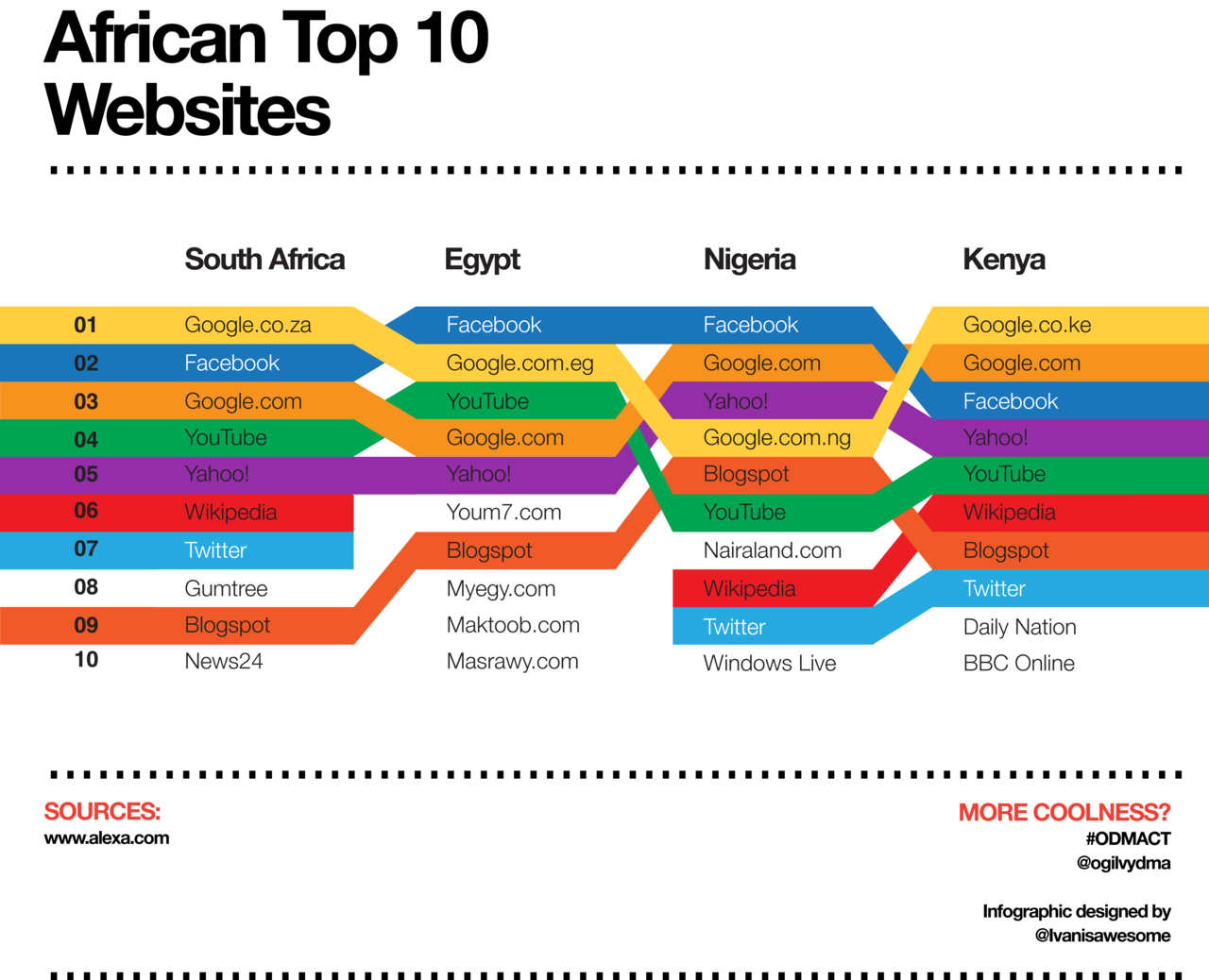
Rank comparisons are extremely popular and I admit I was sucked into them, though now that I’ve tried to make them, I kind of hate them. These are the kinds of comparisons that you’ll hear on the news – Ohio ranks Yth in per capita income but Zth in educational spending per pupil – and see in graphics that often look like this:
Top Ten Websites in Four African Countries | Ivanisawesome
My first attempt to do something similar looked like this.
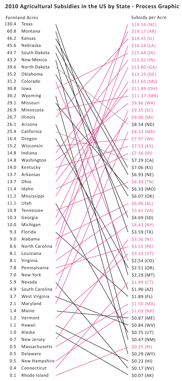
US Agricultural Commodity Subsidies | Process Graphic 01
Here are my problems with it:
There is no obvious pattern – it looks like a rat’s nest.
The states with bad ratios – the ones where we are paying more than $10/acre – have upward sloping lines connecting them from the left column to the right column. Psychologically, the ‘bad’ deals should have downward sloping lines. It just makes better visual sense.
Pink was supposed to be along the lines of red on accounting sheets but it looked too cheery to indicate being ‘in the red’.
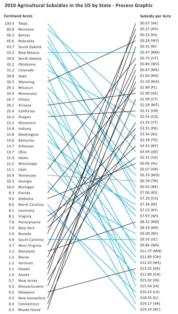
Attempt Number 2
US Agricultural Commodity Subsidies - Process Graphic 2
I got rid of the pink altogether and flipped the scale on the left so that the best deals – the lowest per acre subsidy costs – are at the top. This means that states that are taking less per acre end up having upward sloping lines more often than downward sloping lines.
Thinking through this brought up some larger concerns. Comparing by rank alone is ridiculous. The space between each listing in both columns is extremely critical in a graphic like this and needs to be scaled appropriately. For instance, look at Alabama ($6.06) and Oklahoma ($6.07) in the right hand column. They basically have the exact same amount of spending per acre and yet they are the same distance apart as Washington ($9.86) and Minnesota ($11.37). The same problem happens in the lefthand column – states with about the same amount of acreage dedicated to farmland have the same distance between them as states with large differences in the amount of acreage they have dedicated to farmland.
I scaled both the right and left hand columns using a log scale for farmland acreage (though the number of acres is still given in absolute millions of acres – only the visual arrangement was logged). The pattern is still messy and hard to discern, though clearer than in previous versions. In order to bolster the pattern, I turned the ‘good deals’ in the lefthand column pink. The states with less acreage dedicated to farmland routinely receive less subsidy per acre than some of the bigger states. But the very biggest farming states – like Montana and Texas – are also pretty affordable on a per acre basis. It was states near the middle of the pack that were coming in at $18 and $19 per acre of commodity subsidy spending.
I thought maybe it was a weather event that led to some of the larger subsidies. But if that were the case, states that were geographically near one another would probably have had the same drought/hurricane/flood and should have received similar funding. There is work to be done on the weather question – looking at data over time would be a good step in the right direction there.
However, I don’t know that weather is going to be the best answer to this question. Look at Washington and Oregon. They are geographically right next to each other, grow some similar kinds of things, and have a similar amount of farmland acreage yet they have dramatically different amounts of subsidy spending per acre. Washington takes $9.86 per acre; Oregon gets $2.51 per acre. It’s still unclear why there is such a great disparity between these two states in 2010.
Falsified hypothesis
Through the construction of this information graphic, I falsified my own hypothesis. The states with the smallest amount of land dedicated to farmland received the least amount of commodity subsidies.
I have some thoughts about what is going on. They will require more data analysis and graphic development to suss out and represent completely.
New Hypotheses
1. It’s the weather. It could still be the weather. I did not do enough investigation into this variable, though this seems like a weak hypothesis.
2. It’s corn. The states that grow a lot of corn seem to get more subsidies. This hypothesis could easily be expanded to be something more sophisticated such as: “Subsidies per acre are sensitive to the commodity grown.”
3. It’s lobbying. The states that are known to be “big farm” states seem to have more funding than smaller farm states. Maybe they are better represented by the farm lobbies and therefore end up with more subsidy per acre than states without strong representation from the farm lobby. This hypothesis has an overlap with the “it’s corn” hypothesis.
Conclusion
There are two kinds of conclusions to be drawn. On the agricultural front, it is safe to conclude that Americans spend a good bit of money per acre of farmland; there is no free market on the farms. Bigger states do not offer economies of scale compared to states with less farmland acreage. No additional conclusions can be drawn from this limited data, though interesting hypotheses can be posed about the influence of local weather events, funding for specific commodities like corn, and the impact of lobbyists efforts on agricultural funding allocations.
As a graphic exercise, I hope I have proven that rank orderings do not offer much analytical value on their own. I hope I have also suggested that graphics can be used not only for representing findings at the end of the process but for discovering patterns. Graphics are not just for display, they are also for discovery.
Pie chart humor | The shouting end of life via I love charts tumblr blog
What works
What can I say, I think it’s funny. Pie chart humor with real pie. Ha.
I am impressed at the time and effort someone put into trimming the pie plates, thinking through the crosshatching, and trying to get some different colors going on.
The text of the original post reads:
“THIS IS THE MOST IMPORTANT VISUAL PUN TO HAVE EVER BEEN POSTED ON THE INTERNET.”
I’d take that with a grain of salt, especially considering the gratuitous use of all caps. Probably it’s meant to be ironic or sarcastic or some other hipster attitude that I am too old to absorb osmotically.
I like the colors in the graphic above, however, the version I found does not come with a key but if you click through you can see one. The internet does not always deliver material the way it was originally designed or in the way that we would prefer it.
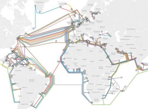
So I went looking for the original, the one that would probably have had a key attached to it, and found this map of the same information instead.
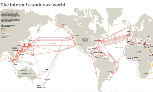
The internet's undersea world | The Guardian
I realize it is hard to see the tiny thumbnail of a graphic so you can either click through to the full version at the Guardian or look through the images I’ve distilled from the original below.
The internet undersea world | Thumbnail from the Guardian
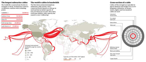
Besides the map above, which shows where all of the cables are laid out and is very similar to the colored version at the top of this post, the Guardian cartographers/infographic designers included useful contextual graphics. Often, there is much more to maps than just the map, and to fully understand why and how the geography matters, it is critical to understand characteristics of the relationship that are not available through the map alone. For instance, in the case of undersea internet cables, the paths and linkages indicate that connections between, say, New York and London are probably quicker than connections between Minneapolis and Leeds. But it is also useful to know how fat the cables are because this is a good proxy for their bandwidth. If the traffic between two points in this network approaches the carrying capacity of the cable, connections might slow down, there would be reasons to build more cables, and so forth.
Undersea internet cable width | The Guardian
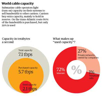
The Guardian carried on with this sort of critical analysis by showing how submarine operations sell capacity to other carriers, who mostly buy it as back-up. On the busy trans-Atlantic route, 80% of the capacity is purchased but only 29% of it is being used. This kind of arrangement is in place for times when communication bandwidth needs spike far, far higher than normal and when cables are cut.
World cable capacity, inset | The Guardian
Discussion
I was turned on to ferreting out these maps by a book I’m reading by Michael Likosky called “Obama’s Bank: Financing a Durable New Deal.” In the book, Likosky points out that one strand of the global internet infrastructure was privately financed, though still heavily reliant on governmental cooperation.
He writes:
In 1995, the US West finalized an agreement fo the construction of the Fiber Optic Link Around the Globe (FLAG). This $1.5 billion project would run a fiber-optic cable from the United Kingdom to Japan. In the process, it would link up twenty-five political jurisdictions. It contributed to a series of interlacing global information infrastructure project. Although underwater telegraphic cables had been laid at the close of the previous century, this project represented the first ever privately initiated and financed transnational communications link of this size and scale. FLAG was only as strong as the public guarantees of the twenty-five licensing authorities involved in legitimizing the project. In other words, it was a transnational public-private partnership.”
I was left wondering who financed the other strands of this aquatic internet infrastructure, realizing that it was probably more reliant on the public sector than the private sector, which is why FLAG is so unique. One of the reasons this matters is that global communications connectivity makes the current trans-national spoke and hub pattern of US business development possible. Without high speed communications connectivity, it would not be feasible for multi-national corporations to situate call centers and other communications-heavy activities far from the hub of commercial activities they are supporting.
If the US Federal government was indeed responsible for some of the early undersea internet bandwidth, I wonder if they had an inkling of how that might impact the development of off-shoring. It has been argued, though maybe not recently, that off-shoring is a good thing because it puts environmentally and socially negative jobs outside of America. Then we can reap all the rewards of growth up the management chain by locating the better jobs here. Clearly, it is irresponsible to locate environmentally detrimental projects in places were regulations are lax for the sake of increasing profits here. The same argument holds with respect to social ills like poor safety standards for workers, child labor, inhumane hours, and other negative working conditions. Increasing the ability to communicate instantly with far flung places makes the spoke-and-hub pattern more possible.
What needs work
Neither of the maps show who paid for the cables or who generates what kind of revenue from their use. I really want to know. I was hoping the color-coded one might do that, but without the key it’s impossible to tell.
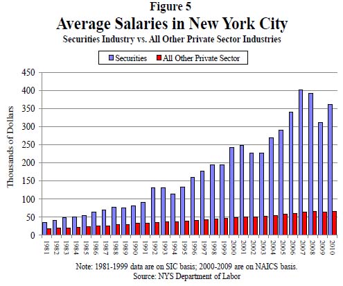
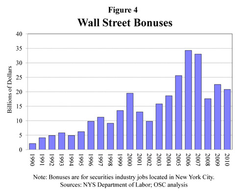
Figure 5. Average Salaries in New York City | Report 12, Office of the New York State Comptroller, Thomas DiNapoli
What works
This may not be the worldest most attractive graphic, but it makes its point: financial workers have much, much higher annual income than the rest of us and the gap is growing over time. The text of the New York State Comptroller’s report said the same thing in words.
Wages (including bonuses) paid to securities industry employees who work in New York City grew by 13.7 percent in 2010, to $58.4 billion. Nonetheless, wages remained below the record paid in 2007 ($73.9 billion), reflecting job losses. In 2010, the securities industry accounted for 23.5 percent of all wages paid in the private sector even though it accounted for only 5.3 percent of all private sector jobs. In 2007, the industry accounted for 28.2 percent of private sector wages.
In 2010, the average salary in the securities industry in New York City grew by 16.1 percent to $361,330 (see Figure 5), which was 5.5 times higher than the average salary in the rest of the private sector ($66,120). In 1981, the average salary in the securities industry was only twice as high as in all other private sector jobs.
You be the judge. I think the graphic leaves a greater impact than the text alone. The two together are striking. Maybe we should…occupy Wall Street to demand a decrease in inequality?
The short report has a few more interesting graphs. First, they throw together a quick graph of Wall Street bonuses. These bonuses are tied to performance and so big that they often represent more than a finance worker’s annual salary. As you can see, they took a dip, but they didn’t disappear even though the US economy is still not great.
Wall Street Bonuses | New York State Comptroller's Report No. 12, 2011
The other interesting metric the report contains is a compensation-to-earnings ratio graph, which is the right context for this discussion. Bankers often defend their large salaries and even larger bonuses by pointing out how much money they have made for their banks. I agree with the bankers that this is the place to look. The question should not be: “How much are individual bankers making?” Rather, it should be, “How much does the banking sector make and is that the way we as a society want to distribute our surplus, primarily to banks and bankers through processes of financialization?”
Ratio of banker's (and insurer's) compensation-to-net-revenues | New York State Comptroller's Report No. 12, 2011
What needs work
The graphs are not attractive and the first one reads as cluttered. I generally go with line graphs for this kind of trend data to cut down on the clutter impact, something I have repeated again and again so I won’t hammer on that point too much. I like the information behind these graphs so I am not going to swat at them too much. Excel is not a graphic design tool for graphs; I have occasionally made some sweet tables with it.
I’m glad the report put these data points into graphs, glad that the report is available during the discussions brought on by the OccupyWallStreet crowd, and glad that the New York State Comtroller’s office rolled right on ahead with the release of some fairly damning evidence against the status quo.
Want more?
Another Society Pages blog, Thick Culture, ran a post including graphs that deal with the compensation and wealth differentials between the tippy-top echelon of financiers and the rest of us at Tax Gordon Gekko.
See also: A blog I wrote – Americans estimate our wealth distribution and fail. Horribly. using a Dan Ariely graphic about how bad Americans are at estimating the distribution of wealth in this country. Teaser: we think it is much more equitable than it actually is.
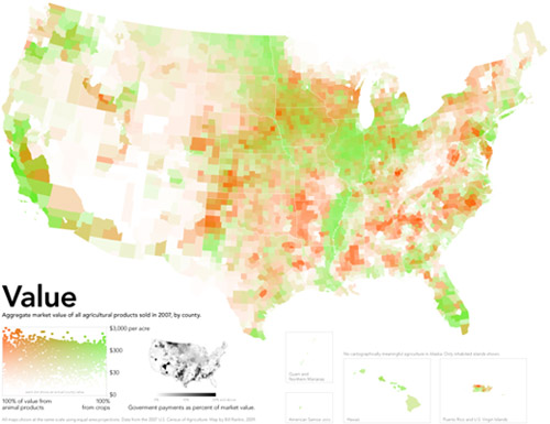
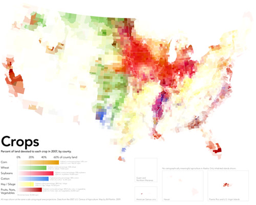
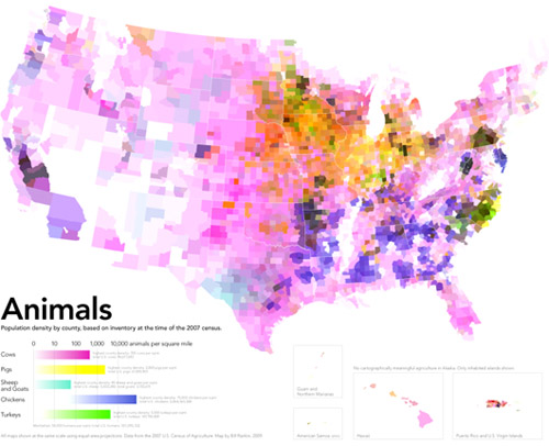
American Agricultural Value map | Bill Rankin, Radical CartographyAmerican Cropland map | Bill Rankin, Radical CartographyAmerican livestock map | Bill Rankin, Radical Cartography
What works
Produced by Bill Rankin, Assistant Professor of History of Science at Yale University and editor/graphic designer at Radical Cartography, these three maps work together to show how American agriculture is organized both spatially and economically. [Click through to Radical Cartography to see much bigger versions. Since that site is in Flash, I can’t embed links that take you directly to the big versions. Once you get to Radical Cartography click: Projects -> The United States -> Animal/Vegetable.] The top map here is the dollar value combination of the cropland and livestock areas in the US. For activist types, what’s even more exciting is the small black and white inset map that takes into account federal agriculture subsidies. The next two maps were combined to produce the top map – one shows how cropland is distributed, the other displays the distribution of livestock.
Bill Rankin is a rigorous researcher with a background in history and the thing he does best here is context. In order to understand the top map – which is what I believe Prof. Rankin wants viewers to store in their memory banks as the critical take-away – he first shows us how cropland and livestock land are distributed and then layers them over one another to show us how they are differentially valued. This type of data is sensitive to geography and location in two ways: 1. crops are sensitive to elements of geography like climate and available water supplies – there are no crops growing in the dessert of the American southwest 2. because the US hands out a variety of agricultural subsidies, the political boundaries of states have to be seen in conjunction with the crop distribution in order to understand how the political levers lead to the current subsidy scenario.
What needs work
The approach he takes is to color each county based on the percentage of area covered by a particular crop. This means that counties with multiple crops will end up with blended color values. For instance, cotton is coded blue and ‘fruits, nuts, and vegetables’ are coded maroon. This means that in some southern counties growing roughly equal amounts of cotton and ‘fruits, nuts, and vegetables’ the counties are neither blue nor maroon but purple. But wait. The blue of cotton might have combined not with the maroon of ‘fruits, nuts, and vegetables’ but with the brighter red of soybeans to produce that purple color. Confused? I am. I don’t know if those southern counties are a mix of peanut and cotton farms (likely) or a mix of soybean and cotton farms (also likely).
Another problem with the additive colors is that the choice of each color has a major impact on the impressionistic take-away of the maps overall. Corn is the most prevalent crop in the US covering over 144,000 square miles. The next most prevalent crop is soybeans which covers about 100,000 square miles. Soy beans and corn are often grown in the same counties (unlike, say, wheat which is a hardier crop and therefore ends up as a monoculture in northern counties where growing corn and soy are riskier endeavors). This means that soy and corn are going to have layering colors the same way that we saw crops layering with cotton along the Mississippi River in the south. Since the bright red color for soy is more aggressive than the somewhat subdued dusty orange chosen for corn, the impression we take away from the map is that soy is more prevalent than corn where the opposite is true. If the color values had been switched so that corn was coded in bright red and soy was coded in the dusty orange, the middle section of the country would end up looking like a corn field, not a soy bean field. Either way, the trouble with blending colors is that our eyes are not very good at looking at a color and saying – “Gee, that looks like it’s about 50% blue and 50% red.” We just say, “Gee, that looks like purple”. Or, in this case, “Gee, all those reddish colors either look like soy beans or maybe an 80% coverage of the ‘fruit, nut, vegetable’ category.”
A solution (that I am too lazy to put together)
In summary, the inclination to display crop and livestock coverage using maps was a solid inclination. I often criticize the inappropriate use of maps. In this case, I still think it could have gone either way. A clever Venn-diagram that used circles based on the total coverage of each crop which then overlapped with other crops in places where they are grown together could have been more illustrative. It would have been easier to see that corn is king, for instance, and that cotton and wheat are never grown together because cotton needs heat and wheat is cold-tolerant. The same sort of Venn-diagram could have been constructed for livestock. A final Venn diagram where the size of the circles is keyed to the dollar-per-square mile value of these crops could have then displayed how agriculture functions economically.
Analyzing the visual presentation of social data. Each post, Laura Norén takes a chart, table, interactive graphic or other display of sociologically relevant data and evaluates the success of the graphic. Read more…