How many households are like yours infographic.
Overview: How Many Households Are Like Yours? | New York Times using IPUMS and Social Explorer

The American Family – A demographic portrait

The New York Times has been running a variety of stories about American demography ever since the 2010 Census results were made publicly available. In this story (which came out last June…sorry for the delay), the article focused on today’s atypical families by spending time with a family comprised of a mom who used sperm donated by a gay friend of hers to have a baby. The biological dad stayed in the picture more than he had planned, as did his partner, though the end of the article hints that the biological mom and dad might be slowly coming closer to a shared living situation that more closely mirrors the traditional set-up.

That sort of one-off telling of the tale of a particular family is not what drew my attention. The larger demographic trends are what I find more fascinating and the interactive infographic offers a much less linear tool for exploring the changes in the demography of the American family than does the article. The article offers a narrative about a particular set of relationships. The infographic presents a question and then gives users enough historical and national context to poke around the possible answers to that question for themselves.

Married Couple
Married Couple - American Family Demography

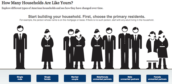
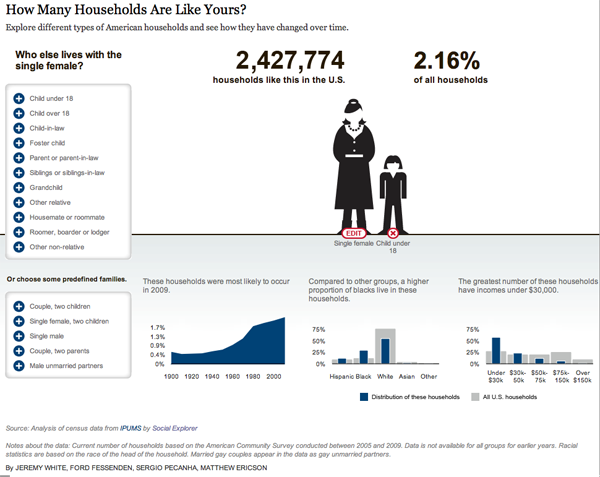
The site allows users to start with a head of household – that matches the way the Census is collected and makes sense. I picked a married couple above. Below I pick a variety of others but if you are sick of crappy screen grabs, feel free to go to the NYTimes site and choose the selections on your own.

What works

+ The graphic design is friendly without offending too many sensibilities (OK, the guy’s hair could be different to be more racially inclusive and it would be nice if the woman didn’t have to wear a skirt, but overall, I like the figures).

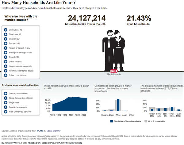
+ Another thing I like about the design is that they smack the percentage up there without feeling that they have to stick it in a pie chart or a graph or any other visual. They assume people have basic numeracy and can interpret a percentage without having to see it as a pac man…I mean pie chart. This leaves the visual field fairly clean and allows the focus to be on the family.

+ The graphs underneath the main family form do an excellent job of providing historical, racial, and income-based context. I love the history one – I think the big point about American family forms is that they are now and have always been subject to a fair amount of change despite the fact that it is fairly common to hear the “American family” referred to as if it were one kind of thing and had been since time immemorial.

+ The interactive component is excellent. Add some kids. Then kill them off. Or keep the kids and give them a different household head. Or get rid of the young kids and add adult kids. Or forget kids and spouses: just add siblings. Besides how much fun I had doing this, I ended up exploring many more angles of the American family demography question than I otherwise would have.

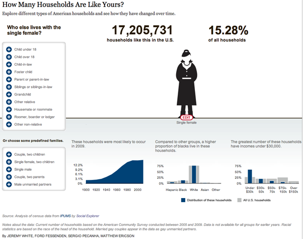
Of course, I was interested in what the story is for people like me (single women)…
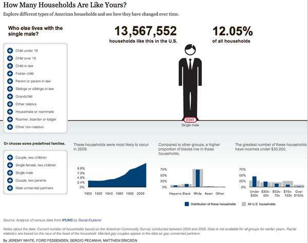
American Family Demography - Single Female

if I were a man

…and whether or not my situation would be different if I were a man. I was surprised that there are more single women than men until I remembered that men die younger so I bet that the difference shows up at the later end of the life course, not so much among my age cohort.

American Family Demography - Single Man

on the other hand

…or had a child on my own like the woman in the article.

American Family Demography - Mom and Kid

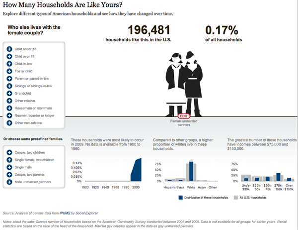
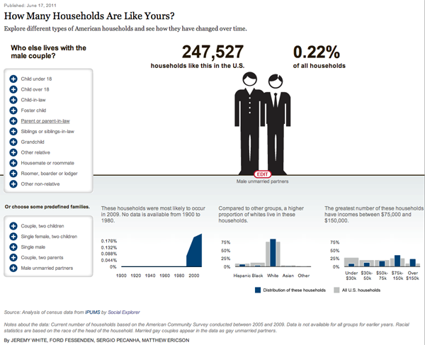
What about the same sex couples? Not exactly a huge percentage of the population, but the Census data upon which this was based are having trouble keeping tabs on the variations of legal statuses of same sex cohabiting couples. In some states same sex couples could marry in 2010, in some states not so much. This is a trend to watch in 2020 and 2030.

American Family Demography - Female partners
American Family Demography - Male Partners

What needs work

I wish there were a way to visualize ‘any children’ instead of having everything broken down by age and number of children. I found myself curious to figure out how many households had kids, who they were, and whether or not they were single-headed, couple-headed, same-sex couple-headed and so on. But there’s no way to do the basic kids vs. no-kids comparison here.

Accessing good data online

This contemporary overview of American family demography was put together by some of the digital team at the New York Times and ran alongside “Baby Makes Four, and Complications”. It uses IPUMS data (which came from the US Census but had to be cleaned up and made properly malleable for crunching with statistical software before it could be analyzed).

The Integrated Public Use Microdata Series – IPUMS – is a project based at the Minnesota Population Center and used widely by American social scientists to study both domestic and international demography. Users – and just about anyone can become a user – can download subsets of the US Census suitable for data analysis on typical desktop computers. The subsets are random samples of the full Census and are generally considered to uphold the highest standards currently outlined for use with the statistical modeling techniques that common among social scientists. While IPUMS is an excellent, fantastic, extremely valuable resource for academic researchers. The Social Explorer, a website supported by Oxford University Press and headed up by Andrew Beveridge at Queens College and the CUNY Grad Center, tries harder to produce public-facing reports using data from IPUMS as well as the American Community Survey and other large-scale surveys. The Social Explorer also makes data available for others to analyze, so between IPUMS and The Social Explorer, it is much easier to get good data sets for analysis than it was in the past.

References

Kleinfield, N.R. (19 June 2011) Baby Makes Four, and Complications New York Times, NY/Region Section.

Steven Ruggles, J. Trent Alexander, Katie Genadek, Ronald Goeken, Matthew B. Schroeder, and Matthew Sobek. Integrated Public Use Microdata Series: Version 5.0 [Machine-readable database]. Minneapolis: University of Minnesota, 2010.IPUMS USA website

Beveridge, Andrew, et al. The Social Explorer website. New York: Oxford University Press.

What would Foucault say?

What works

It’s the end of the term, what works about this image is that it requires very little analytical thought. Use those brain cells for writing papers (and grading them).

References

Wildish, Stephen. (December 2011) “Santa Venn Diagram” [Graphic Design] via @HilaryGreenbaum.

New York Times 100 Notable Books - Authors' Academic Affiliations

What works

Using the New York Time’s list of 100 Notable books of 2011 that ran over the weekend as part of their Holiday Gift Guide, I created the graph above. As an almost-academic, I am interested in the scope of academic work and found it interesting that less than half of the notable books were written by people with academic affiliations. Michael Burawoy and Craig Calhoun have both called for new roles for scholarship and the university, emphasizing that an academy unhitched from the public sphere is not a viable model and might very well be considered irresponsible, given the scale and scope of social, scientific, and technological challenges facing the globe right now and for the foreseeable future.

So what does it mean that non-academics are writing more of the notable books than are academics?

I cannot answer that question definitively, but I can offer three possible avenues for exploration. First, it could be that academics are irresponsible or lazy and that they have either failed to write well or to address relevant topics. They are off publishing pedantic articles in academic journals that nobody reads to fill out their CVs. This scenario is grave. There is an element of truth to it.

An alternative explanation would be that, in part because this is a *gift* suggestion list, these books are not necessarily the most important, but they are the most well written. If that is the case, then the fact that so many non-academic voices make the list indicate that writing itself is an art, one that is spread much more judiciously across the American populous than are academic positions. It also suggests that thinking clearly and writing well are going on in all sorts of places, not just the ivory tower. This is encouraging. There is an element of truth to it.

A third version of this story begins where the second one left off and suggests that, in fact, if academic books do appear on holiday gift lists of notable books, those academics are shirking their duties as academics. Any book with broad public appeal probably is NOT doing much to advance a field. It’s probably just regurgitating existing research in a kind of “Research Thought X for dummies” kind of way. [Many of the people who adhere to this line of thinking have deep and abiding negative thoughts about Malcolm Gladwell.] The view from this perspective argues that asking academics to be responsible to public audiences is akin to asking people to text and drive. It’s dangerous. It takes one’s eye off the critically important field of action and reorients it, likely towards one’s own navel. The primary activity – analytical research and publishing – will suffer, perhaps taking down innocent bystanders along the way. This is a fairly rigid understanding of the best practice for academic research. There is an element of truth to it.

I invite debate on the points I mentioned and those that I have overlooked in the comments.

What needs work

This graphic is not as elegant as I would like. There are far too many words.

I am fascinated with the nitty gritty details of the schools at which those with academic appointments are working. Including the names of so many schools made the endnotes lengthy. I am of two minds on that. Like I said, I enjoy knowing the details, especially when it comes to fleshing out a category like “Elite.” It’s important to know just how eliteness has been defined. In this case, I used US News and World Report. With respect to most of the schools – Princeton, Harvard, Yale, Oxford, Cambridge, Columbia – I think there is widespread agreement that these schools are at the top of the academic heap and have been for a while. Some might quibble about Pomona and Williams.

The point I was trying to illustrate was that those in academia who have books on the notables list could be seen to be public intellectuals or at least they are doing better at making their work accessible to the public than their colleagues who never make it to such lists. It is especially important that the professors in elite institutions make their work accessible because, unlike their colleagues at public schools or less exclusive private schools, the metaphor about the ivory tower as a mechanism of separation is apt. Very few of us have access to elite institutions. Some have argued that those in academia have some responsibility for making their work accessible to broader publics.

References

Burawoy, Michael. (2005 [2004]) http://ccfi.educ.ubc.ca/Courses_Reading_Materials/ccfi502/Burawoy.pdf [Presidential Keynote Address at the Annual Meeting of the American Sociological Association] American Sociological Review Vol. 70.

Calhoun, Craig. (2006) “Social Science for Public Knowledge”>The University and the Public GoodThesis Eleven Vol. 84(7).

New York Times, Sunday Magazine. (November 2011) “100 Notable Books of 2011” [Holiday Gift Guide]

2008 Political Party Identification in the US | David Sparks
2008 family income | David Sparks

What works

I like these maps because they use a smoothing technique currently being developed by David Sparks, a doctoral candidate in political science at Duke University. He uses data with the same kind of granularity – county or census-tract – but then smooths over the harsh (and probably unrealistic) edges that can occur where one county or census block abuts another with a different value for the variable of interest.

Here’s an example of a typical, non-smoothed map visualization using a map made by sociology students at Queens College that I posted about last week:

Percent change in hispanic population in the Dakotas, Minnesota, Iowa, Nebraska, Kansas, Oklahoma

As you can see in this map, each county boundary is stark and it appears that there are cases in which counties with no growth in the Hispanic population are right next to counties with sizable increases in Hispanic people. While this is technically true, there are many cases in which it is more useful to give viewers a clearer impressionistic image that depicts where population concentrations are the highest overall backed up by the granular data without displaying all of the granularity itself.

When it is important to portray an impressionistic point – there are more Democrats on the coasts than in the middle of the country – a smoothed map is a much more effective tool.

Sparks was able not only to achieve a better impressionistic glance by smoothing, he also varied the transparency based on the population density. For instance, because the population density in Montana is much lower than the population density in New York, he made Montana a much more ‘transparent’ state so that it would be easy to get an impressionistic sense of the cumulative spread of the variable. When looking at the purple map of Hispanic population increase in the middle states, no consideration was made for the population densities of cities versus rural areas. This visualization style tips the impressionistic balance away from the more densely populated areas.

What needs work

Since I am generally a fan of the smoothed maps for a clear visual depiction of a data story that is meant to be digested from the 30,000-foot view rather than the microscopic examination of differences between counties or even residential blocks, there is not much to dislike in Sparks’ new smoothed maps. However, I would not recommend the use of this kind of smoothed data for looking at micro-level trends. What Sparks offers is a great way to see patterns from 30,000 feet, one that improves on existing common practices in visualizing map data.

My one issue with the distribution of people’s political persuasion in 2008 is that the colors on the ends of the spectrum – blue and red – blend to form the color in the middle of the spectrum – purple. Therefore, places in which there are lots of independents look purplish. So do places where people living close together are evenly split between Republicans and Democrats. Color choice is essential. The color mix made by the colors at the ends of the spectrum should not mix to produce the color chosen to represent a third position. Small quibble and one that Sparks would have had a hard time satisfying. The colors associated with Republicans and Democrats have already been established.

References

Sparks, David B. (2011) Isarithmic maps of public opinion data [blog post and map graphics] dsparks.wordpress.com

Who visits occupywallst.org? | Harrison Schultz and Hector R. Cordero-Guzman

What works

The graphic above was constructed using 5,006 surveys filled out by people who visited occupywallst.org. Here’s what the survey found:

Gender
Men 61%
Women 37.5%
Other 1.5%

Age
45 y/o 32%

Race/Ethnicity
White 81.4%
Black, African American 1.6%
Hispanic 6.8%
Asian 2.8%
Other 7.6%

Education
H.S. or less 9.9%
College 60.7%
Grad. School 29.4%

Annual Income
$50,000 30.1%

Employment
Unemployed 12.3%
Part-time 19.9%
Full-time 47%
Full-time student 10%
Other 10.7%

Politics
Support the protest 93%
———————
Republican 2.4%
Democrat 27.4%
Independent 70.7%

What needs work

I have two issues. First, I think the graphic is beautiful but functionally useless. It is nearly impossible to get any intuitive sense of anything at a glance. The circular shape forces the categories to come in the order of their popularity which is not always the most logical order. Look at the income data. That should come in order of least income to most income, but it doesn’t (why would anyone put incremental numerical data out of order?). The rounded sections of wedges are also nearly impossible to intuitively compare to one another in size, so I cannot figure out what the functional value of displaying demographic data in this modified pie chart is. In summary, it appears that the information part of the information graphic did not win the contest between aesthetics and utility. Remember: there should not be a contest between aesthetics and utility in the first place.

My second concern with this graphic is its overall reliability. The FastCompany article it accompanies is titled, “Who is Occupy Wall Street”. That title more than implies that this survey of visitors to a particular website associated with the movement – but not THE official website of the movement (there isn’t one) – accurately represent the protesters on the ground. I don’t think that the professor and his partner who conducted the surveys would make such grand claims.

References

Captain, Sean. (2 November 2011) Who is Occupy Wall Street? FastCompany.

Jess3. (2 November 2011) Who is Occupy Wall Street? [information graphic] FastCompany.

Increase and decrease in Hispanic population in the Dakotas, Minnesota, Iowa, Nebraska, Kansas, and Oklahoma | 2010 Census

What works

This is a quiet story, the kind of thing that may or may not be picked up by a major national newspaper like the New York Times. Rural America is often used as a political flag to wave by politicians, but there is not often too much coverage of day-to-day life. The 2010 Census clearly shows,

The Hispanic population in the seven Great Plains states shown below has increased 75 percent, while the overall population has increased just 7 percent.

What is equally odd is that this story is running two graphics – the set of maps above and the one below – that more or less depict the same thing. I salivate over things like this because it gives me a chance to compare two different graphical interpretations of the same dataset.

The two maps above includes a depiction of the change in the white population as a piece of contextual information to help explain where populations are growing or shrinking overall. These two maps show that 1) in many cases, cities/towns that have experienced a growth in their hispanic populations also received increases in their white populations (hence, there was overall population growth) but that 2) there are some smaller areas that are experiencing growth in the Hispanic populations and declines in the white populations.

The second map shows only the growth in the Hispanic population without providing context about which cities are also experiencing growth in the white population. Looking at the purple map below, it’s hard to tell where cities are growing overall and where they are only seeing increases in the Hispanic population which is a fairly important piece of information.

Percent change in hispanic population in the Dakotas, Minnesota, Iowa, Nebraska, Kansas, Oklahoma

What needs work

For the side-by-side maps, the empty and colored circles work well in the rural areas but get confusing in the metropolitan areas. For instance, look at Minneapolis/St. Paul. Are the two central city counties – Hennepin and Ramsey – losing white populations to the suburbs? That is kind of what it looks like but the graphic is not clear enough to show that level of detail. But at least the two orange maps allow me to ask this question. The purple map is too general to even open up that line of critical analysis.

This next point is not a critique of the graphics, but a direction for new research. The graphics suggest, and the accompanying article affirms, that Hispanic newcomers are more likely to move into rural areas than are white people. Why is that? Is it easier to create a sense of community in a smaller area, something that newcomers to the area appreciate? If that is part of the reason new people might choose smaller communities over larger ones, for how many years can we expect the newcomers to stay in rural America? Will they start to move into metro areas over time for the same reason that their white colleagues do?

Are there any other minority groups moving into (or staying in) rural America? Here I am thinking about American black populations in southern states like Alabama, Mississippi, and Arkansas. Are those groups more likely to stay in rural places than their white neighbors? For that matter, what about white populations living in rural Appalachia. Are they staying put or are they moving into cities like Memphis, Nashville, and Lexington?

How do things like educational attainment and income levels work their way into the geographies of urban migration?

References

Queens College Department of Sociology. (13 November 2011) Changing Face of the Rural Plains [information map graphics] Queens College: New York.

Sulzberger, A.G. (13 November 2011) Hispanics Reviving Faded Towns on the Plains New York Times: New York.

Best sociology books of all time | W. W. Norton

What works

Anthony Giddens, Mitch Duneier, Richard Appelbaum, and Deborah Carr put together this list of keyworks in sociology starting way back in 1837. W. W. Norton illustrated each book with a simple diagram that helps illustrate what that book’s main argument is – some are kind of humorous if you happen to be a sociologist – and then laid the whole thing out in a snake stack.

Here’s what I like:

+ the book list includes Harriet Martineau who is often overlooked
+ the book list is short enough to fit on a poster – ask most sociologists about keyworks and they are likely to still be going on about it a week later.
+ the book list uses graphic depictions of the content – spare but intriguing – rather than an annotated bibliography of short summaries. This version is so much more interesting for having said less. Want to know?: read the book.

What needs work

I would have included Simmel, Toqueville, and Mary Douglas. I might have tried to find a way to represent multiple works by the same author (like Marx, Durkheim, and Weber who appear more than once here) in the same grid slot so that more other authors could be included. In order to accomodate that change, I think it would have been possible to arrange this not in a rigid timeline, but in a partitioned grid with early, middle, and contemporary works (or something like that). Even categories like: >100 years ago, between 50 and 100 years ago, in the last 50 years.

One more quibble – the background color has too much green in it to read as a soft brown. I would have liked a soft brown better. Somehow with the green, it ends up with a repellant quality. HOWEVER, I bet this is one of those situations where the poster was designed to be printed, looks fantastic coming off whatever printer it was calibrated for, and looks slightly more pukey on the screen. Trade offs, trade offs.

Recommendation

I have been mightily enjoying W.W. Norton’s tumblr which is where I found this poster. The archive is the best way to get introduced to what they’ve been doing. It certainly is neither primarily about information graphics nor primarily about sociology, but it is wholly intellectual in the most fun kind of way.

If you are more of a twitter person and/or you would like sociology information more than the potpourri of information on the tumblr, W. W. Norton has a twitter feed, too.

References

Giddens, Anthony; Duneier, Mitch; Appelbaum, Richard; and Carr, Deborah. (16 August 2011) Keyworks in Sociology. [information graphic] New York: W. W. Norton.

Box Plot with code
Box Plot with code

What works

This is elegant and information rich. Box plots are an old standard in the display of quantitative data, useful because they are able to show average tendencies, upper and lower confidence intervals, outliers (nice addition here, outlier display is optional), and thus give not only concrete data points but an impressionistic view of skewness.

You can make box plots like this using your own data. The javascript is available. It was created by Mike Bostock using d3 which is something you should check out. From mbstock’s website for d3.js:

“D3 is a small, free JavaScript library for manipulating HTML documents based on data. D3 can help you quickly visualize your data as HTML or SVG, handle interactivity, and incorporate smooth transitions and staged animations into your pages. You can use D3 as a visualization framework (like Protovis), or you can use it to build dynamic pages (like jQuery).”

I haven’t had a chance to try doing anything much with it yet, but I will. It’s extremely exciting to me and I couldn’t wait for myself to mess around with it. I had to post right away.

What needs work

I need to work – my overscheduled self needs to carve out some time and try it.

Javascript code is available

There are a bunch of javascript codes available for a range of different kinds of visualization, including the box plot and code to make things that look like this:

Chord Diagram | d3.js by mbostock

or this:

Force directed graph | d3.js by mbostock

References

Bostock, Mike. (2011) d3.js repository on GitHub. [Code for generating information graphics] See also: Mike Bostock’s webpage

Education vs. Prison in California | Public Administration

What works

The only part of this graphic I kind of liked was the part about California. Here, we are able to compare the average cost of education for a year with the average cost of prison for a year. This is better than comparing the cost of a single school to the average cost of prison, especially when that school is as expensive as Princeton. I still have a problem with this comparison because the cost of school is running over about 8 months whereas the cost of prison is running the full 12 months, or at least that seems to be true from what I can gather. My back-of-the-envelope math suggests prison would be about $32,143 for 8 months. This is still much higher than the average of $7,463 per student spending for 8 months of school. Parent and student contributions to schooling are not factored in, though the point of the graphic is to compare what the state spends on students to what it spends on prisoners, ignoring the total amount spent on students.

What needs work

The information included in this graphic could have been presented in about one fifth of the space. I support the addition of graphical elements to information presentation only when they increase the clarity of the information provided or make the information delivery inarguably more elegant.

What I vastly dislike are the long columns of graphics stacked on top of each other, meant to be viewed as some kind of visual essay. That was where I drew the California graphic from. I pasted it below.

I’m curious. Do other people like these long, internet-only graphic essays? I find them extremely hard to digest. They seem to be plagued by apples-to-oranges faux comparisons, and unbashedly so. A year’s tuition at Princeton doesn’t include room and board. Prison does. Even if that were taken into account, the time frame is off.

One more item to highlight

Note that in the last panel they clue us into an uncomfortable reality: recent college graduates have a higher unemployment rate (12%) than the general population (9%). Ouch.

Prison vs. Princeton | Public Administration

References

Public Administration. (October 2011) “Prison vs. Princeton” [information graphic]

Resnick, Brian. (1 November 2011) Chart: One year of prison costs more than Princeton The Atlantic online.

Visualizing How A Population Grows To 7 Billion | NPR [Click for video]
Visualizing How A Population Grows To 7 Billion | NPR {Click for video}

What works

This video does an excellent job of explaining how population growth has happened with beautiful visualizations. Click through to watch it. It’s worth it.

Visualizing How A Population Grows To 7 Billion | NPR [Click for video]
Visualizing How A Population Grows To 7 Billion | NPR {Click for video}

What comes next

It would be nice to have a visualization that could combine population growth visualizations with quality of life visualizations. Quality of life was pretty dismal in the beginning – infant mortality was high, maternal death was high, life times were short and much more of them were spent in grueling conditions. The rising tide of domestic agricultural practices raised all boats. But then quality of life started to become stratified – some people in some places had it pretty good while others were still facing not such great conditions. Now quality of life is extremely stratified but starting to diminish globally and will continue to diminish as the impacts of climate change set in (not to mention the non-climate related concerns associated with what happens when the planet starts to reach its limit in terms of how many human lives it can support at high levels of ‘quality of life’). Fewer people will be able to eat meat regularly (which may or may not be considered an indicator of high quality of life), more people will get asthma as we all move to cities congested with the exhaust of internal combustion engines and coal-fueled power plants, more people will live in drought stricken places, and more people will end up in conditions of poverty if rates of inequality continue as they are.

The video is beautiful as it is. But the beautiful polish helps obscure the notion that population growth is not necessarily a good thing.

References

Cole, Adam and Starbard, Maggie. (31 October 2011) Visualizing how a population grows to 7 billion. NPR.org.