
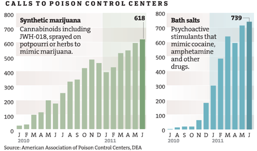
This graphic was subset from a larger graphic. I trimmed off the third drug comparison because it was problematic for reasons I explain below.
What works
Tracking illegal behaviors can be extremely difficult because the people participating do not want to be arrested or fined. How then, do health investigators find out what risky behaviors people are doing in their leisure time? In this case, the investigative team on the Lethal Dose series at the Minneapolis – St. Paul Star Tribune newspaper used calls to the poison control center as a proxy for tracking the rise of newly available synthetic drugs. As journalists rather than, say, doctors, they do not have access to patient data. Using poison control center calls is not a perfect indicator of the spread of the new synthetic drugs, but they have followed up these charts with an entire series in which they interview parents and friends of victims as well as a retailer more than willing to defend his right to sell.
What works for me about this graphic is that the investigators found a fairly unbiased source of information about this drug use, something that helps tie the other articles in the series together. Interviewing stubborn retailers and grieving friends and family is part of what journalists do, but those interviews are so emotionally and politically charged that it I appreciate the presence of trend information.
Because these drugs are new, it was necessary to spell out active ingredients because the average person will not know. I appreciate that they included that in the graphic rather than in a footnote.
What needs work
The shading behind the bar graphs is frivolous. It adds no information and is not necessary to guide the eye. It could be dropped and nothing would be lost.
Trend data is better as a line graph than a bar graph because it is easier for the eye to follow a line and to compare one line to another line than to follow a series of steps and compare one series of steps to another.
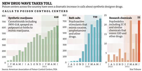
This blog post focuses on two drugs that use the same axis. I would have kept the same axis for the third drug even though it’s use numbers are lower. Note that all of the drugs started with low numbers and rapidly climbed – perhaps the third drug family “synthetic chemicals” is simply lagging behind by a year or so. It is hard to make that comparison when the axis is so dramatically different from the other two. There is a danger in lying with graphics here – making the third graph seem comparable to the first two implies that the third drug poses an equal threat. The numbers do not support that assumption.
References
Star Tribune staff writers. (2011) A Lethal Dose: The war on synthetic drugs Investigative reporting series.
Star Tribune. (2011) “New Drug Wave Takes Toll” [Information Graphic] American Association of Poison Control Centers, DEA.