
What works
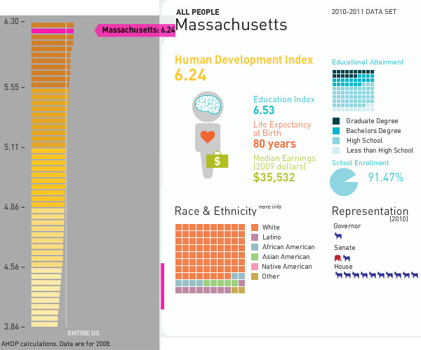
Mapping the Measure of America is a social science project that deliberately includes information graphics as a communication mechanism. In fact, it is the primary tool for communicating if we assume that more people will visit the (free) website than buy the book. And even the book is quite infographic dependent. I support this turn towards the visual. I also support the idea that they hired a graphic designer to work with them. Often, social scientists do not do well when left to their own under-developed graphic design skill set. Fair enough.
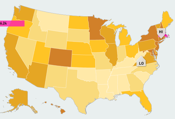
The website presents a unified view of the three images above. I couldn’t get them to fit in the 600 pixel width format, so I presented them one at a time. I encourage you to go to the website because one of the greatest strengths of this approach is the interactivity and layering. I happen to have picked Massachusetts, but each state plus DC has it’s own graphics available. There are other charts and whatnot available, but I think that this set of graphics (which you see all at once) are the strongest.
What needs work
Maps. Maps are too often used. Here’s why I think maps are a problem. Look, folks, political boundaries are meaningful when it comes to making policy or otherwise dealing with state-based funding. And that’s about it. Political boundaries occasionally coincide with geographical boundaries, but not always. Geographical boundaries are meaningful for some things – life opportunities may be based on natural resources or on historical benefits accruing to natural resources. But political boundaries and maps are often not all that useful because they imply that the key divisions are the divisions between states or counties or neighborhoods. Like I said, sometimes this is true because funding tends to be like the paint bucket tool – it flows right up to the boundaries and not beyond, even if the boundaries are arbitrary or oddly shaped. But where the issues are not heavily dependent on funding, thinking in terms of political boundaries makes it harder to see patterns that are organized along other axes. For instance, I wonder what would have happened if some of these categories – education, longevity, income – had been split between urban, suburban, and rural areas. Or urban and ex-urban areas if you prefer that perspective on the world as we know it.
In the end, I think the title is both accurate and disappointing: “Mapping the Measure of America”. Figuring out how to do information graphics well means figuring out which variables are the key variables. In this case, it seems that the graphic options might have determined the display of the information. Maps are easy enough – they appear to offer a comparison between my local and other people’s local. Those kinds of comparisons offer readers an easy way to access the information because everyone is from somewhere and there is a tendency to want to compare self to others. But ask yourself this: to what degree do you feel that state-level information is a reflection of yourself? Do you see yourself in your state?
References
Burd-Sharps, Sarah and Lewis, Kristen. (2010) Mapping the Measure of America with the American Human Development Project. Site design credit goes to Rosten Woo and Zachary Watson.