What works
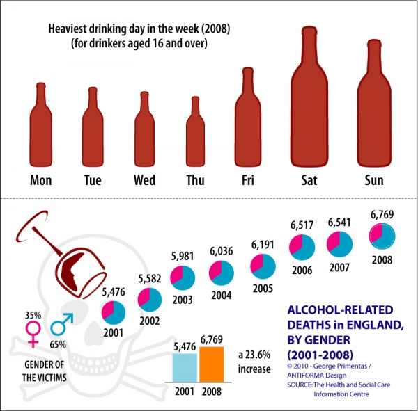
Leading up to the World Cup I am going to try to focus on World Cup related issues. It isn’t that much of a stretch to think about the relationship between sport and the larger category recreation, which often includes drinking. I found this graphic at The Missing Graph by Antiforma Design. The point here was to look at drinking in England – when is it happening? who is doing it? and who is dying? As you can see, men drink more and die more from drinking. Most drinking happens on the weekend and on holidays (there are more Monday and Friday holidays than other weekday holidays in England). Most alarming is that drinking deaths are increasing, not decreasing. Hard to blame it on the recession since the collection period ended in 2008 and increased the most rapidly from 2005 to 2006, a period of relative prosperity and optimism.
What needs work
I would have loved to see a couple more points of information about drinking in England. First, I assume that the information that generated the size of the bottles for each drinking day was somehow related to gallons consumed. I want to know those gallon figures per capita. Then we would be able to compare England’s data to some other country’s data, assuming we ever had a similar set of information about some other country (like, say, South Africa).
I would also have liked some information on what it is that these folks are drinking. Wine? Whiskey? Beer? Absinthe? Something from the bathtub? Perhaps the drinking culture of the country supports more beer drinking but the death-drinkers are drinking something else. Or maybe they just drink too much of the standard fare. Again, since I’m thinking about cross-national comparisons, I’m interested in things that might contribute to a deadly or less deadly drinking culture.
One other consideration: a friend of mine has long been interested in the relationship between drinking and HIV transmission. You’d think someone would have done extensive research on this because it’s rather obvious – drunk folks may have less in the way of cognition and patience when it comes to reaching for a condom. But it has not been well explored. Out of that existing curiousity of mine, I wouldn’t have minded seeing some trend lines for HIV transmission, serious auto accidents, and other sorts of ill-planned behavior that we might associate with drunkenness.
Overall, I love the notion that there is a blog out there dedicated to making infographics out of an intrinsic interest in presenting information for public consumption.
Reference
Primentas, George. (May 28, 2010) “Alcohol-related deaths in England” at The Missing Graph.

Comments 6
erin — June 2, 2010
I assume it's true that men drink more than women, but it doesn't look like this graph indicates that. The gendered graph only shows that men are more likely to be die alcohol-related deaths than women. It doesn't show that men are drinking more.
whelk — June 2, 2010
I can't see the benefit of graphs that use things like bottles to try and make a point in a quirky visual manner, as I can't see what the difference is between say, Thursday and Saturday. The bottle is about twice as high, so is it twice as much? My brain automatically gives the bottle a third dimension, simply because it's a bottle, and a bottle the size of Saturday's bottle would hold about eight or nine times as much liquid as the Thursday bottle (it's not only higher, but also wider and, in the third dimension, deeper), so I automatically assume Saturday is nine times worse than Thursday. Is that the case? Should I be looking at the height (twice as much), the surface area (about four times as much) or the imagined volume (about 8 times as much)?
Michael — June 2, 2010
It's also ambiguous as to the definition of "drinking days." Does Sunday start at 12 midnight? Because most people would probably consider drinking at 3 AM on a Sunday to be part of the Saturday "drinking day."
MeToo — June 3, 2010
I agree with Whelk. As I have commented, and Tufte comments, our brains are not good a apportioning 3D figures. Line or bar graphs are better.
Beyond that: There are many distracting things that make it challenging to grasp info and get a lesson. There are three distinct time lines, weekday, year, and pre/post, causing confusion.
There are at least two distinct icons for alcohol, the bottle and the glass, causing trouble in grapsing what each means. And what is served in a bottle-brown red wine glass? And why are the bubbles floating? Is this another iconic code for alcohol? Are they champagne bubbles? And why hot pink and pastel blue? Are these those fancy club shots that come in test tubes? Oh, it is male/female colors. OK.
The code/key to the series of floating bubbles is in two places: lower left, lower right.
What value is there in noting that people drink more on Fri/Sat than weekday? In this graph, none. It is NOT a data-transmission graph, but a sales pitch: "read me." When we are done reading, we know nothing new. Pictures are engaging - we hold that characteristic from the days when we were two years old. Pictures engage us. But this graph does not do more for me than it does for a two-year-old.
There is value in the male/female death data: "hey ladies, it is not just those rowdy rugby blokes who are dying-while-drunk; it is you, too."
The rest of it is infotainment.