Archive: Apr 2010

War on Drugs in Mexico (Civil war - Mexican cartels versus Mexicans)

What works

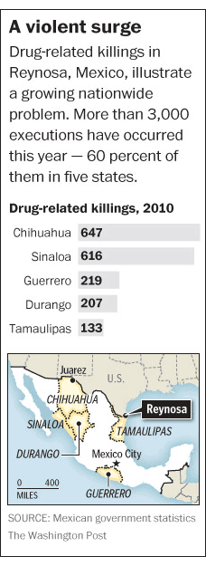
Throwing in a map is smart – most Americans do not know where all the Mexican states are. Breaking the murders down by location is also smart. A national total would obscure part of the point, which is that the drug wars in Mexico are not hitting the whole country equally. Some areas are much more important to the cartels and are getting walloped while others are relatively unscathed, at least in terms of murders and other violence. Including the map and breaking the graph down by geographical boundaries both communicate the geographical specificity of the murder problem.

What needs work

This graphic illustrates just one element, one metric, of a whole constellation of economic and social problems. In journalism, getting any graphics into an article on a tight deadlines is difficult. One could argue that since the troubles in Mexico are not so new, it might be worth putting some extra time into the production of a graphic that could display murders, kidnappings (of whom and for what purpose – money, political deals, revenge), the quantity and type of drugs trafficked from which areas, trafficked/processed through which locations, for distribution where and by which cartels.

Besides a comprenhensive narrative of the trade, which is probably nearly impossible to construct because if it were easy to get information about where drugs are grown, processed and distributed I would be amazed. However, there is at least one other way to demonstrate the violence in a more comprehensive fashion, just by making some assumptions about social/economic networks with respect to the people murdered. The information on kidnappings may not be available – the article mentioned that five journalists had been kidnapped but only one was reported to the police. So we are left with murders, and that is probably why the Washington Post ran the graphic that it did.

Widespread murder creates a terror society – one in which fears and suspicions impact daily life over a sustained period of time. But it can be quite difficult to quantify terror and many graphics rely on quantifiable data. The article is well written and its narrative does a good job of conveying the magnitude of the drug violence and its encroachment on the lives of everyday folks.

The spasm of killing, kidnapping and extortion in the northeastern states of Tamaulipas and Nuevo Leon — vital trade, energy and manufacturing centers on the Texas border — marks a serious escalation in the U.S.-backed drug war and comes with a 21st-century twist: Mexican officials struggle to calm what they call a mass psychosis of fear, stoked by social-media chatter and grisly YouTube videos, by using Twitter to post warnings about “situations of risk.” — William Booth

There is clearly good reason for graphics to accompany text – each play unique roles. That being said, I still think there may be a way to create a network graph that demonstrates the social span of the violence. It could look at one of the hard hit communities in which all people are assumed to be alive and unrelated to anyone who was murdered. Let’s imagine one dot for each person, colored green to show they are alive. Now, a person who is murdered will become a black X and all of their family members and close friends will become black dots (still alive, but severely impacted by violence since they lost friends or family). In a perfect world, more distant friends would become brown dots. But it would be difficult to make a map like that because it is difficult to identify looser friendships. Use guest books at funerals to gather data? Facebook? Hard to say. Kidnappings, where known, could be similarly mapped. After constructing a network map like this, it would be much easier to see that one murder impacts a much wider swath of a community. Once there are many murders, there will be very few people left as green dots. Widespread murder is like necrotic tissue.

Where the persons murdered and kidnapped were wage earners, it would also be possible to demonstrate the income lost by the community as compared to the estimated value of the trafficking activity over a given time period. Of course the value of human life should not be measured by the money they failed to earn because they were dead. It’s just as silly as reducing the value of a human life to the market value of the chemical components of the human body. The point of such a comparison would be to demonstrate the economic impact on the community rather than some sort of death calculus.

References

Booth, William. (21 April 2010) “Drug war violence appears in Mexico’s Northeast, near Texas border”. In The Washington Post, World, North America section.

Humanities and Social Science PhDs - completion failure and job market failure

What needs work

Actually, the graphics aren’t bad, but the story is depressing for someone nearing the final year of a PhD in sociology. The first one is quite good. I might have added a horizontal line under which the ‘failures’ ended up and above which the ‘successes’ floated.

Many people who read this blog are academics and thus familiar with the concept that getting a tenure track job is tough. These graphics do an excellent job of contextualizing what might often seem like personal anxiety to present the problem as a mismatch between supply and demand. There are far more PhDs minted each year than we need and there would be even more if everyone who started down the PhD path actually finished. Who is to blame? For an answer to that question, link to the article (in references below).

Otherwise, just get depressed looking at the graphic story.

References

Cohen, P. (8 April 2010) The Long Haul Degree. In The New York Times, Education Life section.

Reinventing the Automobile* is a book that lays out a vision for a progressive evolution of urban mobility transition that offers a robust point-to-point on-demand mobility network of 2-passenger fully electric vehicles. These vehicles would take up less parking space because not only are they small, but one proposed design folds up when parked. And they’d be able to tell you where the nearest parking spot is as you’re approaching your destination. Being fully electric they require a plug….or do they? The authors suggest that after an initial period of individual owners plugging these babies into outlets in their garages overnight, folks in city planning departments or franchise owners would trust the technology and economics enough to start installing wireless charging devices available curbside or in the road bed itself. Stuck in a bottleneck at a bridge or tunnel entrance? At least charging pads in the roadway can ensure that your 2-seater won’t run out of juice before you get where you’re trying to go. You can sit there and it will charge itself with embedded charging device in the road surface while plodding through gridlock. Even farther down the timeline, the cars might be able to drive themselves. So you can sleep through the gridlock or make calls or surf the ‘net. Just don’t post facebook status updates about your traffic problems. Nobody cares.

What I like most about the book as an object of intellectual design is that even if readers decide to skip all the words and they only look at the images, charts, maps, and diagrams, they won’t miss much. This book is stuffed with great graphics. I haven’t included them all as that would constitute copyright infringement and be too long for a single post. What you see below is just a small sample from Chapter 9: Personal Mobility in an Urbanizing World.

Daily driving in Paris

Daily Trips in Paris - Reinventing the Automobile (Mitchell, Boroni-Bird, and Burns), Figure 9.6

What works

This graphic is both elegant and deep. (Or it would be elegant if I had a better scanner.) It’s a simple form – Paris as concentric circles – but the more you look at it the more you learn. Rewarding that way. What sometimes happens in elegant graphics is that the details become obscured in iconography or approximations. But this graphic includes percentages as well as absolute numbers of two different kinds of trips – public transit and trips by cars. We see that Central Paris is defined as Arrondissements 1-20, the first ring is Seine Saint-Denis, Val-de-Marne, and Hauts-de-Seine, and the second ring is the rest of the Île-de-France region. There’s a summary of all the trips over in the legend so that the graphic itself can just show you the break down of different kinds of trips.

What needs work

In terms of transit, things like rivers often represent real barriers. There are only so many bridges and tunnels which creates a bottleneck effect. Paris is a city on a river so the one thing the elegance of this graphic obscures is the impact of the natural geography on transit choices. Maybe it’s not important when it comes to the cars vs. transit question, but bottlenecks are critical factors when it comes to planning mobility and I’m curious about whether bottlenecks push more people to transit or cars. In Boston/Cambridge, MA only one bridge has a train running across it and I have always assumed that pushed more people into their cars because many of them would have to go out of their way if they took the train and could only go over that one bridge.

Parking in Albuquerque

Parking in Albuquerque - Reinventing the Automobile (Mitchell, Boroni-Bird, and Burns), Figure 9.13

What Works

What you are seeing here is a simplified map of downtown Albuquerque, New Mexico. The white areas are buildings. The teal areas are parking – darker teal represents multi-story parking structures while the lighter teal shows us where surface lots can be found. Lovely way to show this information. One could imagine the same sort of information as a percentage-of-land-use pie chart or some far less granular collection of numbers. This schematic doesn’t bother to calculate just how many square feet of land are dedicated to parking. Nope. This is the visual equivalent of the ‘show don’t tell’ rule that writing professors are always encouraging their students to adopt when constructing essays. A table with land use percentages would be telling. This graphic is showing.

Albuquerque is like a parking lot with some buildings in it.

What needs work

I have never been to Albuquerque but I’m guessing that if you lived in Albuquerque you might like to see some sort of orienting label. Even just a single recognizable street name thrown in their somewhere to help orient. Now, the point of Reinventing the Automobile is not to provide urban planning for Albuquerque so I know they aren’t all that concerned with just precisely which neighborhood in Albuquerque this schematic represents. Still. It’s almost too cleaned up to read as a city plan right away.

Vehicle-to-Vehicle Crashes

Vehicle-to-Vehicle Crashes - Reinventing the Automobile (Mitchell, Boroni-Bird, and Burns), Figure 9.16

What works

This graph does a great job of providing us with granular data and indicating a couple different trends visual. Keep in mind that they have multiple layers collapsed into a single graphic. It looks easy once it’s done but when one is faced with a pile of related numbers along multi-dimensions it isn’t always clear how to relate them to one another visually.

This graph has three levels of accident severity – minor, serious, fatal. It also shows the probability of injury. It also factors in variation in speed (which it does by creating five speed ranges). And then there’s the belted vs. unbelted division. That is a total of four different dimensions all displayed on one graph with a single measure on the y-axis. Color is used well. Grid lines are all that separates minor from serious from fatal accidents which are more or less three different graphs lined up next to one another.

References

Mitchell, William; Boroni-Bird, Christopher; and Burns, Lawrence. (2010) Reinventing the Automobile: Personal Urban Mobility for the 21st Century Cambridge, MA: MIT Press.

* The book specifically credits Ryan Chin, Chih-Chao Chuang, William Lark, Jr., Dimitris Papanikolaou, and Ruifeng Tian with “Illustration Production”.

US household size shrinks, living alone increases

Living Alone

I am helping a professor develop some graphics for his forthcoming book about the increase in people living alone. Above is just a rough draft; I’m still thinking about adding a border. Comments are welcome. More graphics coming in drips and dribbles.

References

US Census: Living Alone