
On color
When architects draft plans and sections, they pay close attention to line weight. Part of the craft of draftsmanship is knowing which line weights are just right and making sure to apply the right line weight in the right instance. One of the criticisms older architects who were used to drafting boards and pencils levied against younger architects who draft using AutoCAD programs is that they just don’t do line weights properly. CAD displays layers in different colors and the younger architects were happy to rely on the appearance of these different colors as they worked on their monitors without making smart choices about line weights. When the documents were printed, all the lines could be the same weight, or if there were different line weights, they appeared to be arbitrarily chosen. Why were the older architects so upset? Because line weight carries meaning in architectural drawings. Get it right, and a simple section can speak volumes to the trained eye. Get it wrong and it’s like hearing a sentence without inflection (or perhaps worse, with inflections in the wrong places).
I feel the same way about color that the older architects feel about line weight. Color should mean something in a graphic. When the paint bucket comes out, there better be a reason for it beyond ‘decoration’. Graphic design is not about decorating otherwise drab diagrams. It is about enhancing the amount of information that can be communicated that privileges the image over the word because words always already require translation and the potential for misunderstanding.
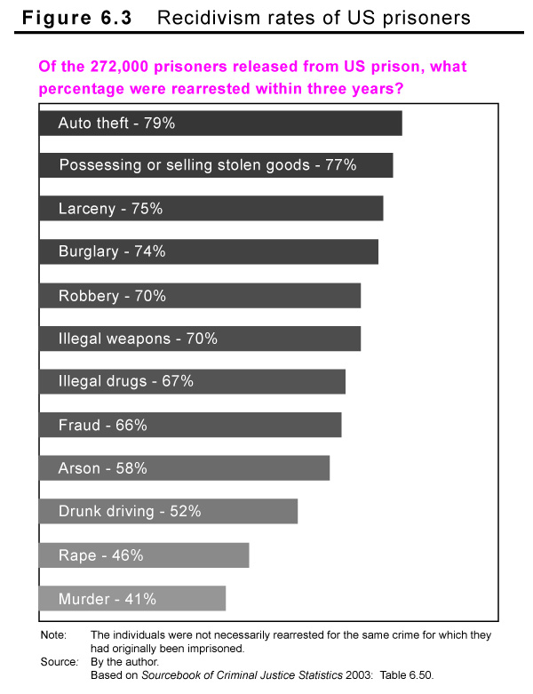
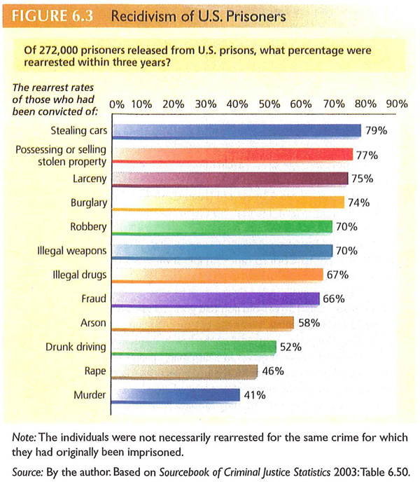
The two bar graphs above depict the same information. One uses color with no apparent meaning attached to it – the bars are different colors just because it looks nice. The backdrop is yellow perhaps “to make the graphic jump off the page”. In my opinion, the full bleed back drop is like a heavy cloak, burying the information the chart contains in a Halloween costume. This Halloween celebration continues with the use of randomly selected colors for each bar on the chart. And the use of italics and bold where it isn’t needed is much like costume jewelry.
The gray-scale graphic uses color to highlight the originating question for the graphic. Each of the bars is shaded in accordance with the recidivism level for that crime – those imprisoned for auto theft have a 79% chance of being rearrested so that bar is 79% saturated with black. The bottom bar represents a 41% rearrest rate so it is 41% saturated with black. In this way, the saturation level reinforces the length of the bar and the numerical value printed in the bar.
References
Color graphic from: Henslin, James. (2009) Essentials of Sociology: A down-to-earth approach 8th ed., Pearson Publishing: New Jersey. Figure 6.3.
Gray-scale graphic: By Norén.

Comments 2
Doug — December 17, 2009
I honestly cannot for the life of me find this colored bar chart you're talking about. All I see is the black and white one
Deaf Indian Muslim Anarchist — December 17, 2009
I think the United States has the worst and highest rate of recidivism in the world.