What Works
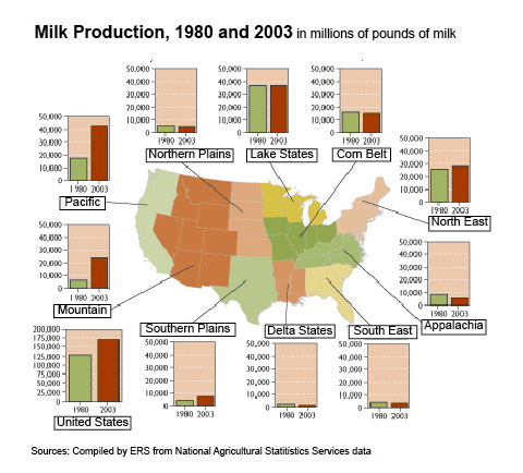
The first map was produced by the USDAs Economic Research Service in 2004 to show the change in milk production by US region from 1980 – 2003. The accompanying text is surprisingly brief, “Since 1980, milk production in the U.S. has increased almost 33 percent. Regional production growth has been most pronounced in the Pacific and Mountain regions, the result of development of low-cost systems of milk production in the Pacific region and some Mountain States. Growth has been much slower in the Northeast and Southern Plains, and the other six regions have seen essentially flat or declining production.”
The graphic is a fairly straightforward way to combine a map with a bar graph. I like it better than if it were just a bar graph with regional labels, but I would like it even more if it were better integrated so that the data from the graphs were embedded in the map, maybe by showing the change in production by color or by applying concavity/convexity to the map.
What Needs Work
There is a serious drawback to the map + graph combination. One of the problem with images is that they tend to appear as sealed, complete narratives that are telling the whole story. It’s hard to interrogate an image, harder than interrogating a text. We’re taught not to believe everything we read, but those strategies don’t translate directly into the world of images. The important missing information here is that the population in the US is shifting to the south and west out of the north east. The image doesn’t suggest causal links; but the text does. However, it leaves out the no-brainer that since milk is a localized commodity, population growth is generally going to result in increased milk production in that area.

Bonus Image
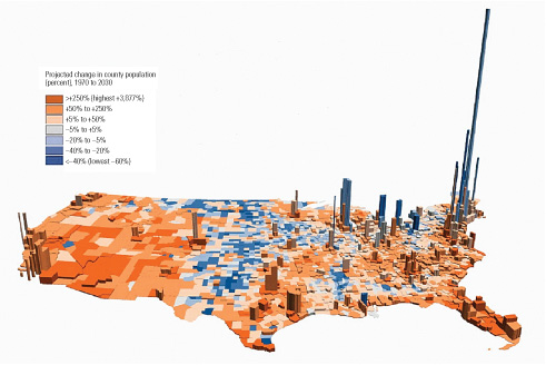
I found this image depicting population density and population change in the US. Cool colors indicate a loss of population; warm ones suggest growth. The z-axis represents human volume. A solid graphic. I have looked and looked and been unable to find the original source which just goes to show that once information hits the digital domain it really does have a life of its own. Hackers were right about that, information wants to be free.
Relevant Resources
Blayney, Donald. (2004) Milk production shifts West USDA Economic Research Center.
Dupuis, E. Melanie. (2002) Nature’s Perfect Food: How Milk Became America’s Drink. New York: NYU Press.
Mendelson, Anne. (2008) Milk: The Surprising Story of Milk Through the Ages. Knopf.

Comments 2
Topics about Food and Recipes » Archive » Mapping (cow) Milk Production — February 13, 2009
[...] Walletpop Blog created an interesting post today on Mapping (cow) Milk ProductionHere’s a short outlineDupuis, E. Melanie. (2002) Nature’s Perfect BFood/B: How Milk Became America’s Drink. New York: NYU Press. Mendelson, Anne. [...]
Sociological Images » CHANGES IN THE DAIRY INDUSTRY — February 26, 2009
[...] Contexts blogger Flaneuse over at Graphic Sociology posted this map showing increases in milk production by [...]