

While listening to a techie podcast the other day, one of the hosts, who happens to be the designer of a popular podcast app, got into a discussion about his design approach. New features in a forthcoming version necessitated new customization settings, but introducing them was complicated by a paradox he affectionately dubs the “power user problem.” He describes the problem (at 26 minutes in) as this:
If you give people settings, they will use them. And then they will forget that they used them. And then the app will behave differently from the default because they changed settings and they forgot that they changed them. And then they will write in or complain on Twitter or complain in public that my app is not working properly because of a setting they changed.
For this reason, the designer defends his inclination to keep user customization to the minimum necessary.
Through iteration, user feedback, and intuition, the designer had arrived at what seemed to him a reasonable compromise between customization and simplicity. Yet, in accomplishing this goal, the design inadvertently leaves some users, even so called power users, out of the loop. (And, in fairness to the designer, he is hardly the first to make this point.)
That is, as a result of its pragmatic simplicity, the design precludes users who cannot navigate/tweak the system from enjoying the product’s full functionality. Therefore, this particular software fails to adhere to “inclusive design,” or design that attempts to resolve the counterposed aspects of technical functionality and accessibility for a physically, biographically, and experientially diverse user population.
Inclusive design has been a rallying cry for disability rights communities, and reads like a gold standard for widespread technological accessibility. However, a recent piece on design and embodiment pushes inclusive design and its proponents to think about what “inclusivity” looks like in practice.
Bodies that are farther from the standard body bear the weight of [environmental] forces more heavily than those that are closer to the arbitrary standard. But to resolve this design problem does not mean that we need a more-inclusive approach to design. The very idea of inclusion, of opening up and expanding the conceptual parameters of human bodies, depends for its logic and operation on the existence of parameters in the first place. In other words, a more inclusive approach to design remains fundamentally exclusive in its logic (emphasis added).
The article, a self-described manifesto for “designs that do not know what bodies aren’t,” presents a real challenge to the conventional wisdom of software design, which has – much like mass market clothing and architectural design – always assumed a default user, with customization options provided as-needed (if at all). On the flip side, allowing user configuration of every conceivable part of the interface would only exacerbate customer support and still doesn’t accommodate everyone (hence the power user problem). This is the central question of the manifesto: how can design trouble its own exclusionary boundaries without creating new ones?

The author identifies the jersey knit cotton T-shirt as one example of design that comes close to solving this problem. That is, the cotton T-shirt adapts to its user.
The jersey knit cotton T-shirt—a product found across the entire price point spectrum—is accessible and inhabitable by a great number of people. Jersey knit cotton is one of the cheaper fabrics, pliable to a broad range of bodies. Jersey knit cotton T-shirts really don’t know what a body isn’t—to this T-shirt, all bodies are T-shirt-able, all bodies can inhabit the space of a T-shirt, though how they inhabit it will be largely determined by the individual body.
This example raises the question: what would the software equivalent of the jersey knit cotton T-shirt look like? What qualities would constitute a software design approach that, as the article says, “create[s] built environments that are pliant, dynamic, modular, mobile?”
Before identifying software that adapts like a t-shirt to its user, looking at a couple examples of highly customizable (but ultimately insufficiently adaptable) software may be helpful to set the parameters.
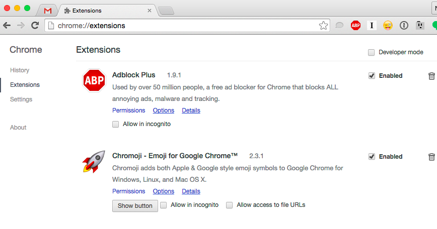
Web browsers, even the simplest ones, allow considerable customization. Most browsers let you install extensions that augment the browser’s default functionality, whether it’s visual themes or ad blocking. But as useful as blocking annoying, battery draining ads is, for those less technically savvy who don’t install AdBlock, their attention and their data effectively subsidize their more technically savvy peers. Therefore, traditional web browser design (and, indeed, website design) assumes that, among other things, the user either knows how to customize their environment to meet their needs (through extensions, like AdBlock and similar resource managers) or that the user has a reliable, relatively fast data connection (or imminent access to power outlets).
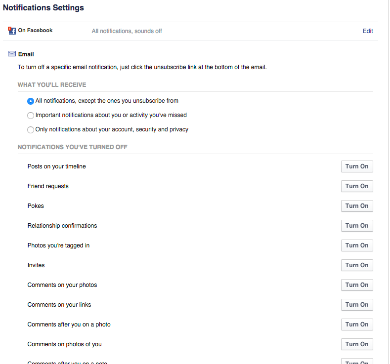
Email clients are another highly customizable technology, but like browsers, control over how one interacts with email depends heavily on one’s willingness and capacity to tinker. Many social media apps use email as their first contact and dumping ground for notifications: Facebook, for instance, has notifications for seemingly everything… there are, in fact, 61 different kinds of email notifications Facebook can send users, many of which are enabled by default. The user who lacks the technical know-how, time or patience to disable these notifications may be inundated with emails relative to the more technically savvy user. Not only do these more casual users pay Gmail/Google and Facebook more data and attention, but are often incessantly hounded by their phones, which by default notify them of every email they receive. The solution to user frustration, advocated by designers and their software, is for us to dig into the settings or to acquiesce to more surveillance and algorithms; even Google’s reconfigured tabbed inbox and its offshoot, Inbox, don’t obviate customization, but mandate customization as the default mode of interaction.
For a more timely example, following the horrific on-air slaying of two TV news anchors in Virginia last week, many people tracking the story on Twitter were exposed to the footage due to Twitter’s auto-playing videos. That videos on Twitter auto-play by default reflects what its design expects: that the viral videos users encounter are likely to be banal, that the user isn’t personally triggered by graphic content, and/ or that users know how to disable auto-play content via settings. Therefore, to misrepresent user requests for adequate warning and control over the nature of their exposure as self-coddling isn’t just wrong, it overlooks how conventional design/designers deprive users of making these decisions for themselves.
If these examples demonstrate what typical inclusive software design misses, Popcorn Time, the “Netflix of piracy,” provides a refreshing alternative, one that comes close to a truly adaptable design approach.
To start with, Popcorn Time is open source, but unlike typical open source software that requires installation of external libraries or knowledge of the command line, Popcorn Time is as easy to install as a web browser; just download and go. The most popular version is less than 30 megabytes, installation requires a reasonable 114MB of disk space, and versions are available for every major desktop and mobile operating system.
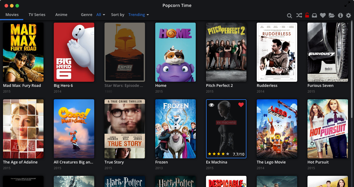
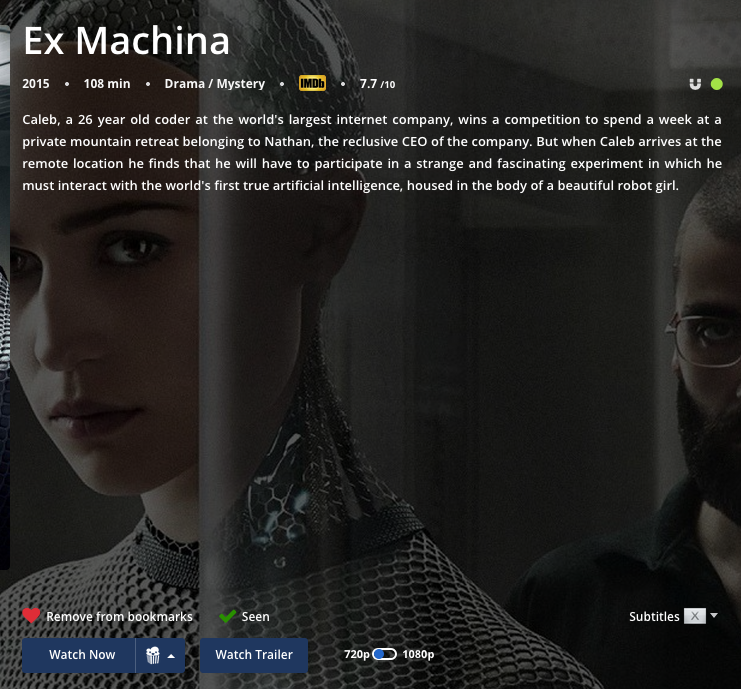
A Netflix-like thumbnail gallery represents Popcorn Time’s central interface metaphor for browsing movies and TV shows. Content can be additionally sorted by metadata (popularity, year, rating) and filtered by genre via prominent, unambiguous menus. If the desired content isn’t featured in the main menu, built-in text search is conveniently accessible, fast, and accurate.
As intuitive as Popcorn Time’s interface may be, evaluated on this criteria alone, the program would be little more than an open source Netflix clone. What distinguishes Popcorn Time from other commercial video streaming services is its affordances for video distribution and playback.
That is, Popcorn Time facilitates streaming a la peer-to-peer torrents. Compared to centralized services like Netflix, p2p distribution offers several obvious advantages, namely service reliability and redundancy. If you’ve ever tried to stream something from Netflix on a weeknight, especially in a neighborhood served by one oversaturated node, you know what a frustrating experience it can be. Videos intermittently stutter and stop, frames drop, the stream oscillates between standard and high definition. You’re lucky if you finish what you started. Centralized distribution favors those areas and users with the best connection to the distributor’s servers and necessarily privileges those users with more reliable connections. Netflix therefore assumes a fast and reliable Internet connection. Popcorn Time does not.

Popcorn Time not only provides, in my admittedly anecdotal experience, a consistently more reliable streaming experience, but also allows one to queue up and download content for later playback. By allowing the user to decouple video playback from its transmission, Popcorn Time accommodates (if imperfectly[i]) a wide range of socio-technical contexts and users for whom streaming isn’t feasible.
Like a T-shirt, Popcorn Time requires no expert knowledge of how it works in order to try it out or use it successfully. Crucially, as a networked technology, Popcorn Time does not presume a basic level of technical knowledge or speed of connection[ii]. By enabling multiple modes of interaction – intuitive and reliable p2p streaming and also downloads for when streaming isn’t feasible – Popcorn Time allows the user to adapt it to them, rather than demand the user adapt to its standard.
That a handful of volunteer developers and designers have brought adaptable design to something as relatively complex as video torrenting suggests the failure of mainstream inclusive software has less to do with resources or compassion on the part of designers than, as indicated by “Spinoza in a T-Shirt,” with the misguided, if often well-intentioned goals embedded within inclusive design itself.
Rather than try to “fix” software designed to meet the demands of certain (power) users and shareholders, it might be more fruitful to reimagine software whose default user is not a composite of focus testers, the designers and their imagined user types, and demographic/usage data, but a potentiality of users willing to adapt software to their particular needs and desires.
Everyday encounters with software are characterized by degrees of banality, annoyance, frustration, and anxiety. As a recent essay on email, “the most reviled communication experience ever,” testifies:
Email is just as “everyday” as coffee pots and doorknobs, but most people don’t fantasize about throwing their espresso machine into a black hole or sawing the knobs off all their doors. Don [Norman, design expert and author of the classic handbook The Design of Everyday Things] has no love for email: ‘The problem is in trying to make email do everything when it’s not particularly good at anything,…’
As a utilitarian messaging protocol developed by “programmers trying to make their lives easier,” email in many ways epitomizes the insufficiency of customization as a substitute for adaptable design.
Instead of offering suggestions myself, I would like to open up this topic for discussion. Taking on the perspective of would-be designers, how might we redesign email or some other instance of everyday software design to afford true adaptability?
Nathan promises not to steal your software ideas, he just wants less email. @natetehgreat
[i] While Popcorn Time embodies adaptable design, it falls short in two ways. First, and this is a major omission, Popcorn Time affords no interaction by users who are blind. Secondly, to download, rather than stream, the user must have installed a separate torrent client of their choice. The program’s download button is also relatively small and nonobvious for those unfamiliar with magnet links. Alas, even Popcorn Time, for all it gets right, still presumes a particular user: sighted and somewhat technically savvy.
[ii] Xiao Mina’s informative paper, “Mapping the Sneakernet,” and her post, “Moving Beyond the Binary of Connectivity,” are the basis of this point.
Comments 2
Dumbdowner — September 11, 2015
The software just needs to be smarter about detecting patterns of how you'd like to use it. For example, if you are getting hundreds of emails from a particular contact, the email should figure out that you might want to create a subfolder for those emails and offer it. It might also suggest an organization scheme for your subfolders based on common organization schemes it detects (with permission) from other users. It might also recognize that emails you aren't reading are emails that you don't want to read, and suggest a filter.
Gmail, Facebook, Twitter… : pourquoi c’est si compliqué ? | InternetActu — September 19, 2015
[…] personnalisation n'a pas que des vertus, rappelle Nathan Ferguson (blog, @natetehgreat) sur Cyborgology (@cybergology). "Si vous donnez aux gens accès à des paramètres, ils vont les utiliser", […]